You’re getting traffic. Google Analytics looks decent. People are landing on your site, clicking around, maybe even reading a blog post or two.
Then they leave. No form fill. No phone call. No purchase. Nothing.
That’s the reality for most small business websites. The average global ecommerce conversion rate sits at roughly 2.58% according to Adobe. Which means for every 100 visitors, roughly 97 walk away without doing anything meaningful. And if you’re a service-based business without an optimized site, your numbers are probably worse.
The good news? Small improvements compound fast. Bumping your conversion rate from 2% to 4% doesn’t just double your leads. It doubles your revenue from the same traffic you already have, without spending another dollar on ads.
Here’s what actually works.
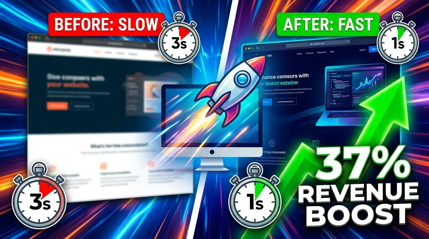
1. Speed Up Your Site (Seriously, This One’s Not Optional)
You’ve heard this before. You’re probably tired of hearing it. But the data keeps getting more extreme, not less.
Sites that load in one second convert at roughly 3x the rate of sites that take five seconds, according to SpeedCommerce’s 2025 benchmarks. And Google’s research on mobile users found that 53% of them abandon pages that take longer than three seconds to load. They don’t wait around to see your beautiful hero section. They’re gone.
Start with the basics: compress your images, minimize JavaScript, and get on a decent hosting provider. If your site runs on WordPress, a caching plugin like WP Rocket or a CDN through Cloudflare can cut load times significantly with minimal effort.
2. Write CTAs That Tell People Exactly What Happens Next
“Submit.” “Learn more.” “Click here.” These are the conversion killers hiding in plain sight on most small business websites.
WordStream’s research found that a well-crafted CTA can push conversion rates from the 2.4% average up to 11.5% or higher. That’s not a marginal improvement. That’s a completely different business.
The fix is simple but specific: your CTA should describe the outcome, not the action. “Get My Free Quote” beats “Submit.” “See Pricing” beats “Learn More.” “Book My 15-Minute Call” beats “Contact Us.” Tell people what they’re getting, and they’re far more likely to click.
3. Put Social Proof Where It Counts
Testimonials buried on a dedicated “Reviews” page that nobody visits aren’t doing much for you. The data says placement matters as much as the proof itself.
According to Trustmary’s 2025 analysis, placing testimonials near CTAs produced a 22.6% increase in conversion rates. OptinMonster’s research found that sales pages with testimonials convert 34% better than those without. And Genesys Growth reported that video testimonials outperformed written ones by 80%.
So don’t just collect reviews. Put them right next to your pricing, your contact forms, and your “Book Now” buttons. That’s where they do their job.
4. Close the Desktop-to-Mobile Gap
Here’s a stat that should bother every business owner: mobile devices drive about 60-65% of all web traffic, but they convert at only 2.9% compared to desktop’s 4.8%, per SpeedCommerce’s benchmarks. And mobile cart abandonment hits a brutal 77.2%.
Most of your visitors are on phones. Most of your conversions are on desktop. That gap is money you’re leaving behind.
The usual suspects: forms with too many fields on mobile, checkout flows that require too much typing, buttons that are too small to tap accurately, and pages that look fine on a 27-inch monitor but cramped on a phone screen. Audit your site on an actual phone. Not a browser simulator. A real phone, with real thumbs.
5. Reduce Form Fields to the Bare Minimum
Every field you add to a form is friction. Every piece of friction costs you conversions.
HubSpot’s testing has consistently shown that reducing form fields increases submissions. Their data suggests going from four fields to three can improve conversions by up to 50%. Think about what you actually need to start a conversation. Name, email, and maybe one qualifying question. That’s it. You can learn everything else on the first call.
If you’re asking for phone number, company size, annual revenue, and “how did you hear about us” all on the first touch, you’re asking too much. People don’t want to fill out a job application to get a quote.
6. Use Exit-Intent Popups (Without Being Obnoxious)
Popups have a bad reputation, and some of them deserve it. But exit-intent popups, the ones that trigger when a visitor’s cursor moves toward the browser’s close button, can recover visitors who were already gone.
OptinMonster reports that exit-intent popups can recover between 10-15% of abandoning visitors when they offer something genuinely valuable. The key word is “genuinely.” A 10% discount code for an ecommerce store works. A free resource or tool works. “Subscribe to our newsletter!” does not.
Keep the popup simple: one headline, one offer, one form field (email), and one button. If it takes longer than two seconds to understand what you’re offering, it’s too complicated.
7. Build Landing Pages for Specific Campaigns
Sending paid traffic to your homepage is one of the most expensive mistakes in digital marketing. Your homepage tries to serve everyone. A landing page speaks to one audience about one thing.
According to Unbounce’s conversion benchmark report, the median landing page conversion rate across industries is about 4.3%, but top-performing pages hit 11.5% or higher. The difference comes down to message match: when the landing page headline mirrors the ad that brought the visitor there, conversion rates climb because there’s no cognitive disconnect.
If you’re running Google Ads for “kitchen remodeling in Denver,” send that traffic to a page specifically about kitchen remodeling in Denver. With Denver-specific photos, Denver-specific testimonials, and a form that says “Get Your Denver Kitchen Remodel Estimate.” Not your generic homepage with a slider.
8. Add Live Chat or a Chatbot
Some visitors are ready to buy but have one question that’s holding them back. If the only way to get an answer is to fill out a form and wait 24 hours, a lot of them won’t bother.
Intercom’s research found that website visitors who chat are 82% more likely to convert than those who don’t. And you don’t need a human sitting there 24/7. Tools like Tidio or Drift let you set up automated chatbots that handle common questions, qualify leads, and route the serious ones to your team during business hours.
The trick is making the chat feel helpful, not intrusive. A small chat icon in the corner is fine. A chat window that pops open and blocks the whole screen three seconds after someone arrives? That’s the digital equivalent of a salesperson following you around a store.
9. Show Pricing (Or At Least a Range)
B2B businesses especially love to hide pricing behind “Contact Us for a Quote.” And yes, custom work genuinely varies in cost. But people want a ballpark before they commit to a sales conversation.
A Gartner study on B2B buyer behavior found that 77% of B2B buyers described their last purchase as very complex or difficult. Part of that difficulty is not knowing what things cost until you’re deep into a sales cycle.
Even a simple “Projects typically start at $X” or a tiered pricing table helps visitors self-qualify. The ones who can’t afford you won’t waste your time. The ones who can will feel more comfortable reaching out because you’ve been transparent. Either way, you win.
10. Use Urgency and Scarcity (But Only When It’s Real)
Fake countdown timers that reset when you refresh the page fool nobody in 2026. But genuine scarcity and real deadlines still work because they give people a reason to act now instead of “later” (which usually means “never”).
Real examples that work: “We take on 4 new clients per month” (if that’s actually true). “This offer expires Friday” (if it actually does). “3 spots left in our March cohort” (if there are actually 3 spots). People are good at detecting manufactured urgency, and it destroys trust fast.
WiserNotify’s research showed that recent booking notifications, those “Sarah from Austin just booked a consultation” widgets, increased conversions by 18%. That’s real-time social proof combined with scarcity, and it works because it’s showing actual activity.
11. A/B Test One Thing at a Time
Here’s where most businesses get conversion optimization wrong: they redesign everything at once, see a result (good or bad), and have no idea which change caused it.
Pick one element. Test it. Measure it. Move on.
Start with your highest-traffic page and your most important CTA. Change the button color, the headline, or the offer, but not all three at once. CXL’s research on CTA testing showed that what matters isn’t whether your button is red or green. It’s whether the button contrasts with its surroundings enough to stand out. The “best” color depends entirely on your site’s design.
Tools like Google Optimize (free), VWO, or Optimizely make running A/B tests straightforward even if you’re not technical. Test for at least two weeks to account for weekday vs. weekend traffic patterns, and don’t call a winner until you have statistical significance.
The Bigger Picture
None of these tactics work in isolation, and none of them are one-time fixes. The businesses that consistently convert well are the ones that treat their website like a sales tool, not a digital brochure. They test, measure, and iterate.
You don’t need to do all 11 things this week. Start with the one that’s the biggest bottleneck for your specific situation. If your site is slow, fix that first. If you’re getting traffic to your services page but no one’s filling out the form, look at your CTA and form fields. If mobile users are bouncing, audit your mobile experience.
Small changes. Real data. Consistent improvement. That’s how you turn a website that “looks nice” into one that actually pays for itself.
Ready to stop losing visitors and start converting them? Let’s talk about your website and figure out exactly where you’re leaving money on the table.

Richard Kastl
Founder & Lead EngineerRichard Kastl has spent 14 years engineering websites that generate revenue. He combines expertise in web development, SEO, digital marketing, and conversion optimization to build sites that make the phone ring. His work has helped generate over $30M in pipeline for clients ranging from industrial manufacturers to SaaS companies.