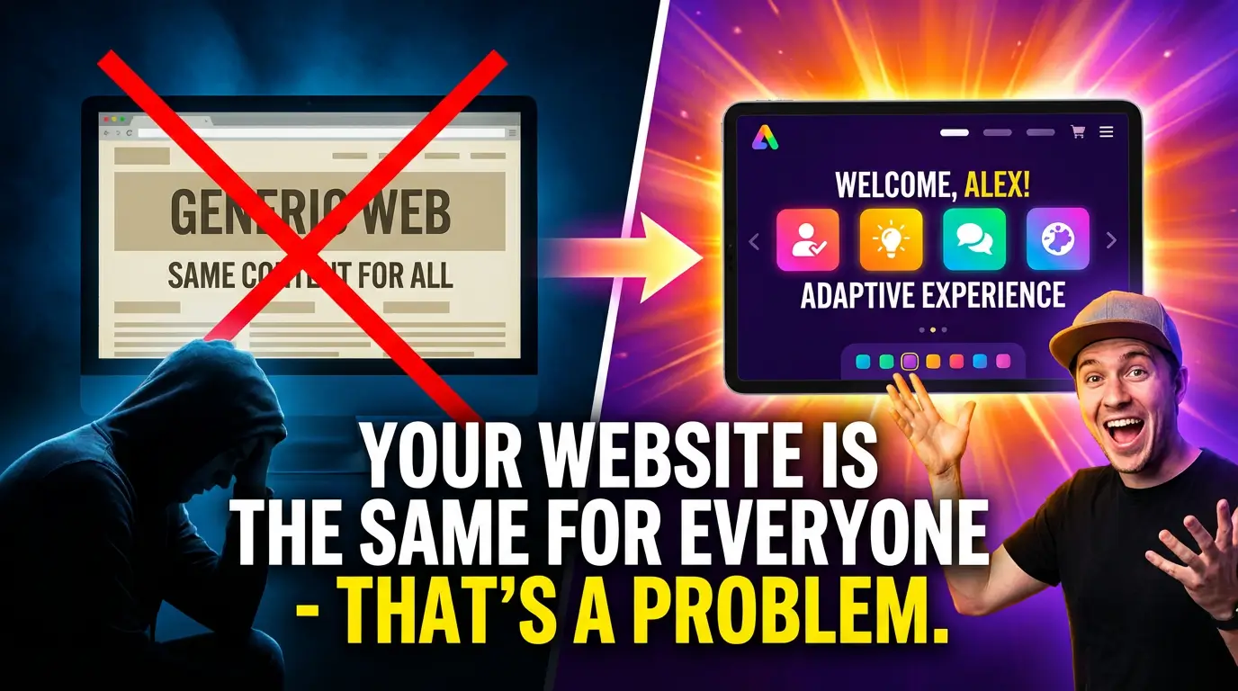
Here’s something most business owners don’t think about: when a first-time visitor and a returning customer land on your homepage, they see exactly the same thing. Same headline, same hero image, same call-to-action. One person has never heard of you. The other already bought from you three months ago. And your website treats them identically.
That worked fine for a long time. It doesn’t anymore.
The web in 2026 is moving away from static, frozen pages toward something more responsive to intent. Not just responsive to screen size (we solved that a decade ago) but responsive to who is visiting and what they’re trying to do. The shift is real, it’s accelerating, and businesses that ignore it are going to feel it in their conversion rates.
What “Adaptive” Actually Means
Let’s be clear about what we’re talking about, because “personalization” has been a marketing buzzword for years without delivering much for most small and mid-size businesses.
Adaptive web design isn’t about showing someone’s first name in a header. It’s about structuring your site so that different visitors get different experiences based on signals like where they came from, what they’ve looked at before, what device they’re on, and what stage of the buying process they’re in.
A first-time visitor from a Google search for “custom CNC machining near me” should see something different than a repeat visitor who’s already downloaded your capabilities brochure. The first person needs trust signals, portfolio examples, and a quick way to request a quote. The second person probably wants pricing details, lead times, or a direct line to your sales team.
Gapsy Studio’s analysis of 2026 web design trends describes this as a shift from “forcing visitors to search, compare, and decide” toward websites that actively do the work for the user. That’s a big deal. Instead of building a single page and hoping it serves everyone, you’re building experiences that meet people where they are.
The Numbers Behind It
This isn’t just a design philosophy. The data is clear.
McKinsey’s research on personalization found that companies doing personalization well see 10 to 15 percent revenue lifts, with some hitting 25 percent depending on their sector and execution. That’s not a rounding error. For a business doing $2 million in annual revenue through their website, even the low end means an extra $200,000.
Google’s own research on page performance showed that bounce probability jumps 32% when load time goes from one second to three seconds. Now apply that logic to relevance. If someone lands on your page and the content doesn’t match their intent, the cognitive “load time” is just as punishing. They bounce, not because your page is slow, but because it’s wrong for them.
Routes.Design published a case study where a CRO-focused website redesign produced a 45% traffic increase and a 60% conversion boost in three months. That wasn’t magic. It was aligning the experience with what visitors actually wanted.
The Rise of “Agentic” Web Experiences
There’s a concept gaining serious traction in the design world right now: agentic UX. The term comes from the idea that a website isn’t a passive brochure anymore. It acts on behalf of the user.
Blog-UX’s 2026 trends report frames it this way: “The user no longer searches; they delegate.” Instead of clicking through five pages to find what they need, the site surfaces the right content, the right CTA, and the right next step based on context. The metric that matters isn’t time-on-site anymore. It’s resolution velocity, how fast the visitor gets what they came for.
Think about what that means for a business website. Your average B2B buyer has already done research before they land on your site. They don’t want to read your “About Us” page from top to bottom. They want to know: can you do what I need, how much will it cost, and how do I get started? An agentic website gets them there faster.
Elementor’s 2026 web design report talks about this same shift. Websites are moving from static layouts to intelligent systems that adapt structure, tone, and content automatically. The creator sets the intent and framework. The system handles the variations.
Ginger IT Solutions puts it plainly: websites in 2026 “listen, respond, adapt, and guide.” That’s the direction. Not every site needs to be fully autonomous, but every site should be smarter than a static page that ignores who’s looking at it.
What This Looks Like in Practice
You don’t need a six-figure AI budget to start making your website more adaptive. Here’s what it looks like at different levels of sophistication.
Entry level: Smart CTAs. Your homepage call-to-action changes based on whether someone is a new or returning visitor. New visitors see “See Our Work” or “Get a Free Quote.” Returning visitors see “Schedule a Consultation” or “View Your Proposal.” Most modern CMS platforms can do this with basic cookie detection or UTM parameters. (If your CTAs need work in general, here are 11 proven conversion tactics to start with.)
Mid level: Segmented landing pages. Instead of sending all your paid traffic to one generic page, you build variations for different audiences. A manufacturer running Google Ads for “precision machining” and “prototype development” sends each keyword group to a page tailored to that specific need. Same company, different stories.
Advanced: Dynamic content blocks. Sections of your page change based on industry, company size, or behavior. A visitor from the automotive sector sees automotive case studies. Someone from aerospace sees aerospace examples. This used to require enterprise-level personalization platforms. Now tools like Mutiny, Optimizely, and even some headless CMS setups make it accessible to smaller teams.
Cutting edge: Generative interfaces. This is where things get genuinely new. Blog-UX’s report describes “GenUI,” or generative user interfaces, where AI assembles page components in real-time based on context. Instead of a designer building 20 page variations, the system generates the right layout for each visitor. It’s still early, but it’s coming fast.
Why Static Sites Still Win on Speed (And That Matters More Than You Think)
Here’s where it gets interesting. The best foundation for an adaptive website isn’t a bloated WordPress site loaded with plugins. It’s a fast, clean static site built on a framework like Astro that ships minimal JavaScript by default.
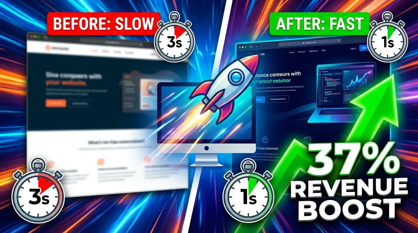
Why? Because adaptive features need to load on top of your base experience. If your base is already slow and heavy, adding personalization layers makes it worse. But if your base loads in under a second with clean HTML and near-zero JavaScript, you’ve got headroom to add smart components without killing performance. (The revenue impact of speed is massive: a 2-second improvement drove a 37% revenue increase in one case.)
Pagepro’s 2026 framework comparison confirms that Astro “outputs clean, static HTML by default, loads minimal JavaScript, and delivers strong Core Web Vitals.” That makes it a perfect foundation for layering adaptive content on top. You get the speed that Google rewards and the flexibility to serve different experiences to different people.
This is exactly the approach we take at YourWebTeam. We build on Astro because it gives us the fastest possible baseline. Then we layer in smart personalization where it makes the biggest difference, usually on key conversion pages like homepages, service pages, and landing pages for paid campaigns.
The “Good Enough” Trap
Most businesses fall into a pattern: they build a website, it looks decent, it loads reasonably fast, and they leave it alone for two or three years. During that time, their competitors are testing, iterating, and adapting. And slowly, almost invisibly, the “good enough” site starts losing ground.
The VWO conversion optimization team documented a case where Hype’s homepage redesign, focused on CRO principles, led to a 42% increase in sign-ups. That’s not from adding a chatbot or some flashy animation. It’s from rethinking the page structure based on how people actually behave.
Your competitors are doing this. Maybe not all of them. But the ones that are eating your market share? They’re testing headlines, rotating CTAs based on traffic source, and building pages that don’t treat every visitor like a stranger.
What You Should Do This Quarter
You don’t need to rebuild your entire site tomorrow. But you should stop treating your website like a finished product. It’s not a brochure you print once. It’s a system that should evolve with your business and your customers.
Start with your highest-traffic pages. Look at your analytics. Where are people entering your site? Where are they dropping off? Those are your first candidates for adaptive treatment. A/B test a different headline for paid traffic versus organic. Add a returning-visitor CTA. Build a landing page variant for your best-performing ad group.
If your current site is built on WordPress and it’s slow, heavy, and hard to modify, that’s a separate conversation. WordPress may be costing you more customers than you realize. You might be carrying technical debt that makes any of this harder than it needs to be. A migration to something faster and more flexible, like Astro, gives you the foundation to actually execute on adaptive design without fighting your own platform.
The bottom line is this: a website that treats every visitor the same is leaving money on the table. How much depends on your traffic, your industry, and how far behind you are. But the direction is clear. The web is getting smarter. Your site should too.
Ready to stop leaving conversions on the table? Let’s talk about what an adaptive, high-performance website looks like for your business.

Richard Kastl
Founder & Lead EngineerRichard Kastl has spent 14 years engineering websites that generate revenue. He combines expertise in web development, SEO, digital marketing, and conversion optimization to build sites that make the phone ring. His work has helped generate over $30M in pipeline for clients ranging from industrial manufacturers to SaaS companies.