Every January, design blogs publish their trend lists. Most of them read like a Pinterest mood board: pretty but useless if you’re running a business and need your website to actually work.
This isn’t that kind of list.
These are the trends worth paying attention to in 2026 because they solve real problems. Faster sites, clearer layouts, better conversions. Some of them are brand new. Others have been building for a couple of years and are finally hitting the mainstream. All of them are things you can act on right now.
1. Performance-First Design Is No Longer Optional
For years, designers would build something beautiful and then hand it off to developers to “make it fast.” That doesn’t fly anymore.
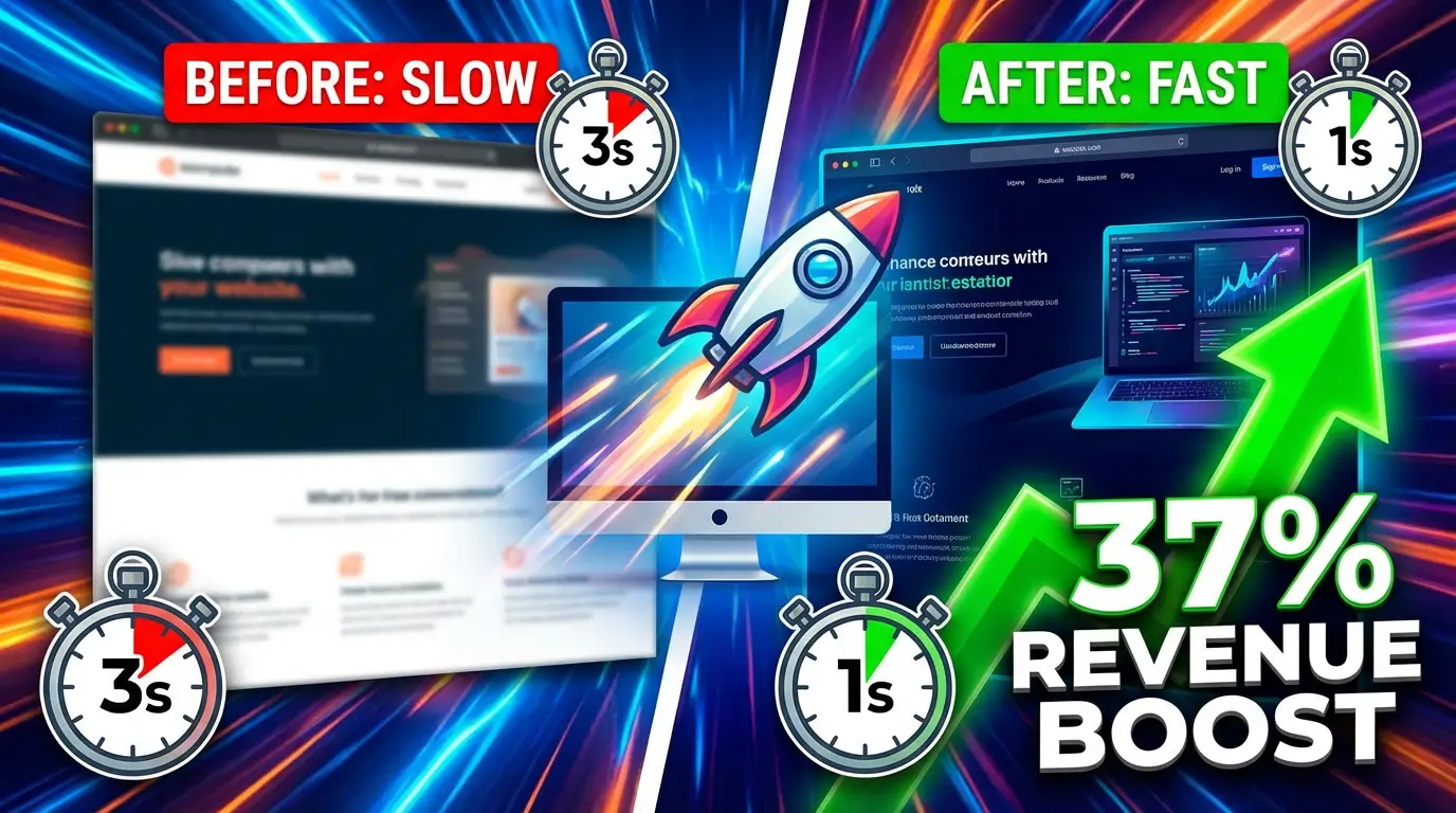
Google’s Core Web Vitals are now deeply embedded in how search rankings work, and the bar keeps rising. A 2025 study from Portent found that conversion rates drop by an average of 4.42% for every additional second of load time. That’s real money walking out the door.
What’s changed in 2026 is that performance is part of the design conversation from the very beginning. Designers are thinking about image weight before they choose a hero photo. They’re questioning whether that parallax section is worth the 200ms it adds. Tools like Astro and frameworks that ship zero JavaScript by default are gaining serious traction because they force this discipline.
If your site takes more than 2.5 seconds to load on mobile, you’re losing people before they even see your homepage. That’s not a development problem. It’s a design problem. (We put real revenue numbers on this: how a 2-second speed improvement increased revenue by 37%.)
2. Bento Grid Layouts Are Everywhere
You’ve seen this if you’ve looked at Apple’s product pages in the last two years. Content organized into neat, modular boxes of different sizes, like a Japanese bento box.
The reason this layout took off isn’t just aesthetics. It solves a genuine information architecture problem: how do you show a lot of features or services without creating a wall of text? Bento grids let you give each item its own visual space while keeping everything organized. Companies like Notion and Linear have used this approach on their marketing pages to showcase dozens of features without overwhelming visitors.
For small businesses, this is gold. Got 6 services? Put them in a bento grid instead of a boring bulleted list. Each box gets an icon, a short description, and a link. Clean, scannable, professional.
The key is restraint. Don’t cram 20 boxes onto one page. Keep it to 4-8 items per grid section, and make sure the visual hierarchy is clear.
3. Glassmorphism Done Right
Glassmorphism (frosted glass effects with translucent panels, blurred backgrounds, and subtle borders) has been floating around since 2020. But early attempts were often heavy, inaccessible, and slow.
In 2026, the approach has matured. Squarespace’s design team highlighted it as a defining trend this year, and for good reason: modern CSS backdrop-filter support across all major browsers means you can achieve the effect without performance-killing workarounds. The Ginger IT Solutions design report describes the current approach as “translucent panels, frosted overlays, layered depth, and soft shadows that create separation without heavy borders.”
Where it works: navigation bars, card overlays, pricing tables, modal windows. Where it fails: anywhere it makes text hard to read. If your contrast ratio drops below WCAG guidelines, skip the frosted glass. No visual trend is worth making your site unusable.
4. Scroll-Driven Animations (Without the JavaScript Bloat)
Here’s something genuinely exciting. CSS now natively supports scroll-driven animations without any JavaScript at all. Elements can animate based on scroll position, from 0% to 100%, using pure CSS.
This is a big deal because scroll animations used to require libraries like GSAP or custom scroll listener code, adding weight and complexity. The new CSS approach is smoother, more performant, and as Digital Silk noted in their 2026 analysis, it gives designers control over pacing and emphasis without the Core Web Vitals penalty that JavaScript-based solutions often carry.
Use this for: fade-in effects as users scroll, progress indicators, subtle parallax on hero images. Don’t use this for: anything that makes your visitor feel like they’re on a rollercoaster. If someone has to figure out how to navigate your page, you’ve gone too far.
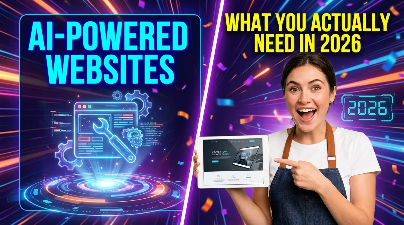
5. AI-Generated Layouts Are Getting Practical
Not “AI will replace designers” practical. More like “AI will handle the boring parts so designers can focus on the hard parts” practical.
Elementor’s 2026 trend report describes AI tools that can now generate full page sections (testimonials, contact forms, feature grids) complete with layout and styling from a single prompt. Figma’s AI features can suggest layout adjustments based on content length and type. Framer lets you generate entire page drafts from text descriptions.
The small business angle? If you’re building your own site, AI tools can get you 70% of the way to a professional layout in minutes. That last 30% still needs a human eye, but the starting point is dramatically better than a blank page or a generic template. (For a practical breakdown of which AI features actually matter for small businesses, see our guide to AI-powered websites in 2026.)
Don’t let AI write your copy, though. It still reads like AI wrote it, and your customers can tell.
6. Organic Shapes and Soft Gradients Replace Sharp Minimalism
The ultra-clean, geometric, white-space-heavy look that dominated the 2010s is softening. Elementor’s trend analysis puts it plainly: “After years of strict grids and sharp minimalism, design is softening. Organic shapes, flowing lines, and soft gradients are making digital experiences feel more natural and approachable.”
Why does this matter for your business? Because approachable sells. When everything looks cold and clinical, nothing stands out. A touch of warmth in your design (rounded corners, gentle color gradients, blob shapes in your backgrounds) can make your brand feel more human without looking unprofessional.
You don’t need to go wild with it. Replace your straight-edge hero section divider with a subtle wave. Swap your solid color backgrounds for soft gradients. Use rounded corners on your cards and buttons. Small changes, big impact on how your site feels.
7. Unified Platform Design (Your Website as Your Business Hub)
This one’s less about visual design and more about how your website fits into your entire business operation. The trend is toward websites that aren’t just brochures but are connected hubs where e-commerce, marketing, automation, and data flow through a single system.
Elementor’s report calls this “a single source of truth for teams and customers alike.” What that looks like in practice: your contact form feeds directly into your CRM. Your blog automatically generates social posts. Your booking system syncs with your calendar. Your analytics dashboard is built into your site admin, not a separate tab you forget to check.
Platforms like HubSpot CMS, Webflow with its integrations ecosystem, and even WordPress with the right plugin stack are all pushing this direction. For small businesses, the real value is eliminating the duct-tape approach of connecting 12 different tools that barely talk to each other.
8. Dark Mode as a First-Class Design Decision
Dark mode used to be an afterthought. A toggle in the corner that developers would implement last and test never. In 2026, it’s a primary design consideration.
The numbers back this up. Surveys from Android Authority consistently show that over 80% of smartphone users prefer dark mode on their devices. If your website doesn’t respect that preference, you’re creating a jarring experience every time someone visits from their phone at night.
The CSS prefers-color-scheme media query has been supported in all major browsers for years now, but the design challenge is harder than just inverting colors. You need a coherent dark palette, images that work on both backgrounds, and UI elements that maintain their visual hierarchy without relying on “light thing on white background” contrast. Plan for it from the start, not as a bolt-on feature.
9. Motion Narrative (Scroll as Storytelling)
Squarespace Circle’s 2026 trend report coined this nicely: “Where you scroll becomes the storyteller.” The idea is that scrolling through a page reveals a narrative, with elements pinning, layering, and transitioning as you move.
Apple has done this for years on their product pages. Scroll down and a MacBook opens, rotates, shows you the screen, highlights the ports. It tells a story without a single paragraph of text.
For most small businesses, you don’t need that level of production. But the principle is useful. Instead of dumping all your information above the fold, structure your page so each scroll section reveals the next logical piece. Problem, solution, proof, action. Guide people through a story instead of handing them an encyclopedia.
The tools are getting accessible, too. Webflow and Framer both have visual scroll-animation builders that don’t require code. And the native CSS scroll-driven animations mentioned earlier mean even custom-built sites can do this without heavy JavaScript.
What to Actually Do With This
You don’t need to chase every trend on this list. That’s how you end up with a Frankenstein site that’s trying to be everything and achieving nothing.
Pick two or three that solve a real problem you’re having. Site too slow? Focus on performance-first design and cut the JavaScript bloat. Services page a mess? Try a bento grid layout. Site feels generic? Add some organic shapes and a dark mode.
The best websites in 2026 won’t be the ones using every trend. They’ll be the ones that picked the right trends for their audience and executed them well. If you want the data to back up that claim, 47 web design statistics that should change how you build is a good place to start.
If you’re not sure where to start, we can help you figure that out. We’ll look at your current site, identify what’s working, what’s not, and which of these trends would actually move the needle for your business.

Richard Kastl
Founder & Lead EngineerRichard Kastl has spent 14 years engineering websites that generate revenue. He combines expertise in web development, SEO, digital marketing, and conversion optimization to build sites that make the phone ring. His work has helped generate over $30M in pipeline for clients ranging from industrial manufacturers to SaaS companies.