Here’s a number that should make you rethink your homepage: the average user spends less than 7 seconds on a webpage before deciding whether to stay or leave. Not 7 minutes. 7 seconds.
In that window, your homepage has one job: convince a stranger that they’re in the right place and give them a reason to go deeper. Most small business homepages fail this test completely — not because of a single catastrophic flaw, but because of a handful of compounding mistakes that each shave a few seconds off that already-short window.
The frustrating part is that most of these mistakes are invisible to the business owner. You’ve looked at your homepage a hundred times. You know what you do. But your visitors don’t — and your homepage isn’t telling them fast enough.
Here are 11 homepage mistakes that are quietly killing your conversions, and exactly how to fix each one.
1. Your Headline Doesn’t Say What You Do
Most small business homepages open with a headline like “Welcome to [Business Name],” “Excellence in [Industry],” or some variation of “We Help Businesses Succeed.” These headlines say nothing. They tell a visitor zero about what you actually offer, who you serve, or why they should care.
Your headline is the first thing a visitor reads. According to Copyblogger, 8 out of 10 people read the headline but only 2 out of 10 read the rest of the page. A vague headline doesn’t just fail to convert — it actively pushes people away because it doesn’t confirm they’re in the right place.
The fix is simple but requires honesty: write a headline that answers the question “What do you do and for whom?” in one sentence. “We build lead-generating websites for service businesses” beats “Building Better Businesses” every single time. Specificity creates trust. Vagueness creates doubt.
2. You Have No Clear Primary Call-to-Action
Visitors who are ready to take the next step need to know exactly what to do. If your homepage has four buttons of equal visual weight — “Learn More,” “Contact Us,” “See Our Work,” and “Meet the Team” — you’ve created decision paralysis. The visitor looks at all four options and clicks none of them.
Every page needs one primary call-to-action. Not zero, not three. One. HubSpot found that CTAs with personalized, single-focus messaging outperform generic ones by 202%. On your homepage, that primary CTA should reflect the single most important action you want a visitor to take: book a call, get a quote, start a free trial, whatever the next logical step is in your sales process.
Make it impossible to miss. High-contrast button color. Action-oriented copy (“Get My Free Quote” not “Submit”). Placed above the fold and repeated lower on the page. If you want to go deeper, our guide to call-to-action strategies that drive website conversions breaks down the exact copy, placement, and design principles that move visitors to act.
3. Your Page Loads Too Slowly
If your homepage takes more than 3 seconds to load, you’ve already lost more than half your visitors before they’ve seen a single word. Google’s research shows that 53% of mobile users abandon sites that take longer than 3 seconds to load. And after 5 seconds, bounce rates climb above 90%.
Speed isn’t just a user experience issue — it directly affects your Google rankings. Core Web Vitals are a confirmed ranking factor, and a slow homepage gets penalized in search results before visitors even have a chance to see it. (The revenue impact of speed is significant enough that we’ve written an entire piece on how a 2-second faster website can increase revenue.)
Test your homepage speed right now at Google PageSpeed Insights. Common culprits: uncompressed images, too many third-party scripts, no browser caching, cheap shared hosting. Fix the biggest issues first — usually image compression alone recovers 30–50% of load time.
4. The Above-the-Fold Section Doesn’t Show Your Value Immediately
“Above the fold” refers to everything visible before a visitor scrolls. On most screens, that’s roughly 600–700 pixels of content. What you put in that zone determines whether visitors scroll further or leave immediately.
Many small business homepages waste this prime real estate on a giant background image, a navigation bar, and a logo. The actual value proposition gets buried below the fold, where most visitors never see it. Studies from Nielsen Norman Group show that users spend 57% of their page-viewing time above the fold.
Your above-the-fold section should contain, at minimum: a clear headline that states your value, a subheadline with a supporting detail, a primary CTA, and ideally a trust signal (like a client count or a recognizable logo). Every element below the fold should deepen the case made above it — not introduce it.
5. You’re Talking About Yourself Instead of the Customer
Read your homepage copy right now. Count how many times it says “we,” “our,” and “us” versus “you” and “your.” If “we” wins by a wide margin, your homepage is about you — and visitors don’t care about you yet. They care about their own problems and whether you can solve them.
This is one of the most common and costly homepage mistakes. Business owners write copy that describes the company’s history, values, and process. But visitors come to your homepage with a problem. They need to see that problem reflected back at them before they’ll trust that you have the solution. Donald Miller’s StoryBrand framework makes this point bluntly: the customer is the hero, not your brand.
Rewrite your copy through the customer’s lens. “We’ve been building websites for 10 years” becomes “You get a website built by a team with 10 years of client results.” The information is the same. The impact is completely different.
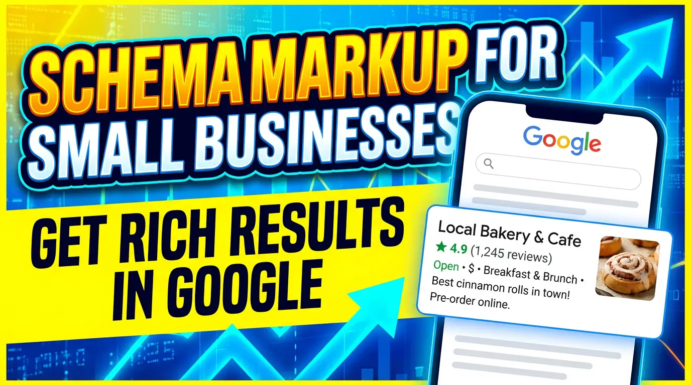
6. There’s No Social Proof in Sight
New visitors arrive at your homepage as skeptics. They don’t know you, they don’t trust you, and they have no reason to believe your claims. Social proof — reviews, testimonials, case studies, client logos, results data — is what converts skeptics into inquiries.
A homepage with no social proof is a homepage that asks visitors to trust you on faith alone. BrightLocal’s 2024 Consumer Review Survey found that 88% of consumers trust online reviews as much as personal recommendations. If you have happy clients but you’re not showing their words on your homepage, you’re leaving your most persuasive sales tool in a drawer.
The fix: add at least three specific testimonials with real names and photos (not “J.S. from Ohio”). Include a result if possible: “We booked 14 new clients in 60 days after the redesign.” Numbers make testimonials credible. Vague praise does very little. We’ve covered how to deploy social proof systematically in our guide on using social proof to win more clients.
7. Your Navigation Has Too Many Options
Navigation menus are supposed to help visitors find what they need. But when a menu has 8, 10, or 12 items — Services, About, Team, Blog, Portfolio, Resources, FAQ, Case Studies, Pricing, Contact — it creates cognitive overload. Visitors freeze, then leave.
Hick’s Law is a UX principle that states: the more choices a person has, the longer it takes to make a decision. More options don’t help visitors — they slow them down and increase the chance they abandon the decision entirely.
Keep your primary navigation to 5 items or fewer. If you have more pages than that, use a simplified top nav (Services, About, Blog, Contact) and reserve secondary pages for the footer. Test this change and watch your time-on-site metrics improve within days.
8. Your Homepage Has No Clear Audience Signal
If someone lands on your homepage and they’re not sure whether you serve them, they’ll leave and find a competitor who makes it obvious. Audience signals are the words, images, and examples that tell a specific type of person “yes, this is for you.”
A web design company that says “We build websites” could be for anyone from Fortune 500 corporations to solo realtors. That ambiguity might feel like it opens you up to more business, but it actually does the opposite — it dilutes your message so thoroughly that no one feels truly targeted. MarketingExperiments research consistently shows that specificity in messaging increases conversion rates dramatically.
Name your customer directly. Show photos of people like them. Reference their specific industry or situation. “We build websites for local service businesses like HVAC companies, plumbers, and contractors” is far more compelling to a plumber than a generic homepage that could be for anyone.
9. You’re Not Mobile-First
Statista reports that 62% of web traffic worldwide now comes from mobile devices. If your homepage looks great on a 27-inch desktop monitor but clunky on a phone, you’re botching the visit for the majority of your traffic. The full picture of mobile website statistics and user behavior makes clear just how much revenue rides on that experience.
Mobile-first doesn’t just mean your layout resizes. It means your tap targets are large enough for thumbs. Your font sizes are readable without pinching. Your images load at mobile-appropriate resolutions. Your CTA button is visible without scrolling past a full-screen hero image. Your phone number is a tap-to-call link, not text someone has to memorize.
Google ranks your site based on its mobile version (mobile-first indexing), so this isn’t just a UX issue — it’s a ranking issue. Pull up your homepage on your actual phone right now, not in a browser preview. Can you read it easily? Is the CTA obvious? Can you navigate without frustration? What you find is what your visitors experience every day.
10. Your Images Are Generic Stock Photos
Smiling stock-photo people shaking hands. Teams gathered around a table laughing at a laptop. A woman looking delightedly at a clipboard. These images are everywhere, they mean nothing, and visitors have learned to tune them out completely.
Worse, generic stock photography actively undermines trust. It signals that there are no real people behind the business — and in a digital environment where scams and low-quality operations are common, trust signals matter enormously. A study published in Marketing Land found that real photos of real people outperform stock photos by 35% in conversion tests.
Replace stock photos with real images: your actual office or workspace, your actual team, photos from client projects (with permission), or behind-the-scenes process shots. If professional photography isn’t in the budget, iPhone photos in good natural light beat stock photography every time. Authenticity converts better than polish.
11. There’s No Reason to Act Now
Even when visitors like what they see, they often leave without converting because there’s no urgency. “We’ll be here when you’re ready” is the implicit message of most homepages, and visitors take you up on it — they come back later, then forget, then buy from someone who gave them a reason to act today.
Urgency doesn’t mean fake countdown timers. It means giving visitors a clear picture of what they miss by waiting. This can be a limited intake (if true), a current promotion, a process timeline (“New client projects book 3–4 weeks out”), or simply a compelling articulation of the cost of the status quo: “Every month you wait is another month of missed leads.”
A free consultation offer with a specific deliverable is one of the most effective tools here. Not “Contact us for a free call,” but “Get your free 20-minute website audit — we’ll show you exactly where you’re losing leads.” A specific offer with a specific deliverable is far easier to say yes to than a vague “contact us” CTA.
Your Homepage Is Your Best Salesperson — Or Your Worst
Every day your homepage makes one of these mistakes is a day it’s actively undoing your marketing spend. Traffic that took months and thousands of dollars to build lands on your page and leaves in 7 seconds because nothing convinced them to stay.
The good news: these are all fixable. You don’t need a complete redesign to address most of them — you need clear copy, real social proof, a single focused CTA, and a commitment to speaking to your customer’s problem before your own credentials.
If you want a professional set of eyes on your homepage — someone who can identify exactly which of these mistakes are costing you the most — our team offers a free website audit where we walk through your site and tell you precisely where you’re losing leads and how to fix it.
Your homepage should be working for you around the clock. Let’s make sure it is.

Richard Kastl
Founder & Lead EngineerRichard Kastl has spent 14 years engineering websites that generate revenue. He combines expertise in web development, SEO, digital marketing, and conversion optimization to build sites that make the phone ring. His work has helped generate over $30M in pipeline for clients ranging from industrial manufacturers to SaaS companies.