You have 50 milliseconds.
That’s it. Half a tenth of a second. Before a visitor reads a single word, clicks anything, or scrolls at all — they’ve already decided whether your website feels trustworthy, professional, or like something they should immediately close.
First impressions on the web aren’t just powerful. They’re nearly instantaneous — and they’re almost entirely visual.
These 55 statistics reveal what shapes that snap judgment, how lasting it is, and what it means for your bottom line. Whether you’re a web designer, a business owner, or a marketer, this data will change how you think about your homepage.
The Speed of Judgment
1. It takes just 50 milliseconds (0.05 seconds) for users to form a visual opinion of your website. This landmark finding comes from a 2006 study published in Behaviour & Information Technology by researchers at Carleton University. They found that aesthetic impressions form faster than conscious thought — and they remain remarkably consistent.
2. 94% of first impressions are design-related. Research cited by convergine.com and widely replicated shows that when users form their initial opinion of a site, the overwhelming driver is visual design — not content, not messaging, not value proposition. The visuals come first.
3. 75% of consumers judge a company’s credibility based on its website design. Stanford Web Credibility Research found that three in four users are making credibility assessments — is this business real? is this professional? should I trust them? — directly from design signals.
4. 48% of users cite design as the #1 reason they distrust or leave a website. According to data from Zipdo’s Web Design Statistics report, nearly half of all website abandonment is tied directly to design failures. Not slow load times, not bad content — design.
5. 88% of online users are less likely to return to a website after a bad first experience. UserGuiding’s UX statistics roundup shows that a negative first impression isn’t just lost traffic today — it’s a permanently burned bridge. Almost 9 in 10 users won’t give you a second chance.
6. Users give your homepage 3 to 5 seconds to earn their trust. SAMPS research notes that while the visual impression forms in 50ms, the trust judgment that follows plays out over the next few seconds. In that window, your site must communicate credibility, clarity, and ease of use — simultaneously.
Design Quality & Visual Appeal
7. 38% of visitors will leave a website if they find the layout unattractive. UserGuiding’s compilation of UX data found that more than a third of users are explicitly making aesthetic judgments and bouncing when the design doesn’t meet their expectations.
8. 94% of users say they don’t trust poorly designed or outdated websites. The same dataset shows that visual aging — old fonts, dated color palettes, layouts that look like they haven’t been touched in years — is nearly universally read as a trust signal failure.
9. Visitors form an opinion of your site’s aesthetic appeal in 17 to 50 milliseconds. Dovetail’s UX research compilation narrows the range: some studies find 17ms, others 50ms. Either way, the judgment is made before the page finishes loading.
10. 60% of users consider usability the most critical website design feature. SQ Magazine’s web design statistics report found that when asked what matters most in design, a majority points to usability — not aesthetics alone. Beauty without clarity doesn’t convert.
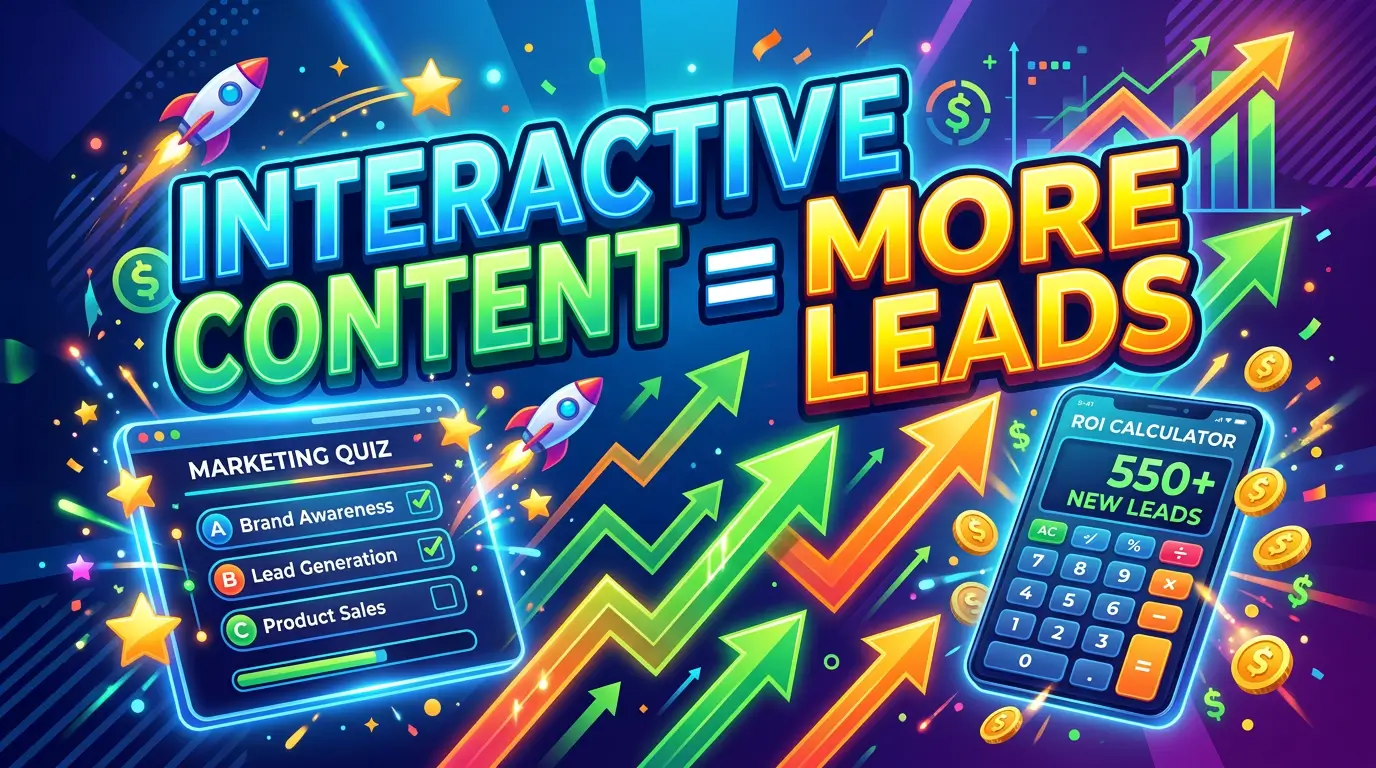
11. Improving visual design alone can increase conversion rates by 200%. DesignRush’s web design statistics cite cases where investing in design overhaul — even without changing copy or offers — doubled conversion rates.
12. 66% of users prefer to read beautifully designed content over plain content. Dovetail’s UX data shows that design makes content itself more persuasive. The same words, presented beautifully, are more believable.
Page Speed as a First Impression
Page speed isn’t separate from first impressions — it is a first impression. A slow-loading site fails the user before a single pixel is rendered.
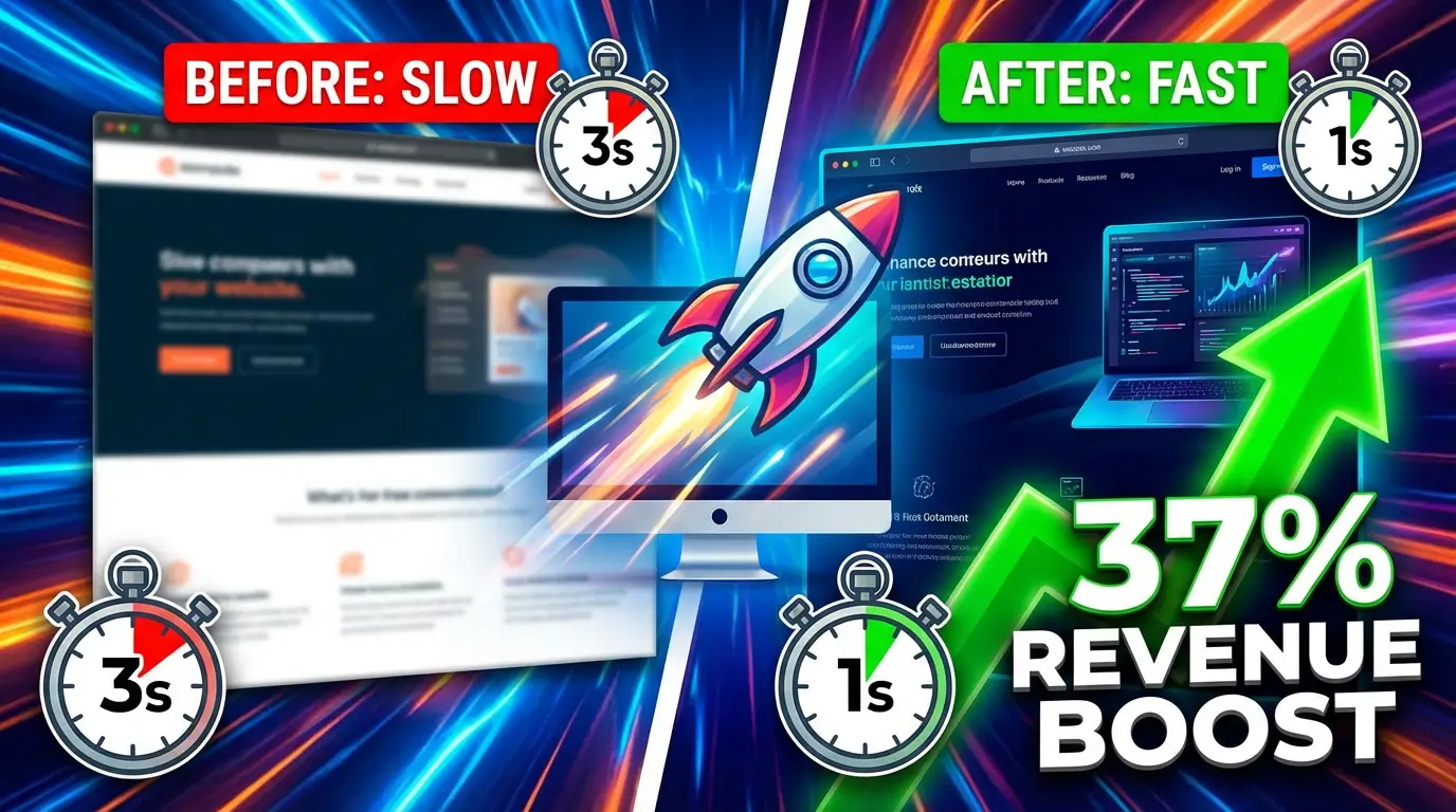
13. 53% of mobile users abandon a site that takes more than 3 seconds to load. Google’s research established this benchmark, and it remains one of the most cited stats in web performance. Over half your mobile visitors won’t wait 3 full seconds.
14. A 1-second delay in mobile load time reduces conversions by up to 20%. SiteBuilderReport’s speed statistics show the direct linear relationship between milliseconds and money. Every second costs you conversions.
15. Reducing load time from 8 seconds to 2 seconds can increase conversions by 74%. UserGuiding cites research showing this dramatic improvement — and it’s achievable with proper performance optimization.
16. 80% of users say website speed impacts their perception of a company’s trustworthiness. Stanford research cited by SEO Sandwitch connects speed directly to brand trust. A slow site isn’t just annoying — it signals incompetence or neglect.
17. Page load time influences 94% of first impressions. Forrester Research, cited by SEO Sandwitch, found that speed is woven into nearly every first impression a visitor forms. It’s not a technical metric — it’s a brand metric.
18. A 2-second delay in load time results in 87% of users abandoning a purchase. SiteBuilderReport data shows that e-commerce is particularly brutalized by slow load times. The cart abandonment rate nearly doubles with a 2-second delay.
19. Sites with slow speeds lose an estimated $6.8 billion in revenue annually. UserGuiding’s UX roundup puts a dollar figure on the industry-wide cost of poor performance. Speed is not optional.
20. The average website takes 1.9 seconds to load on mobile in 2025. Google CrUX data via Kanuka Digital sets the current benchmark. If you’re well above this, you’re already losing.
Color, Typography & Visual Hierarchy
21. Color increases brand recognition by up to 80%. UserGuiding’s UX statistics cite research showing that consistent color use in design dramatically increases how memorable and recognizable a brand becomes.
22. The right color choice can increase conversion rates by up to 24%. DesignRush data shows that color isn’t decorative — it’s functional. The right button color, background contrast, and palette alignment with user psychology moves conversion needles significantly.
23. Typography-first designs improved readability by 31% in UX studies. SQ Magazine’s research compilation shows that prioritizing typographic clarity — font size, line spacing, hierarchy — has a measurable impact on how users engage with content.
24. Serif fonts can increase reading speed by 8–12% for longer content sections. Scope Design’s typography guide notes this advantage for long-form content — while also pointing out that serif fonts signal authority in professional services contexts.
25. Enhancing color contrast can boost content readability by 48%. UserGuiding cites this figure from accessibility research — a finding that applies not just to users with visual impairments but to everyone reading in bright sunlight or on small screens.
26. 42% of users are frustrated by confusing layouts. UserGuiding surfaces this data point as one of the top drivers of website frustration. Visual hierarchy isn’t just about aesthetics — it’s about cognitive load.
Above the Fold & Homepage Structure
27. Users spent 80% of their time above the fold in 2010 — that number had fallen to 57% by 2018. Nielsen Norman Group research, analyzed by LogRocket, shows that user scrolling behavior has evolved dramatically. Users scroll more now than ever before — but above-the-fold still matters.
28. In 2025, the estimated above-the-fold attention share is approximately 40%. LogRocket’s UX analysis extrapolates the trend: below-the-fold is now nearly as important as above. This doesn’t mean your hero section matters less — it means the rest of your page matters more than it used to.
29. Visitors scan pages in an F-shaped or Z-shaped pattern — not by reading top to bottom. Nielsen Norman Group eye-tracking research established this pattern decades ago and it holds today. Content placed outside these patterns is largely invisible.
30. The headline is the single most important element above the fold. Copyblogger research found that 8 out of 10 people read the headline, while only 2 out of 10 read the body. The headline is your first impression in words.
31. Pages with clear visual hierarchy see 20% higher engagement. Tapflare’s design statistics cite research showing that when users can instantly parse “what’s most important here,” they stay longer and interact more.
32. 70% of users find content more readable when presented with bullet points. UserGuiding found this compared to only 55% for non-bulleted lists — a meaningful gap that has direct implications for how you structure above-the-fold content and value propositions.
Trust Signals & Credibility Cues
33. 75% of website credibility assessments are based on overall aesthetics. Stanford’s Web Credibility Project found this in research spanning thousands of websites and users. Design isn’t superficial — it’s the primary credibility signal.
34. 98% of consumers say authentic images are essential to building trust. Getty Images research cited by Shotkit found near-universal agreement that authentic photography is a trust builder. Fake, overly polished, or obviously AI-generated imagery undermines credibility.
35. Websites that include professional team photos see higher conversion rates than those using stock images of people. Multiple UX case studies and CRO practitioners report this consistent finding. Real people — with real names — convert better than generic stock imagery.
36. 33% of users judge whether to read a business’s content based on the visual design alone. DesignRush web design statistics cite this figure — a sobering reminder that content quality doesn’t matter if design quality keeps people from reading it in the first place.
37. SSL certificates and HTTPS are now baseline trust expectations — their absence creates a visible distrust signal. Google’s own browser warnings for HTTP pages, combined with user awareness research, confirm that no SSL = instant credibility destruction for the majority of users.
38. Edelman’s 2025 Trust Barometer shows trust is increasingly fragile — small design decisions carry outsized weight. Brand Vision’s analysis of the Edelman data notes: when consumers are primed to distrust, every design decision becomes a trust test. An outdated copyright year in your footer can trigger doubt.
39. 85% of users believe well-structured content contributes to a brand’s credibility. UserGuiding surfaces this connection between content organization and brand trust. Structure is a trust signal.
Mobile First Impressions
40. 62–64% of all global web traffic now comes from mobile devices. Mobiloud’s 2026 analysis confirms mobile’s dominance. More than half your visitors are forming their first impression on a 4–6 inch screen.
41. 85% of users expect mobile websites to perform just as well as desktop versions. UserGuiding cites Enozom research showing that expectations have fully converged — mobile visitors hold you to desktop-level standards.
42. Mobile users are 5 times more likely to abandon a task if the site isn’t mobile-friendly. Google research, cited by Embryo via UserGuiding, makes the mobile-first imperative undeniable. A site that fails on mobile fails the majority of your audience.
43. 67% of shoppers are more likely to buy from websites optimized for mobile devices. UserGuiding’s UX data confirms that mobile optimization isn’t just about user experience — it’s about revenue.
44. 74% of users are more likely to return to mobile-friendly websites. UserGuiding cites this repeat-visit data point. Mobile-first design isn’t just a first impression issue — it drives retention.
45. Mobile conversion rates average 1.81% vs. 1.98% on desktop — a smaller gap than many assume. Eleken data, cited by UserGuiding, shows the gap has narrowed as mobile UX has improved. The ceiling on mobile conversions is high if the experience is right.
The Cost of a Bad First Impression
46. A third of consumers will stop supporting a brand they love after just one bad website experience. UserGuiding’s research compilation makes clear that brand equity doesn’t protect you from UX failures. Loyalty has limits — and a terrible website can hit them.
47. 88% of visitors are less likely to return after a poor experience. Reinforcing the earlier stat: repeat visits require earning them. UserGuiding found this holds across virtually all site categories.
48. Slow-loading content leads to $2.6 billion in annual revenue loss due to user drop-offs. UserGuiding’s data, sourced from Embryo puts a revenue number on the content/speed intersection.
49. Every $1 invested in UX design returns up to $100 — a 9,900% ROI. Baymard Institute data, cited by UserGuiding, is one of the most-cited statistics in the industry. The first-impression investment pays.
50. Staples saw a 500% increase in online revenue after a UX-focused site redesign. UserGuiding cites Baymard on this dramatic case study. When Staples made first impressions better, everything improved downstream.
Specific Design Elements That Shape Impressions
51. Websites using accessibility guidelines see an 18% average traffic increase year over year. SQ Magazine’s design statistics found this connection between accessibility and organic reach. Google rewards accessible sites — and so do users who’d otherwise leave immediately.
52. 83% of users expect websites and apps to work seamlessly across all their devices. UserGuiding shows that cross-device consistency is a first impression factor — when a site behaves differently on phone vs. laptop vs. tablet, trust erodes.
53. 45% of users expect content layout to remain consistent across all devices. UserGuiding surfaces this as a specific design expectation. Responsive design that dramatically reshuffles content hierarchy on mobile frustrates users.
54. Continuous scroll formats can reduce bounce rates by up to 15%. UserGuiding cites this for content-heavy pages. Removing friction to continue reading keeps users in the first impression window longer.
55. Improving content clarity can reduce support costs by 25%. UserGuiding (from Keevee) surfaces this ROI calculation that’s often missed in the conversion conversation. First impressions that confuse users don’t just lose conversions — they generate costly support requests.
What This Means for Your Website
The data tells a consistent story: your website’s first impression is a business asset or a business liability — and it’s decided in milliseconds.
Here’s the framework that emerges from these 55 statistics:
The 5 Pillars of a Strong First Impression
1. Visual credibility — Is the design current, clean, and professional? (Stats #1–12) Your design will be judged before a single word is read. Outdated layouts, clashing colors, and amateur typography destroy trust before you’ve made an argument.
2. Load speed — Does the page respond instantly? (Stats #13–20) Speed is a first impression. A slow site tells users you don’t care about their time — and 53% of them will leave before they ever see your design.
3. Clear hierarchy — Can users instantly understand what you do and what to do next? (Stats #21–32) Beautiful design fails if users can’t navigate it. Visual hierarchy, typography, and above-the-fold layout determine whether visitors become readers and readers become leads.
4. Trust signals — Do you look trustworthy? (Stats #33–39) Social proof, real photography, SSL, professional copy, and consistent branding all contribute to the credibility judgment that happens within those critical first seconds.
5. Mobile experience — Does the first impression hold on a phone? (Stats #40–45) More than half your visitors arrive on mobile. A site that makes a great desktop first impression but falls apart on mobile is failing the majority of its audience.
The Bottom Line
You have 50 milliseconds.
In that window, visitors decide whether you’re credible, whether you’re professional, and whether you’re worth their time. That judgment — formed before a word is read, before a CTA is seen, before your offer is understood — determines everything that comes after.
The good news: first impressions are designable. They’re not luck. The statistics above show exactly what drives positive judgment (clean design, fast load, clear hierarchy, real trust signals, mobile-first execution) and exactly what destroys it.
If your website isn’t making a great first impression, every other marketing investment you make is working against that friction.
Ready to Fix Your Website’s First Impression?
If these numbers are making you look at your homepage differently, that’s the point. Your website should be your best salesperson — working 24/7, making great first impressions with every single visitor.
At YourWebTeam, we design websites built for exactly this — fast, credible, conversion-focused sites that pass the 50-millisecond test.

Richard Kastl
Founder & Lead EngineerRichard Kastl has spent 14 years engineering websites that generate revenue. He combines expertise in web development, SEO, digital marketing, and conversion optimization to build sites that make the phone ring. His work has helped generate over $30M in pipeline for clients ranging from industrial manufacturers to SaaS companies.