Most websites do not lose buyers in one dramatic moment. They lose them in small dead ends.
A visitor reads a useful blog post and sees no next step. A shopper searches for a product and gets a blank result. A prospect fills out a form, hits an error, and has no idea what went wrong. Nobody complains. They just leave.
That is the problem with dead ends. They look like tiny website details, but they quietly waste paid traffic, referrals, SEO visits, and sales conversations your team worked hard to earn.
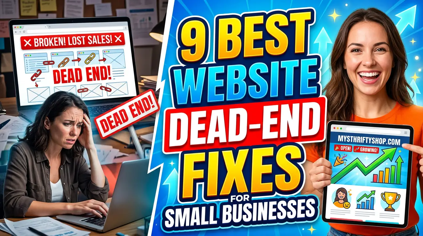
Here are 9 website dead-end fixes worth making before you spend more money driving people to the site.
1. Turn your 404 page into a recovery page
A default 404 page tells visitors they are in the wrong place. A useful 404 page helps them recover.
Start with plain language: “We could not find that page.” Then give people the next best options: your main service pages, contact page, search box, homepage, and one helpful sentence about what your company does. If you changed URLs during a redesign, include a short note that the page may have moved.
Google recommends custom 404 pages that match the rest of the site and include links to popular pages or the homepage, not blank error screens or technical messages. Google’s custom 404 guidance is simple, but many small business sites still skip it.
Example: a roofer with an old /storm-repair/ link should not dump visitors into a dead error page. The 404 should point them to roof repair, insurance claim help, emergency service, and the phone number.
2. Add next steps at the end of every blog post
Blog posts often rank, answer the question, then stop. That is polite, but it is not very useful for the business.
Every article should end with a relevant next step. Not a generic “contact us” button on every page. Match the CTA to the visitor’s intent. A post about website speed should offer a performance review. A post about Google Business Profile mistakes should point to local SEO help. A post about pricing should lead to a quote or consultation.
This matters because visitors decide quickly whether a page is useful. Nielsen Norman Group says users often leave web pages in 10 to 20 seconds unless the page gives them a clear reason to stay.
Example: an accountant writing about S-corp tax deadlines could end with “Want us to check your setup before filing season? Book a 20-minute review.” That is far stronger than leaving the reader at the bottom of the page with nowhere to go.
3. Fix form errors so people know exactly what happened
A form error should not make the visitor feel like they failed a test.
If a phone number, email, ZIP code, file upload, or required field is wrong, say exactly what needs to be fixed. Highlight the field. Keep the visitor’s previous answers. Do not clear the whole form. Add a fallback phone number or email address near the form for people who are stuck.
This is especially important for lead generation forms. Harvard Business Review found companies that contacted online leads within an hour were nearly seven times more likely to qualify the lead than companies that waited longer. That advantage disappears if the form never submits.
Example: a commercial HVAC company asking for building square footage should accept ranges like “20,000” or “about 20k” instead of rejecting anything that is not a perfect number. The goal is to start the conversation, not grade the prospect’s data entry.
4. Give no-results search pages a second chance
Site search visitors usually have intent. They typed what they wanted. A no-results page that says “0 results found” wastes that intent.
Build a better recovery path. Show spelling suggestions, related categories, popular pages, contact options, and a short line that says your team can help if the visitor cannot find the item or service. For ecommerce, show close substitutes or best sellers. For service businesses, show related services and FAQs.
Baymard’s ecommerce search research found that nearly 50% of sites fail to provide effective recovery options when a search yields no results. That is a fixable problem.
Example: if someone searches a landscaping site for “retaining wall repair” and the site has no exact page, the no-results page should suggest hardscaping, drainage, outdoor masonry, and a quote form. Do not make the visitor guess your internal service names.
5. Replace expired offers with current alternatives
Expired offers are trust killers. If your website promotes a spring sale in July, visitors wonder what else is outdated.
Do not delete every old promo page without a plan. If the URL has traffic or backlinks, update it with the current offer, a waitlist, or a related evergreen page. If the offer is truly gone, explain that clearly and send people to the closest next step.
This is common with local service campaigns. A pest control company may run “mosquito treatment special” in May, then forget the landing page exists. By August, paid search visitors or returning customers may still find it.
A better version says, “This offer has ended, but our seasonal treatment plans are open.” Then it links to the current plan and includes a phone number. The page stays honest, useful, and tied to revenue instead of becoming a dusty corner of the site.
6. Add choices when booking has no available times
A booking page with no appointments available is not the end of the sale. It is a capacity problem, and the website should handle it like one.
Give visitors options: join a cancellation list, request a manual callback, pick another location, book the next available date, or ask for emergency help if that applies. If your calendar is often full, explain the normal booking window so people know what to expect.
Example: a dental office showing no hygiene appointments this week can offer “Join the cancellation list” and “Request the next morning opening.” A home service company can offer an emergency number for urgent jobs and a standard quote form for everything else.
The worst version is a blank calendar that silently says no. The better version keeps the buyer moving, even when your schedule is tight.
7. Give out-of-stock pages a path to purchase
Out-of-stock pages should not strand shoppers. They should answer one question: what can I do now?
Add restock alerts, expected timing if you know it, substitute products, nearby inventory, preorder options, or a way to talk to sales. If the product is discontinued, say that plainly and recommend the closest replacement.
This matters because checkout and cart friction already cost ecommerce teams a lot. Baymard calculates the average cart abandonment rate at 70.22% across 50 studies. An out-of-stock page with no alternative adds another avoidable exit before shoppers even reach checkout.
Example: a parts supplier that runs out of a common gasket should show compatible part numbers, lead time, and a “notify me” button. A boutique retailer should show similar sizes, colors, or styles instead of a dead product page.
8. Make thank-you pages useful after the conversion
A thank-you page should confirm the action and set expectations. Too many small business sites waste it with one sentence: “Thanks, we will be in touch.”
Tell people what happens next. Include response time, who will contact them, what information to prepare, and one useful link. That link might be a case study, pricing guide, prep checklist, financing page, or FAQ.
Example: a remodeler can say, “We usually respond within one business day. Before the call, take a few photos of the space and think about your target timeline.” Then the page can link to a project planning checklist.
This reduces anxiety and improves lead quality. Sales does not have to repeat basic instructions, and prospects show up better prepared. The conversion is not the finish line. It is the handoff.
9. Add a primary CTA to pages that quietly get traffic
Some of your most valuable pages may not look like landing pages. About pages, case studies, FAQ pages, careers pages, comparison pages, and old blog posts can all pull qualified visitors.
Check analytics for pages with traffic but weak next steps. Add one clear CTA near the top, one in the body, and one near the end. Keep it specific. “Get a quote for your project” beats “Learn more.” “Schedule a website audit” beats “Submit.”
Example: a manufacturer may have a case study ranking for a niche product problem. If that page only tells the story and never offers engineering help, a buyer may leave impressed but unconverted. Add a CTA beside the result: “Need a similar part? Send us your drawing.”
This fix is boring. It also works because it connects existing demand to an action the business can follow up on.
Start with the dead ends closest to revenue
You do not need to fix every corner of the website this week. Start where people are already trying to buy, book, submit, search, or contact you.
Check your forms, booking pages, search results, 404 page, top blog posts, and top landing pages. Anywhere the visitor hits a wall, give them a practical next step.
If you want a second set of eyes on the pages where your site is leaking leads, get started with Your Web Team. We will help you find the dead ends and turn them into paths buyers can actually follow.