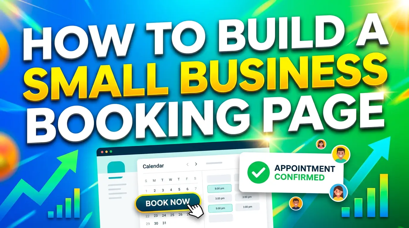
A lot of small-business websites say they want more leads, then make booking painfully awkward.
The visitor clicks “book now,” lands on a bare calendar, gets hit with a long form, has no idea what happens next, and leaves. That is not a traffic problem. That is a booking-page problem.
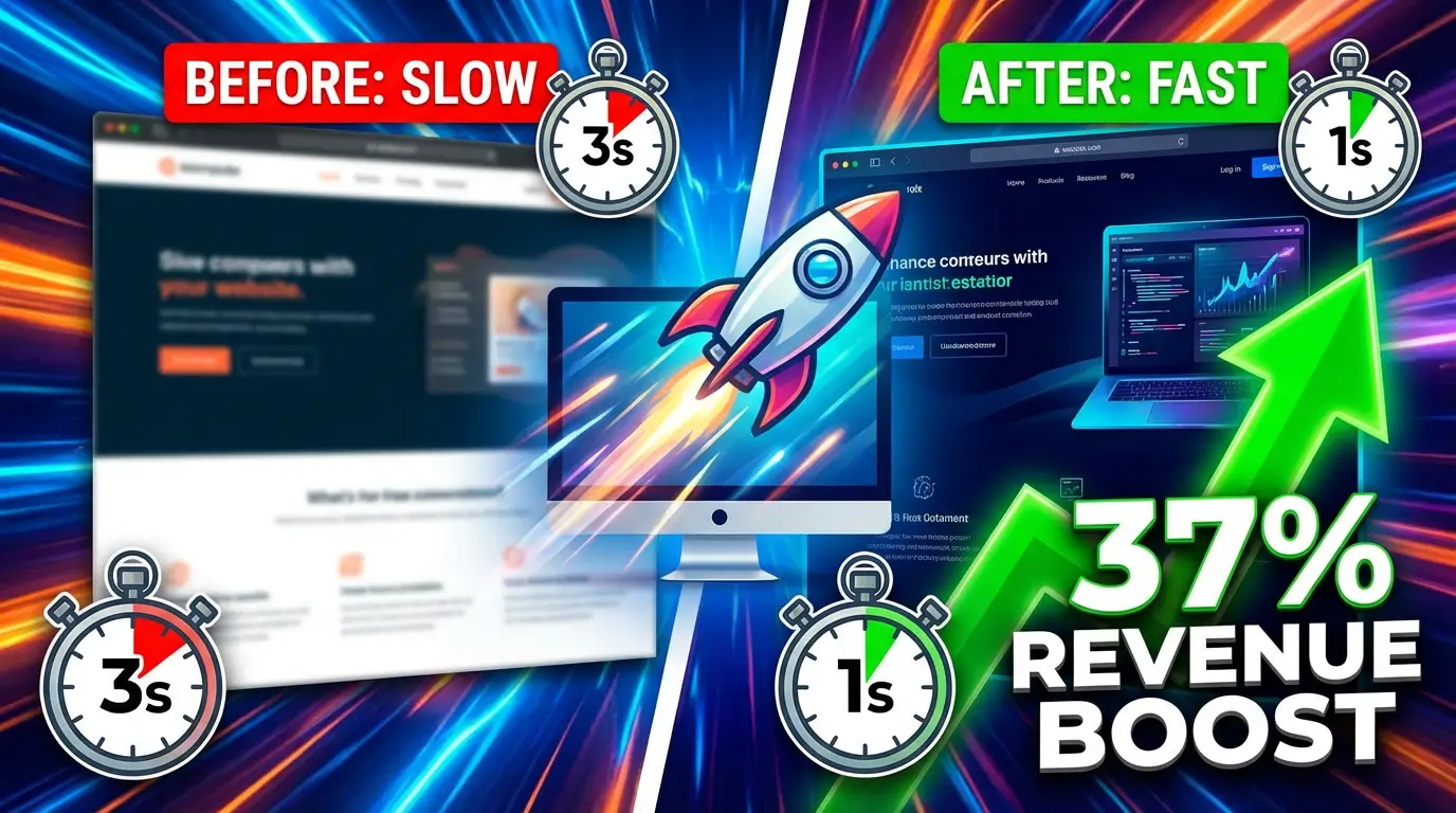
This matters more now because local businesses are getting more chances to win intent-rich traffic, but they still have to convert it. Webflow reported that local businesses using online booking systems alongside local SEO saw an average 37% revenue increase. On the other side, Webflow also found that only 23% of local service businesses had an online booking system in place, even though the same study says half of customers prefer to book online rather than by phone.
There is the gap.
If your business depends on consultations, estimates, demos, classes, salon visits, repair calls, or any other scheduled interaction, your booking page is not a side feature. It is a sales page with a calendar attached.
Here is how to build one that gets more appointments in 2026.
Start with the questions people ask before they book
Most booking pages fail because they jump straight to the calendar.
That sounds efficient, but it often creates hesitation. Lunacal’s 2026 scheduling benchmark found that the average scheduling page converts 15.1% of visitors into bookings, while the top 10% of pages convert 30% to 33%. The strongest pattern was not fancy software. It was lower decision friction, helped by useful page content, FAQs, and context around the meeting.
In plain English, people want to know what they are booking before they commit.
Your booking page should answer these five questions above the calendar, or at least next to it:
- What is this appointment for?
- Who is it for?
- How long does it take?
- What happens after I book?
- Is there any cost, prep, or obligation?
If you are a med spa, that might mean a short note explaining whether the booking is a consultation or treatment slot. If you run a home-service company, it might mean clarifying whether the visit includes diagnosis, estimate, or same-day work. If you are an agency, it might mean explaining whether the meeting is a strategy call, onboarding session, or project review.
Simple context reduces anxiety. It also cuts down on junk bookings.
Add enough trust signals to make the appointment feel real
Lunacal’s benchmark found that bookers consistently preferred pages that included details about the person or company, FAQs, files, videos, or a map when location mattered. That is useful because it mirrors how people actually make decisions. They are doing a quick risk check.
A strong booking page does not need to look crowded, but it should feel legitimate.
What usually helps:
- a short intro about the business or person they are meeting
- one or two testimonials near the booking area
- a photo of the office, team, or provider if the relationship is personal
- a map or address for in-person visits
- a brief FAQ that handles timing, pricing, cancellation, or next steps
If your page is just a calendar widget floating on a blank page, you are asking visitors to trust you without giving them a reason.
This is especially important for first-time customers. Someone searching “massage therapist near me,” “roof inspection estimate,” or “book a tax consultation” is often comparing multiple businesses fast. The one that feels clearest and safest usually wins.
Keep the form short, because long forms feel like work
This is where a lot of booking pages quietly lose appointments.
Lunacal found that scheduling forms with 3 to 5 fields had about 71% completion, while 6 to 8 fields dropped to about 62%. Baymard’s 2024 checkout research points in the same direction: the average checkout contains 11.3 form fields, but Baymard says most sites need only 8 fields in total, and that form-field load matters more than the number of steps.
Your booking flow is not ecommerce checkout, but the UX principle is the same. More fields create more friction.
Ask only for what you need to accept the appointment. Usually that means:
- name
- email or phone
- preferred service or meeting type
- one short message field, if needed
That is enough for most small businesses.
Do not ask for full addresses, budget ranges, referral details, file uploads, three dropdowns, and a 500-character project brief before someone can grab a time slot. If you need deeper qualification, collect it after the booking confirmation or in a follow-up email.
The page should feel easy. If it feels like homework, people delay. Delay kills bookings.
Show real availability and set expectations clearly
One of the biggest reasons people use booking pages is to avoid back-and-forth scheduling.
Lunacal found that 74% of organizers and 67% of bookers would rather use a scheduling page than phone calls or messages, and 62% of organizers said back-and-forth coordination was their top scheduling problem. HubSpot makes the same case from the sales side, describing scheduling software as a way to remove email ping-pong and reduce no-shows, and says Sales Hub customers using meeting scheduler saw 27% more deals closed.
That only works if your page shows accurate availability and explains the rules.
Your booking page should make these details obvious:
- available appointment windows
- how much notice is required
- whether people can reschedule easily
- what time zone the booking uses, if you serve remote clients
- whether the meeting is by phone, Zoom, or in person
Nothing is more annoying than booking a time and then getting an email saying, “Sorry, that slot is not actually open.”
If you use a tool like Calendly, HubSpot, Acuity, Cal.com, or another scheduler, sync it properly and test it like a customer. Click through from mobile. Book a real test appointment. Check the confirmation email. Make sure it feels clean.
Use the page to improve lead quality, not just volume
A booking page should not only get more appointments. It should get better appointments.
That is where many small businesses miss the point. They either overqualify too early with a giant form, or they underqualify and fill the calendar with bad-fit meetings.
The middle ground works best.
Lunacal’s report says a few booking questions can improve meeting quality, but long forms reduce completions fast, which is why their benchmark recommends keeping pre-booking questions light and moving deeper context gathering later in the process. That is the smart play for most local and service businesses.
For example:
A law firm might ask what type of case the prospect needs help with. A med spa might ask whether the appointment is for a consultation or repeat visit. A marketing agency might ask what service the business is interested in. A contractor might ask whether the customer needs an estimate, repair, or second opinion.
That one question helps route people correctly without creating drag.
If you need more detail, use the thank-you page or confirmation email to gather it. You can link to a short intake form, ask for photos, request a project address, or explain what to bring.
Do not send traffic to a booking page that feels disconnected from the rest of the site
A high-converting booking page should still feel like part of your brand.
This sounds obvious, but many businesses embed a third-party calendar on a page with no real headline, weak copy, different colors, and zero trust cues. The result feels bolted on.
That disconnect matters because booking is a high-intent action. By the time someone gets there, they are deciding whether you look credible enough to claim their time.
Your booking page should match the rest of your site in tone, design, and clarity. Use the same logo, the same brand colors, and the same plain-English messaging style. Keep navigation simple. Remove distractions if needed, but do not make the page feel isolated or sketchy.
If you are running local SEO, Google Business Profile, paid search, or social campaigns, create booking pages that match the source intent. Someone clicking from a “book a haircut” query should not land on a generic “contact us” page. Someone clicking from a “schedule a website consultation” ad should not have to hunt for the right meeting type.
Specific intent converts better than generic intent.
Reminders and confirmation are where show rates are won or lost
Getting the booking is only half the job.
Lunacal reports that the average show rate across scheduling pages is 77%, while the top 10% reach about 87% to 90%. Their benchmark also ties stronger attendance to reminder setup, especially email plus SMS when appropriate.
That tells you something important. A booking page is not finished when the form is submitted.
After someone books, they should get:
- an immediate confirmation
- a calendar invite
- a reminder before the appointment
- clear instructions for location, parking, call links, or prep
- an easy path to reschedule if needed
This is where small changes pay off. A salon can remind clients to arrive five minutes early. A contractor can remind homeowners to upload photos before the estimate. A consultant can send a short agenda so the call feels worth showing up for.
The easier you make the next step, the better your show rate gets.
What a good small-business booking page looks like in practice
If I were building one today for a service business, I would keep it simple:
Above the fold
A clear headline, one-sentence explanation, expected appointment length, and the booking widget.
Right below that
Two testimonials, one small FAQ section, and a short note about what happens after booking.
In the form
Only the fields needed to accept the appointment.
After booking
Confirmation page, calendar invite, reminder sequence, and a clear reschedule option.
That is not flashy. It is just usable.
And usable wins.
The bottom line
If your website depends on appointments, your booking page is one of the highest-value pages on the site.
A better booking page will not magically fix bad traffic or weak offers. But if good prospects are already reaching your site, it can help you convert more of them into real calendar spots, and help more of those people actually show up.
That means fewer missed opportunities, less admin chaos, and more revenue from the traffic you already worked hard to earn.
If you want help building a booking flow that fits your business, from page structure to tracking to follow-up automation, talk with us here.

Richard Kastl
Founder & Lead EngineerRichard Kastl has spent 14 years engineering websites that generate revenue. He combines expertise in web development, SEO, digital marketing, and conversion optimization to build sites that make the phone ring. His work has helped generate over $30M in pipeline for clients ranging from industrial manufacturers to SaaS companies.