The average landing page converts at 5.89% across all industries, according to HubSpot’s 2023 survey of 101 marketing professionals. But most small business landing pages? They’re sitting closer to 2-3%. Meanwhile, the top 10% of landing pages convert at 11.45% or higher, based on WordStream’s analysis of thousands of Google Ads accounts with $3 billion in combined annual spend.
That’s not a small gap. That’s the difference between 20 leads a month and 80.
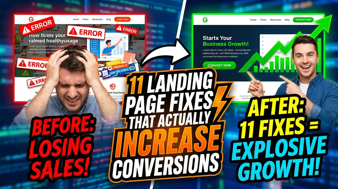
The good news: you don’t need a complete redesign to close it. Most landing pages fail because of a handful of fixable problems. Here are 11 of them.
1. Kill the Navigation Menu
Your landing page has one job: get someone to take action. A navigation menu gives them six other options. Every extra link is an escape route.
VWO ran tests across e-commerce and SaaS sites showing that removing navigation from landing pages increased conversions by 20-30% in most cases. The logic is simple. If someone clicks your ad and lands on a page with your main nav, they start browsing. They check your About page. They look at your blog. They leave without converting.
Strip the nav. Keep your logo (it builds trust), but don’t make it clickable. The only links on your landing page should point to your CTA.
2. Match Your Headline to the Ad or Email That Sent Them There
This is called “message match,” and most businesses get it wrong. Someone clicks an ad that says “Get a Free Website Audit” and lands on a page with the headline “Welcome to Our Digital Marketing Agency.” That disconnect kills trust immediately.
Unbounce has been preaching this for years, and their data backs it up. Pages with strong message match between ad copy and landing page headlines see conversion lifts of 30% or more. The fix takes five minutes. Read your ad. Read your headline. Make them say the same thing in the same language.
3. Cut Your Form Fields to Four or Fewer
HubSpot’s survey found that 30.7% of marketers say four form fields is the sweet spot for conversions. Omnisend’s research on e-commerce brands found that three fields hit a 10% conversion rate, with the best-performing combinations being email + name (7%) and email + birthdate (5.7%).
Look at your form right now. If you’re asking for a phone number, company size, job title, annual revenue, and favorite color, you’re filtering out most of your leads before they even start. Ask yourself what you actually need to follow up. Usually it’s name, email, and maybe one qualifying question. You can always gather more information later in the sales process.
4. Put Your CTA Above the Fold
“Above the fold” means visible without scrolling. It’s an old newspaper term, and it still matters online. Nielsen Norman Group research shows that users spend 57% of their viewing time above the fold and 74% in the first two screenfuls. Content below the fold gets dramatically less attention.
Your CTA button doesn’t have to be the only thing above the fold, but it needs to be there. If someone has to scroll past three paragraphs and a stock photo to find your “Get Started” button, you’ve already lost the impatient ones. And on the internet, most people are impatient.
5. Replace Stock Photos with Real Images
Speaking of stock photos. That image of a diverse group of professionals smiling around a conference table? Everyone has seen it. Everyone knows it’s fake. It adds nothing.
MDG Advertising found that 67% of online shoppers rate image quality as “very important” when making a purchase decision. Real photos of your team, your office, your actual product, or your actual customers outperform stock every time. If you sell a service, show a screenshot of your dashboard. Show your team at work. Show before-and-after results. Authenticity converts; stock doesn’t.
6. Add Video (But Keep It Under 90 Seconds)
HubSpot’s survey found that 38.6% of marketers say video is the number one element that impacts landing page conversions. Wistia’s engagement data consistently shows that videos under two minutes get the most engagement, with a sharp drop-off after that mark.
A short video that explains your offer, shows a customer testimonial, or walks through your product can replace paragraphs of text. People would rather watch than read, especially on mobile. But don’t autoplay with sound. That’s a guaranteed bounce. Let visitors choose to press play.
7. Use Specific Numbers Instead of Vague Claims
“We help businesses grow” means nothing. “We helped 347 businesses increase leads by an average of 41% in 2025” means something.
Specificity builds trust because it implies measurement. If you can say “our average client sees results in 14 days,” that’s far more convincing than “fast results.” If you’ve served 1,200 customers, say 1,200, not “thousands.” CXL Institute research on trust signals shows that specific numbers consistently outperform round numbers and vague language in conversion tests. The reason is psychological: precision signals confidence and honesty.
8. Add Social Proof Near the CTA
Most businesses put testimonials at the bottom of the page. That’s where nobody looks. Put them right next to your CTA button or form.
BrightLocal’s annual consumer review survey has consistently shown that the vast majority of consumers trust online reviews as much as personal recommendations. On your landing page, social proof should do the heavy lifting right when someone is deciding whether to fill out your form. A short quote from a real customer, with their name and company, placed directly beside your form, can be the nudge that tips someone from “maybe” to “yes.”
Don’t have testimonials yet? Use client logos, review counts, or even a simple “Join 500+ businesses” line. Something is always better than nothing.
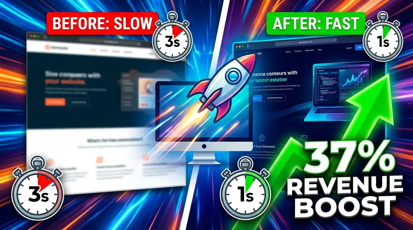
9. Speed Up Your Page Load Time
Google’s own research found that as page load time goes from one second to three seconds, the probability of bounce increases by 32%. At five seconds, the probability jumps to 90%. Your landing page could have the best copy, the best design, and the best offer in the world. None of it matters if the page takes four seconds to load.
Run your landing page through Google PageSpeed Insights. Common fixes include compressing images (most landing pages serve images five times larger than they need to be), enabling browser caching, and removing unnecessary scripts. If you’re running a WordPress landing page with 15 plugins loaded, that’s your problem right there.
10. Write a CTA That Says What Happens Next
“Submit” is the worst CTA button text in existence. It tells the user nothing about what they’re getting. Compare these:
- “Submit” vs. “Get My Free Audit”
- “Sign Up” vs. “Start My 14-Day Trial”
- “Learn More” vs. “See Pricing Plans”
Unbounce tested thousands of landing pages and found that personalized CTA copy (using “my” instead of “your”) tends to outperform generic alternatives. The button should complete the sentence “I want to…” so that clicking it feels like getting something, not giving something up.
Also, make the button big, make it a contrasting color, and don’t surround it with other clickable elements. It should be the most obvious thing on the page.
11. Test One Thing at a Time (And Actually Do It)
Here’s the honest part. All of the fixes above are generalizations. What works for a SaaS company might not work for a plumber. What converts in B2B might flop in e-commerce. The only way to know what works for your specific audience is to test.
But most small businesses never test anything. They build a landing page, launch it, and forget about it. Or worse, they change five things at once and have no idea which change made the difference.
Pick one fix from this list. Implement it. Run it for two to four weeks with enough traffic to get meaningful data. Then try the next one. Google Optimize was the go-to free tool for this, but since its shutdown, tools like VWO, Optimizely, and Convert offer affordable alternatives for A/B testing. WordStream’s analysis of billions in ad spend found that incremental, data-driven changes are what separate the top 10% of landing pages from everyone else.
What This Adds Up To
You don’t need all 11 fixes. Start with the ones that feel most relevant to your current situation. If your form has eight fields, start there. If your page takes five seconds to load, fix that first. If your headline doesn’t match your ad, that’s a 10-minute fix with outsized impact.
The difference between a 3% conversion rate and a 10% conversion rate isn’t magic. It’s attention to the details that most businesses skip because they’re too busy building the next campaign instead of fixing the one that’s already running.
If your landing pages aren’t converting the way they should, we can help you figure out why. We’ll audit your current pages, identify the biggest opportunities, and build landing pages that actually turn visitors into leads.

Richard Kastl
Founder & Lead EngineerRichard Kastl has spent 14 years engineering websites that generate revenue. He combines expertise in web development, SEO, digital marketing, and conversion optimization to build sites that make the phone ring. His work has helped generate over $30M in pipeline for clients ranging from industrial manufacturers to SaaS companies.