You’re spending money on ads, writing blog posts, maybe even running email campaigns. Traffic is showing up. People are clicking around. And then they hit your contact form… and leave.
According to Zuko’s 2025 conversion benchmarking data, contact forms have the lowest conversion rate of any form type on the web. Only 38% of people who start filling one out actually submit it. The view-to-completion rate? A brutal 9%.
That means for every 100 visitors who see your contact form, 91 of them walk away.
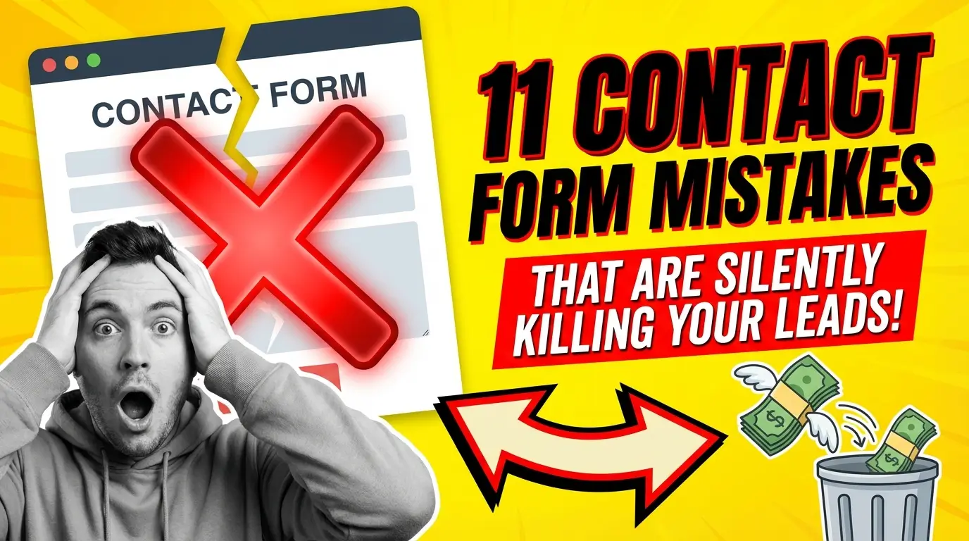
Your contact form is probably the most important page element on your entire site, and most businesses treat it like an afterthought. Here are 11 mistakes that might be costing you leads right now.
You’re Asking for Too Much Too Soon
The classic blunder. You want to know their name, email, phone number, company name, company size, annual revenue, project timeline, budget range, and how they heard about you. All before you’ve even said hello.
Fluent Forms’ 2026 analysis of online form statistics found that 74% of businesses use web forms for lead generation, but completion rates drop sharply as field count climbs. Research from Venture Harbour showed that the old design guideline of sticking to five fields or fewer still holds as a reasonable starting point.
But here’s the nuance: it’s not just about the number of fields. Conversion optimizer Michael Aagaard ran a test where removing fields actually decreased conversions by 14%. Why? He’d removed the fields people wanted to interact with and left only the ones they didn’t. Context matters. A request for a home valuation needs more fields than a newsletter signup. Think about what’s reasonable given what you’re offering.
Start with name, email, and one open-ended question like “How can we help?” You can always qualify later.
Your Form is Buried at the Bottom of the Page
If someone has to scroll through 2,000 words of “about us” copy before they find a way to contact you, you’ve already lost the impatient ones. And in 2026, most of them are impatient.
Zuko’s data shows that only 45% of people who view a page with a form on it even start filling it out. That gap between viewing and starting is where visibility kills you. If they can’t find the form without effort, they won’t look for it.
Put a clear call-to-action and either a short form or a link to your form above the fold. Keep the detailed content for those who want it, but don’t make everyone wade through it.
Your Submit Button Says “Submit”
“Submit” is the most boring, least motivating word you could put on a button. It tells the visitor nothing about what happens next. Will they get a quote? A callback? A download?
HubSpot’s research on conversion elements has consistently shown that specific, value-oriented button copy outperforms generic labels. “Get My Free Quote” beats “Submit.” “Book My Consultation” beats “Send.” Even “Let’s Talk” is better because it at least suggests a two-way conversation.
The button is the last thing someone reads before deciding to commit. Make it count.
You Don’t Have a Thank-You Page (or Confirmation)
Someone fills out your form, hits the button, and… nothing. Maybe the page refreshes. Maybe there’s a tiny green text that says “Message sent” that they’re not even sure they saw.
This is terrible for two reasons. First, people genuinely don’t know if their submission went through. They might fill it out again, or worse, give up and try your competitor. Second, you’re wasting a prime engagement opportunity.
A dedicated thank-you page can set expectations (“We’ll reply within 24 hours”), offer additional resources, suggest they follow you on social media, or even present a secondary conversion. At minimum, give people a clear, obvious confirmation that yes, it worked, and here’s what happens next.
Your Form Doesn’t Work on Mobile
Zuko’s benchmarking data shows desktop users convert at 55.5% on forms while mobile users convert at only 47.5%. That’s already a gap, and a poorly optimized mobile form makes it much wider.
Tiny input fields, dropdowns that don’t respond to touch properly, keyboards that don’t switch to the right type (showing a full keyboard instead of a number pad for phone fields), text that’s too small to read. These are all common issues.
Test your form on an actual phone. Not just in Chrome’s device emulator, but on a real iPhone and Android device. Tap through every field. Try to complete it with one thumb. If it’s annoying, fix it.
You’re Using a CAPTCHA That Punishes Real People
CAPTCHAs exist for a good reason. Spam bots are real, and nobody wants 500 fake submissions a day. But some CAPTCHA implementations are so aggressive that they punish the actual humans you’re trying to reach.
The Manifest’s survey data found that 81% of people have abandoned at least one online form, and complications during the process are a major driver. Being asked to identify traffic lights across 12 blurry images definitely counts as a complication.
Modern alternatives exist. Google’s reCAPTCHA v3 runs invisibly in the background and scores users based on behavior rather than making them prove they’re human. Honeypot fields (invisible fields that only bots fill out) catch most automated spam without the user ever knowing. Cloudflare Turnstile is another solid option that runs non-intrusive challenges.
Your Form Has No Privacy Reassurance
People are more cautious about handing over personal information than they were five years ago. GDPR, data breaches in the news, endless spam calls. If your form asks for a phone number with zero explanation of what you’ll do with it, some percentage of visitors will bounce.
You don’t need a full legal disclaimer next to your form. A simple line like “We’ll only use this to respond to your inquiry. No spam, ever.” goes a long way. Edge Digital’s research on form optimization specifically recommends including clear privacy messaging near contact fields to reassure users.
If you do require a phone number, explain why. “We find a quick 10-minute call is the fastest way to give you an accurate quote” is a reason. Asking for a phone number with no context is just creepy.
Your Error Messages Are Useless
Nothing is more frustrating than filling out a form, clicking send, and seeing a red banner that says “Please correct the errors below” with no indication of what the errors actually are. Or worse, the form clears everything you typed and makes you start over.
Good error handling is specific and immediate. If an email address is missing the @ symbol, say so next to the field as soon as they move to the next one. If a phone number needs a specific format, show that format as placeholder text. If a required field is empty, highlight it clearly with a message that names the field.
Fluent Forms’ analysis notes that 67% of site visitors who encounter complications in a form will abandon it permanently. Bad error messages are one of the most common complications, and one of the easiest to fix.
You’re Not Following Up Fast Enough
This isn’t a form design problem, but it might as well be. A form that delivers leads into a black hole is functionally broken.
Monday.com’s 2026 guide on lead generation forms emphasizes that the speed of your first response directly affects whether that lead converts. The data across the industry is clear: responding within the first hour dramatically increases your chances compared to waiting a day.
Set up email notifications so you know the second a form comes in. Better yet, set up an auto-response that goes out immediately with useful information. “Thanks for reaching out. Here’s a link to our pricing guide while you wait. We’ll personally follow up within 4 business hours.”
If your contact form submissions sit in a Gmail inbox that someone checks once a day, you’re losing deals.
Your Form Looks Like It’s From 2015
Design credibility matters. If your form uses default browser styling, grey boxes with sharp corners, tiny 10px fonts, and a layout that screams “I was built with basic HTML,” visitors are going to question whether your business is legit.
Your form should match the design quality of the rest of your site. Clean typography, proper spacing, labels that are clearly associated with their fields, and a layout that doesn’t feel cramped or overwhelming. Eleken’s analysis of high-converting contact form designs highlights that elements like social proof (testimonials or client logos near the form) and clean, modular layouts significantly improve trust at the point of contact.
A well-designed form signals professionalism. A sloppy one signals the opposite. First impressions don’t just apply to your homepage.
You Only Have One Way to Get in Touch
Some people hate forms. They want to pick up the phone. Others want to send an email directly. Some prefer live chat. A few will DM you on social media.
If your only contact option is a single form on a single page, you’re forcing every potential customer through one funnel. That works for some, but it alienates others. At minimum, display a phone number and email address alongside your form. If you can offer live chat during business hours, even better.
The goal is to remove barriers between potential customers and conversations. Every barrier you put up is a filter, and some of the leads you’re filtering out are the good ones.
What to Do Next
Pick the easiest fix on this list and do it today. For most businesses, that’s updating button copy, adding a privacy line, or setting up instant notifications. These aren’t massive redesign projects. They’re small changes that directly affect whether people actually reach out or quietly close the tab.
If you want help auditing your forms and turning your website into something that actually generates leads, get in touch with our team. We’ll take a look and tell you exactly what’s leaking.

Richard Kastl
Founder & Lead EngineerRichard Kastl has spent 14 years engineering websites that generate revenue. He combines expertise in web development, SEO, digital marketing, and conversion optimization to build sites that make the phone ring. His work has helped generate over $30M in pipeline for clients ranging from industrial manufacturers to SaaS companies.