A newsletter signup form should not feel like a begging cup at the bottom of your website.
If someone is reading your service page, pricing page, blog post, or product guide, they are already giving you attention. The signup offer has to give them a clear reason to stay connected. That matters because email is still one of the few channels where you own the relationship. Litmus reports that email returns an average of $36 for every $1 spent, but that return does not come from random footer forms that say “Join our newsletter.”
The better play is simple. Match the signup to what the visitor is doing right now.
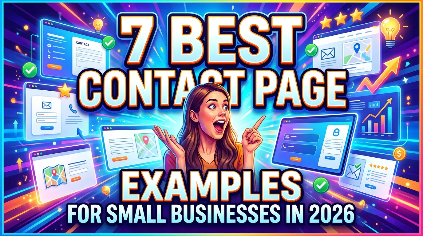
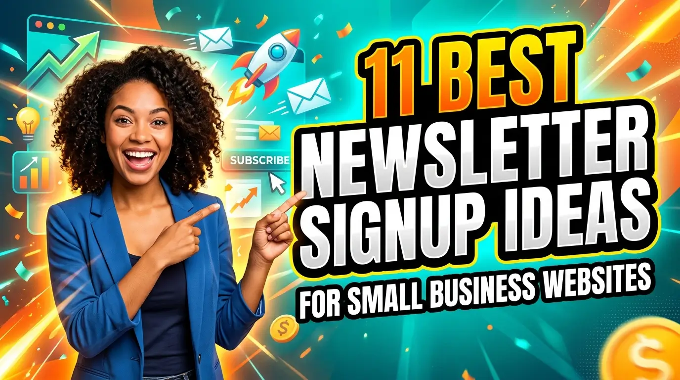
Here are 11 newsletter signup ideas small business owners and marketers can use to turn more website visitors into subscribers without making the site feel pushy.
1. Put a plain-English signup in the website footer
The footer is not flashy, but it works because it is available everywhere. A visitor who reaches the bottom of a service page, blog post, or about page has already shown some interest. Give them a low-pressure way to keep hearing from you.
The key is to make the promise specific. “Get one practical marketing tip every Tuesday” is stronger than “Subscribe.” A local HVAC company might write, “Get seasonal maintenance reminders before peak heating and cooling months.” A business attorney could use, “Get plain-English legal updates for small business owners.”
This is also the safest place to start because it does not interrupt anyone. Tools like Mailchimp and Klaviyo make footer forms easy to embed, but the tool is not the win. The message is.
2. Add an end-of-post signup that matches the article topic
Blog readers are more likely to subscribe when the form connects to the article they just read. If someone finishes a post about local SEO, do not show them a generic newsletter pitch. Offer more local marketing advice.
For example, a med spa blog post about Google reviews could end with, “Want the monthly local visibility checklist we use for service businesses? Get it here.” A B2B consultant writing about sales follow-up could offer weekly teardown-style advice on better follow-up emails.
This is basic context matching, and it keeps the signup from feeling bolted on. Mailchimp’s email benchmark guidance also points out that segmenting audiences by preferences or behavior helps businesses send more relevant content. The signup location gives you that signal before you ever send the first email.
3. Use a short embedded form on high-intent service pages
A visitor on a service page may not be ready to book a call today. That does not mean they are a bad lead. They may be comparing options, waiting on budget, or trying to understand what they need.
Add a small newsletter block halfway down the page or near the FAQ section. Keep it useful and tied to the service. A web design page could say, “Not ready to redesign yet? Get one website improvement idea each week.” A payroll company could offer, “Get payroll deadline reminders and small business compliance tips.”
This works because it gives cautious buyers a next step that is less intense than a sales call. It also protects your pipeline. If a buyer is not ready now, you are not depending on them to remember your name three months later. If your broader contact forms have the same problem, use this website lead capture audit checklist to find the friction points.
4. Create a preference-based signup with two or three choices
Not every subscriber wants the same thing. A restaurant owner, ecommerce founder, and home service contractor may all visit the same marketing website, but they care about different examples.
A preference-based signup asks one simple question after the email field, such as “What do you want help with?” Good answer choices might be more website leads, local SEO, email marketing, or website maintenance. Do not overbuild it. Two or three useful segments beat twelve choices nobody understands.
This gives your email list cleaner data from day one. Mailchimp’s segmentation guidance recommends using preferences and past interactions to send more relevant campaigns. A small business does not need enterprise software to do that. It just needs one useful field and the discipline to send different content when the answers are different.
5. Offer a first-order or first-project update for ecommerce and service businesses
Some visitors subscribe because they want a deal. Others subscribe because they want to know when something useful is available. Both are valid, but they need different wording.
An ecommerce store can use, “Get early access to restocks and new arrivals.” A custom cabinet shop might use, “Get project planning tips and material updates before your remodel.” A photographer could offer seasonal booking reminders before graduation, wedding, or holiday slots fill up.
This is not just about discounts. Discount-only subscribers can be expensive if they never buy without a coupon. A better signup gives people a reason to hear from you because timing matters. That can mean launches, appointment windows, seasonal reminders, availability, or useful planning advice.
6. Add a checkout or booking confirmation opt-in
The best time to ask for a subscription is often right after someone has taken action. They just booked, bought, requested a quote, or registered. You have earned more trust than you had five minutes earlier.
Use a checkbox or small signup block on the confirmation page. A salon could invite customers to get style care tips and cancellation-slot alerts. A landscaper could send seasonal yard reminders. A boutique ecommerce brand could offer product care guidance and early access to limited drops.
Keep consent clear. Do not hide the signup inside transaction language. If you use Shopify Email, Squarespace Email Campaigns, or another platform, make sure the opt-in language says what customers are agreeing to receive.
7. Use an exit-intent popup only when it adds value
Popups can work, but bad popups make small business websites feel desperate. The difference is timing and relevance.
An exit-intent popup should appear when someone is leaving, not three seconds after they land. The message should also match the page. On a pricing page, offer buying advice or a project planning email series. On a product category page, offer restock alerts or care tips. On a blog post, offer more of the same topic.
Baymard increased newsletter signups by 274% in an early test by changing the signup approach, which is a good reminder that small wording and placement changes can matter. Still, test popups carefully. If mobile users are fighting the close button, you are trading trust for email addresses.
8. Turn your about page into a relationship builder
The about page gets traffic from people who want to know if you are real. That is a strong moment for a newsletter signup.
A local accounting firm could add, “Want monthly reminders before tax deadlines sneak up?” A contractor could say, “Get practical home improvement planning notes from our team.” A consultant could offer, “Get the same growth notes we send to clients each month.”
This placement works because it fits the visitor’s mindset. They are not just comparing features. They are deciding whether they like you, trust you, and want to hear more from you. Put the signup near a founder note, team section, or story block instead of burying it below legal links.
9. Add a small signup inside your resource library
If your website has guides, calculators, FAQs, case studies, or templates, your resource library is a natural place to ask for subscribers. The visitor is already in learning mode.
Use a signup that promises future resources, not generic company news. A managed IT provider could write, “Get new cybersecurity checklists for small teams.” A commercial cleaning company could offer, “Get facility maintenance reminders by season.” A web design agency could use, “Get practical website fixes you can hand to your developer.”
This also helps you identify content demand. If resource-library subscribers mostly choose SEO topics, that tells your marketing team where to publish next. Do not make the form complicated. Email plus one topic preference is enough.
10. Use social proof beside the signup form
People are more likely to subscribe when they can see that the email is actually useful. Add a small proof point beside the form.
That proof can be a testimonial, subscriber count, recognizable customer category, or sample subject line. For example: “Read by 1,200 local business owners” works if it is true. So does, “Recent issue: 5 fixes that helped a roofing company get more quote requests.” If you do not have a big list yet, use proof of usefulness instead of pretending you do.
This is especially helpful for service businesses where trust drives the sale. A newsletter is not just a marketing channel. It is a repeated trust touchpoint. Show prospects what kind of value they will get before asking for the email.
11. Test the button copy, not just the form design
Many newsletter forms fail because the button says “Submit.” That word is accurate, but it is not motivating.
Use button copy that repeats the benefit. Try “Send me the tips,” “Get the weekly checklist,” “Send the local SEO notes,” or “Get the next issue.” The button should answer the subscriber’s quiet question: what happens when I click?
Form testing does not have to be complicated. HubSpot’s form optimization guidance notes that button wording and form experience affect conversion behavior across a large set of customer landing pages. Small businesses can run the same basic test with Google Analytics, Microsoft Clarity, or their email platform’s form reporting.
Make the signup worth the inbox space
A better newsletter form will not fix boring emails. Before you chase more subscribers, decide what you can send consistently that a real customer would want.
For most small businesses, the winning formula is simple: useful timing, specific advice, clear examples, and no filler. Put the signup where the visitor already has intent, tell them exactly what they will get, and make the next email prove they made a good decision.
If your website gets traffic but does not turn enough of it into leads or subscribers, Your Web Team can help rebuild the path from visitor to customer.