A $49-per-month accessibility widget is tempting when you’re running a small business website.
You install a script. A little icon appears in the corner. The sales page says the tool uses AI to make your site compliant. You feel like the problem is handled.
That is exactly where a lot of businesses get burned.
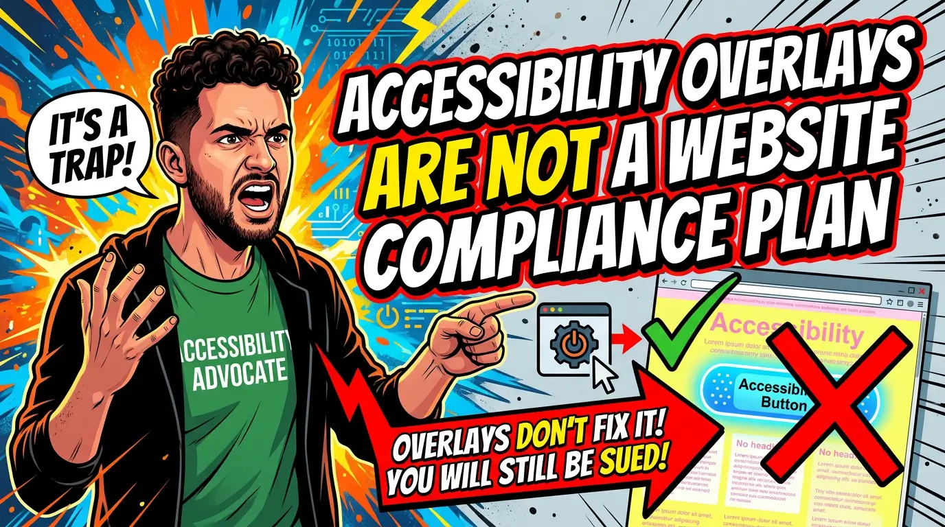
Accessibility overlays, widgets, and one-click compliance tools can help with a few surface-level adjustments, but they do not fix the underlying website. They cannot reliably repair bad form labels, broken keyboard navigation, confusing page structure, inaccessible PDFs, poor checkout flows, or custom components that were never built to work with assistive technology.
The risk is not theoretical. The Federal Trade Commission approved a final order requiring accessiBe to pay $1 million over claims that its AI-powered accessWidget could make websites WCAG compliant. UsableNet’s 2026 lawsuit trend analysis says more than 5,000 digital accessibility lawsuits were filed in 2025, and it specifically notes that widgets did not materially reduce lawsuit risk.
If your site brings in leads, sells products, books appointments, or handles customer support, accessibility needs to be part of the actual build, not a sticker on top of it.
What an accessibility overlay actually does
An accessibility overlay is usually a JavaScript tool that sits on top of your website. Visitors click an icon and get options such as larger text, contrast changes, pausing animations, screen reader adjustments, keyboard navigation helpers, or simplified page views.
Some tools also scan the page and attempt automatic fixes. They might add missing image descriptions, adjust ARIA attributes, change colors, or create alternate navigation.
That sounds useful. Sometimes it is, in a limited way.
But the overlay is not your website. It is a third-party layer trying to interpret your website after the fact. If the underlying code is messy, if the form is built wrong, if the menu cannot be used with a keyboard, or if the checkout flow has inaccessible error messages, the overlay is guessing.
That is the core problem. Accessibility is not only about how a page looks. It is about whether the page works predictably for people using keyboards, screen readers, voice control, magnification, switch devices, and other assistive tools.
A widget cannot know your business process. It cannot rewrite your checkout logic. It cannot make your staff upload better PDFs next month. It cannot guarantee that the next plugin update will not break something.
Why this matters more in 2026
The web is getting more complex, and complexity is where accessibility problems multiply.
WebAIM’s 2026 Million report found 56,114,377 distinct accessibility errors across the top one million home pages, an average of 56.1 errors per page. That was a 10.1% increase from 2025. WebAIM also found 95.9% of home pages had detectable WCAG failures.
The most common issues are basic, not exotic. WebAIM reported low-contrast text on 83.9% of home pages, missing alt text on 53.1%, missing form input labels on 51%, empty links on 46.3%, and empty buttons on 30.6%.
Those are not problems you solve with a compliance badge. They are build quality problems.
For a small business, the practical cost shows up in plain places:
- A customer cannot read light gray text on a phone outside.
- A screen reader user cannot tell what your contact form fields mean.
- A keyboard user gets trapped in a navigation menu.
- A shopper cannot hear an error message because it only appears visually.
- A patient, client, or customer cannot download or understand a PDF they need.
That is lost revenue, not just legal exposure.
The legal risk is not only for giant companies
Some owners assume accessibility lawsuits are a big-retailer problem. The data is more uncomfortable than that.
UsableNet’s 2026 analysis says e-commerce accounted for nearly 70% of ADA web lawsuits in 2025. Food and service businesses made up roughly 21%. Those are normal businesses with normal websites: stores, restaurants, appointment-based companies, service providers, and online ordering systems.
The same report found 1,427 lawsuits in 2025 targeted companies that had already faced an ADA web accessibility claim. That matters because a quick settlement followed by partial cleanup does not end the issue. If the site remains hard to use, it can stay exposed.
Widgets are not a shield here. UsableNet says lawsuits increasingly referenced accessibility widgets while still alleging unresolved code-level barriers, and that monthly filing data showed no meaningful reduction in lawsuits against widget users.
I am not a lawyer, and this is not legal advice. But as a website strategy issue, the direction is clear. If your business depends on the website, treat accessibility as maintenance and quality control, not as a checkbox.
What overlays miss on real small business sites
Most small business accessibility problems live inside everyday website components.
Forms
Lead forms are one of the biggest trouble spots. A contact form may look fine to a sighted mouse user, but still fail because the inputs do not have programmatic labels, the required fields are not announced properly, or the error messages are only shown in red text.
WebAIM found missing form input labels on 51% of home pages in its 2026 sample. That is not a minor issue if your form is how prospects ask for estimates.
A widget might try to infer labels from placeholder text. That is not the same as building the form correctly.
Menus and navigation
A menu should work without a mouse. Visitors should be able to tab through links in a logical order, open and close dropdowns, see where focus is, and avoid getting trapped.
Overlays can add helpers, but they cannot always repair a custom menu built with poor focus handling. If your mobile menu, booking widget, or product filter does not work from the keyboard, the source code needs attention.
Contrast and design decisions
Low contrast was the most common issue in WebAIM’s 2026 report, showing up on 83.9% of home pages. That is often a brand and design problem, not a technology problem.
Thin gray text on a white background may look modern in a mockup. It may also be difficult for older customers, people with low vision, or anyone using a phone in bad lighting.
A contrast toggle is not a substitute for readable default design.
PDFs, menus, and downloadable documents
Restaurants, contractors, medical offices, schools, and service businesses often rely on PDFs. Menus, intake forms, price sheets, brochures, care instructions, spec sheets, and applications all count.
An overlay on your website does not automatically fix the PDF. If the document lacks structure, tags, readable text, proper reading order, and descriptive links, it may still block users.
Third-party tools
Scheduling tools, payment processors, chat widgets, review widgets, map embeds, CRMs, calculators, and popups can all introduce barriers.
The hard part is ownership. Your team may not control every line of code, but your customers still experience the whole page. An overlay cannot guarantee that each third-party tool works for every assistive setup.
What to do instead of relying on a widget
You do not need to rebuild everything this week. You need a practical accessibility plan that fixes the things customers actually use.
Start with the revenue path. For most small businesses, that means the home page, service pages, contact page, quote form, booking flow, checkout flow, location pages, and any PDFs customers need before buying.
Then work through the basics:
- Use readable contrast for body text, buttons, navigation, and form labels.
- Add useful alt text to meaningful images, and leave decorative images empty when appropriate.
- Make every form field use a real label, not only placeholder text.
- Ensure error messages are specific and announced in a way assistive technology can detect.
- Test menus, forms, popups, filters, and checkout flows with only a keyboard.
- Use proper heading order so pages make sense when skimmed by structure.
- Write descriptive button and link text instead of vague labels like “click here” or “learn more” everywhere.
- Replace inaccessible PDFs with accessible HTML pages when possible.
- Test with automated tools and at least some manual review.
That list is not glamorous. Good. Accessibility work is mostly craft, discipline, and QA.
Automated scanners are still useful. WebAIM notes that WAVE detects barriers with a high likelihood of WCAG failures, while also warning that not all conformance failures can be automatically detected and the absence of detected errors does not mean a page is accessible. Use tools to catch repeatable problems, then verify important workflows manually.
When an overlay can still be part of the stack
This is not an argument that every accessibility tool is useless.
Some tools can help users customize the experience. Some can help your team find issues faster. Some vendors pair automation with human testing, developer support, monitoring, and remediation guidance. That is different from pretending a widget alone makes your site compliant.
If you keep an overlay, be honest about its role. It is an assistive option, not the compliance plan.
Ask vendors direct questions:
- What does the tool fix automatically, and what does it not fix?
- Do you provide manual audits by qualified accessibility testers?
- Do you test keyboard, screen reader, mobile, and checkout or form workflows?
- Will you help our developer fix source code issues?
- What evidence do you provide after remediation?
- Do your marketing claims match what the FTC has said about unsupported compliance promises?
The FTC accessiBe order is a useful warning because it bars claims that automated products can make any website WCAG compliant unless there is evidence to support those claims, and it also addresses misleading reviews and endorsements tied to the product’s marketing.
If a vendor promises instant ADA compliance for every site, be skeptical.
A small business accessibility plan that actually works
Here is a realistic 30-day plan.
Week 1: audit the paths that make money. Test the home page, top service pages, contact form, booking or checkout flow, and most-used PDFs. Use an automated scanner, but also tab through the site manually. If you cannot complete the main task without a mouse, log it.
Week 2: fix the obvious blockers. Start with contrast, missing labels, empty buttons, empty links, broken focus states, vague link text, and form errors. These issues are common, visible, and usually cheaper to fix than redesigning the whole site.
Week 3: review third-party tools. Check scheduling, payment, chat, map, review, and popup tools. If a tool blocks users or cannot be configured accessibly, replace it or remove it from critical pages.
Week 4: create a maintenance routine. Add accessibility checks to every site update. New pages, new forms, new plugins, new PDFs, and new campaigns should not ship without basic QA.
That is the part most businesses miss. Accessibility is not one project. It is a standard you keep.
The business case is simple
A usable website is easier to buy from, easier to trust, easier to maintain, and less likely to create expensive surprises.
You do not need to panic. You also should not hide behind a widget and hope for the best.
Fix the source. Test the real customer path. Keep records of what you changed. Make accessibility part of how your site is built and maintained.
If you want help auditing the pages that bring in leads and fixing the issues that matter first, start here: talk to Your Web Team about your website.