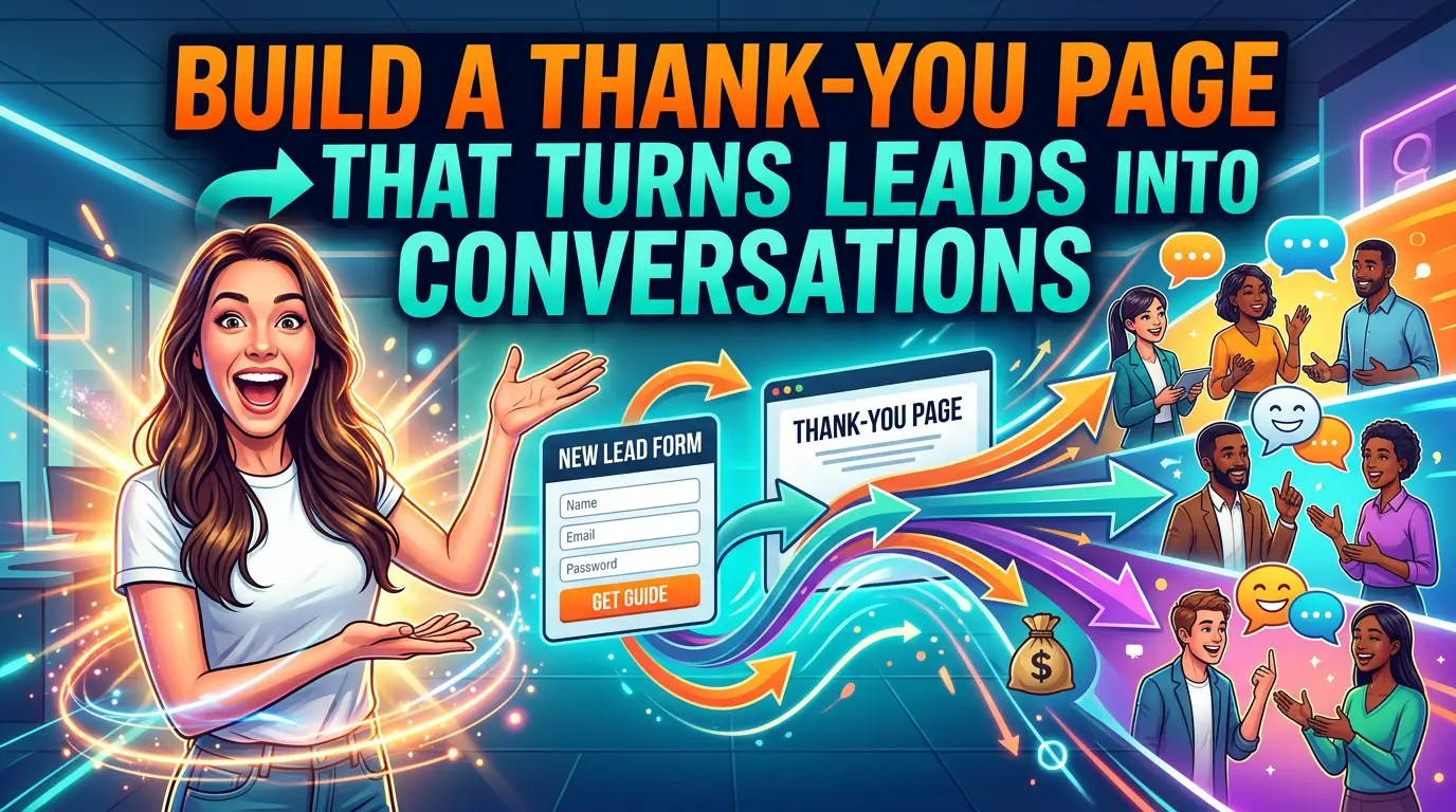
Most small business thank-you pages waste a high-intent moment.
Someone just filled out your form, booked a call, downloaded a guide, or asked for a quote. They raised their hand. Then the next page says little more than “Thanks, we got it.”
That is a mistake.
HubSpot describes the thank-you page as both the last step in the conversion process and the first step in retention, and it points out that the page is a natural place to make the next step obvious, immediate, and valuable (HubSpot). If you are paying for traffic, working for SEO traffic, or trying to get more from the leads you already generate, this page deserves more attention than it usually gets.
This matters even more in 2026 because buyers do not stop researching after they submit a form. TrustRadius found that 72% of B2B tech buyers encounter Google AI Overviews during research, and 90% click through cited sources to fact-check what they read (TrustRadius). In plain English, people still want proof. Your thank-you page can help provide it while interest is still high.
Here is a practical way to build a thank-you page that does more than confirm a submission.
What most thank-you pages get wrong
Most weak thank-you pages fail in one of three ways.
They stop at confirmation. They create uncertainty about what happens next. Or they throw too many choices at the visitor and break momentum.
A better page does not need to be fancy. It needs to answer the questions a real prospect has right after converting:
- Did my form actually go through?
- What happens next, and how long will it take?
- Why should I keep trusting this business?
- What should I do while I wait?
If your page answers those four questions well, you are already ahead of a lot of small business websites.
1. Start with a clear confirmation
HubSpot recommends treating the thank-you page as a true continuation of the conversion path, not just a receipt page, and its examples consistently lead with a clear confirmation that the visitor completed the intended action (HubSpot). That sounds basic, but a lot of sites still bury the confirmation under branding, stock photos, or a generic headline.
Your first screen should confirm the exact action the person just took.
Good example: “Thanks, your quote request is in. Our team will review it and reply within one business day.”
Weak example: “Thank you for contacting us.”
The stronger version reduces anxiety because it confirms both the action and the next timeline. That matters for local service businesses, agencies, consultants, and any company where the lead is waiting on a human response.
2. Tell people exactly what happens next
One of the strongest patterns in HubSpot’s thank-you page examples is clarity around the next step, whether that is checking an inbox, downloading a resource, creating an account, or preparing for an appointment (HubSpot).
Do not make visitors guess.
If someone requested a quote, tell them when they will hear back and from whom. If they booked a call, repeat the appointment details and tell them how to reschedule. If they downloaded a guide, give them the link right there on the page.
That last point is especially important. HubSpot explicitly recommends offering the requested resource directly on the thank-you page, even if you also send it by email, because it keeps visitors engaged and makes it easier for them to act right away (HubSpot).
For a small business, that can be as simple as:
- a sentence confirming the action
- a short timeline for the follow-up
- one button for the next logical step
That is enough to make the page useful.
3. Add trust signals while the prospect is still paying attention
BrightLocal’s 2026 Local Consumer Review Survey found that 97% of consumers read reviews for local businesses, and the average consumer uses six different review sites when choosing a business (BrightLocal). That means your new lead may still be checking you out, even after they submit the form.
This is why thank-you pages should not be bare.
A strong thank-you page can include one or two trust elements such as:
- a recent review snippet
- client logos
- certification badges
- a short case study link
- a note about response time or process
You do not need all of them. In fact, you probably should not use all of them. One recent review and one process reminder is often enough.
If you sell something with a longer consideration cycle, user-generated content is especially valuable. PowerReviews found an 8.5% lift in conversion when visitors were served some form of user-generated content, and visitors who interacted with ratings and reviews converted at a rate 108.3% higher than average in its analysis of 1.5 million product pages across more than 1,200 sites (PowerReviews). That study focused on ecommerce, but the core lesson carries over to lead generation sites: proof from real customers helps people move forward.
4. Use a short video when trust or complexity is high
A thank-you page is one of the best places to use a short video, especially if your service is expensive, technical, or unfamiliar.
Wyzowl’s 2026 video marketing research found that 96% of people have watched an explainer video to learn more about a product or service, 63% say they would most like to learn about a product or service by watching a short video, and 89% say video quality affects their trust in a brand (Wyzowl). That is a strong case for a simple post-submit video from the owner, salesperson, or project lead.
This video does not need to be polished like a commercial. It does need to be clear.
A good thank-you page video can do three jobs fast:
- confirm what the person just did
- explain what happens next
- reduce uncertainty about the process
For example, a home remodeling company could embed a 45-second video that says, “Thanks for requesting an estimate. We review every project request personally. If your project looks like a fit, we will reach out within one business day to schedule a walkthrough.” That is simple, human, and useful.
5. Give one relevant next step, not five random ones
HubSpot’s examples work because they continue the journey with a logical next action, not a pile of unrelated links (HubSpot). The keyword is logical.
If someone downloaded your SEO checklist, a smart next step might be a website audit page. If someone booked a consultation, the next step might be a short intake form or a case study. If someone bought a starter service, the next step might be onboarding or account setup.
The mistake is turning the thank-you page into a sitemap.
Pick one primary CTA. You can include a secondary link below it, but the page should still have a main direction.
TrustRadius found that buyers want to fact-check and verify information rather than take marketing copy at face value (TrustRadius). So a useful secondary CTA is often something that supports confidence, such as a pricing page, a testimonial page, a case study, or a short explainer video, not a generic “read our blog” button.
6. Match the page to the conversion type
A good thank-you page after a contact form should not look the same as a thank-you page after a purchase or a newsletter signup.
HubSpot’s examples show different jobs for different page types, including contact forms, resource downloads, purchase confirmations, appointments, and account creation flows (HubSpot). That is the right way to think about it.
Here is a simple template:
After a contact form
State that the request was received, give a realistic reply window, show one trust signal, and link to one case study or service page.
After a download
Deliver the asset on-page, confirm that it was also emailed, and offer one related next step such as a consultation or audit.
After a booking
Repeat the date and time, explain what to prepare, and offer a calendar add or reschedule link.
After a purchase
Confirm the order, set delivery expectations, and suggest one useful related product, guide, or setup step.
That is enough structure for most small businesses.
7. Treat the thank-you page like a measurement page
A standalone thank-you page is also easier to measure than an inline “thanks” message buried on the same page as the form. You can track pageviews, define conversions more cleanly, and build audiences from the people who reached specific milestones.
That matters because small improvements here can stack up. PowerReviews’ research showed that specific review interactions, Q&A interactions, and user-generated imagery interactions all correlated with meaningful conversion lifts, which is a reminder that post-conversion experience is worth measuring instead of guessing about (PowerReviews).
For lead generation, your version of that measurement might be simpler:
- what percentage of form submitters click to a case study
- what percentage watch the embedded video
- what percentage book the next call
- what percentage return and convert later
If you are not measuring those actions, you are probably underestimating how much value this page can create.
Two mistakes to avoid
First, do not overload the page. A thank-you page is not the place for six offers, full site navigation, and three competing buttons. Keep the page focused.
Second, do not make claims without proof. BrightLocal’s research shows people keep checking reviews and reputation signals across multiple platforms (BrightLocal). If your thank-you page says you are trusted, experienced, or easy to work with, back that up with a review, a logo, a testimonial, or a short case study.
The practical takeaway
Your thank-you page should answer the visitor’s immediate question, reduce uncertainty, and move them one step deeper into a real business conversation.
That means confirming the action, setting the next expectation, showing a little proof, and offering one relevant next step. If you need ideas for the proof piece, here is what a strong reviews page can do for a small business website.
It is not a glamorous page. It is not usually the page people obsess over. But it sits right after one of the most important moments on your website. That alone makes it worth fixing.
If your current thank-you page is just a sentence and a logo, this is a good place to start.
If you want help building a website that turns more clicks and form fills into real sales conversations, get started here.