Most small business thank you pages waste the warmest click on the whole site.
Someone just bought, booked, subscribed, or asked for a quote. They already said yes to something. Then the page they see next says little more than “Thanks.” That is a missed opportunity.
HubSpot reports the average landing page conversion rate across industries is 5.89%, and Omnisend found landing pages were the highest-converting signup form type at 23%. When a visitor converts, you have real momentum. A better thank you page helps you keep it.
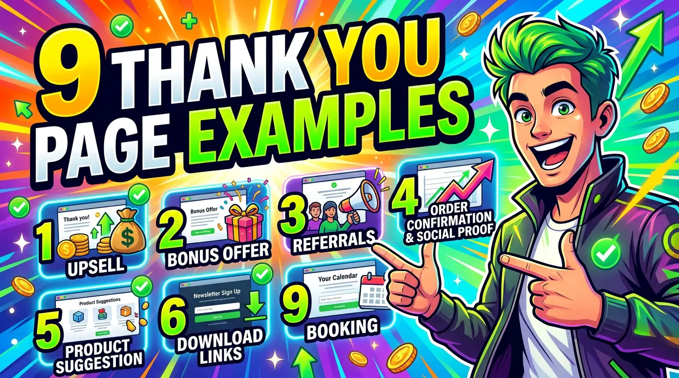
Here are 9 thank you page examples small businesses can learn from in 2026.
1. Rocket Agency, use the thank you page to reinforce trust fast
HubSpot highlights Rocket Agency’s contact form thank you page because it does more than confirm submission. It reinforces the brand, adds social proof, promotes other useful offers, and gives visitors a direct phone number for a faster conversation.
That is a smart move for any small business that sells high-trust services. Someone who just filled out your contact form is still deciding how serious you are. A thank you page can calm that uncertainty immediately with awards, client logos, review proof, or a simple line about response time.
If you run an agency, legal practice, contractor business, or B2B service company, this is the model to copy. Don’t just say the form worked. Confirm the next step and give the visitor one more reason to feel they picked the right company.
2. Smart Passive Income, give people the thing they asked for right away
HubSpot also points to Smart Passive Income’s resource download thank you page as a strong example because the page gives the resource immediately, welcomes the visitor as a subscriber, and introduces related content and events.
That matters because delay kills intent. If someone requested your checklist, pricing guide, or webinar replay, don’t make them hunt through their inbox and hope it lands. Put the download button on the page. Then tell them exactly what to do next.
For a small business, this can be simple. Deliver the guide, suggest one related article, and offer one next CTA such as booking a consult or viewing your services. If you need ideas for that follow-up CTA, our guide on call-to-action strategies that improve website conversions pairs well with this approach.
3. Amazon, make the post-purchase page work harder
HubSpot calls out Amazon’s purchase confirmation page because it uses the moment after checkout to recommend related products and promote other offers like Prime.
Most small businesses won’t have Amazon’s data or scale, but the principle still holds. A thank you page after purchase should not be dead space. It should answer, “What naturally comes next?” That could mean a related add-on, a setup guide, a care plan, a refill option, or an invitation to create an account.
This works especially well for ecommerce brands, subscription businesses, and service companies selling a starter package. The key is relevance. Don’t stack three random offers on the page. Put one logical next step in front of someone who already trusted you enough to buy.
4. OpenTable, reduce uncertainty after a booking
In HubSpot’s roundup, OpenTable’s booking confirmation page stands out because it does two helpful things right away. It confirms the reservation and gives users useful next steps, including the app and arrival details.
That is exactly what service businesses should do after a booking. Once someone schedules an appointment, the job is not finished. They still have questions. Where do I go? What should I bring? Can I reschedule? How do I contact someone if plans change?
A strong thank you page lowers no-shows because it replaces uncertainty with clarity. If you run a salon, clinic, consultant practice, restaurant, or home service business, use the page to repeat the appointment details and answer the top two or three questions that usually create friction.
5. Backlinko, spell out the next step with no ambiguity
HubSpot highlights Backlinko’s account creation thank you page because it clearly lays out what the user should do next. The messaging is direct, friendly, and slightly urgent, which keeps people moving instead of dropping off.
That lesson matters for any free trial, account signup, or email subscription. If visitors hit your thank you page and have to guess what happens next, some of them will leave. Others will forget. Both outcomes hurt conversion.
Tell people exactly what to do in plain English. Check your inbox. Confirm your email. Watch the 2-minute setup video. Add this event to your calendar. Complete your profile. Small businesses often lose leads here by assuming the user already knows the process. They usually don’t.
6. Save the Chimps, reassure people they made the right decision
HubSpot’s article praises Save the Chimps’ donor thank you page for putting the beneficiaries front and center. It reminds donors what their money supports and why their action mattered.
That same idea works beyond nonprofits. Every conversion creates a little bit of buyer’s remorse risk. People wonder if they filled out the right form, chose the right provider, or spent money wisely. A good thank you page reduces that doubt.
For small businesses, that can mean restating the value of the offer, showing a quick customer quote, or reinforcing the outcome the buyer wants. If someone booked a consultation, remind them what they’ll walk away with. If they bought a service package, restate what happens next. Reassurance is conversion work too.
7. Consumer Reports, use confirmation pages to personalize future engagement
HubSpot also features Consumer Reports’ newsletter signup flow, where users can choose the topics that match their interests before the page confirms signup and recommends relevant content.
This is smart because it improves future marketing without adding much friction. Personalized CTAs convert 202% better than default versions, according to HubSpot. A thank you page is a natural place to start that personalization.
If you run a small business with several services or audience segments, let new subscribers self-sort. A visitor could choose SEO, web design, paid ads, ecommerce, or local marketing. Then you can send better emails and show better content. One extra click here can make the rest of your funnel much more relevant.
8. Dropbox, turn thank you pages into referral engines
GetResponse points to Dropbox’s referral-driven growth model as a classic example of giving users extra value for bringing in a friend. Dropbox rewarded referrals with more storage, which helped fuel its early growth.
Small businesses can borrow that idea without building a giant referral machine. The principle is simple. After someone signs up, buys, or books, offer a reason to share. That might be account credit, a discount, a bonus resource, or a free add-on for both people.
This tends to work best when the reward feels directly connected to the original purchase or signup. A home service company might offer a referral credit. A software business might extend the trial. A consultant could offer a bonus template. If you want word-of-mouth to happen, the thank you page is one of the cleanest places to ask for it.
9. DigitalMarketer, test a low-friction upsell while intent is high
GetResponse uses DigitalMarketer’s thank you page example to show how a business can place a small paid offer in front of someone right after a conversion. In their example, the page promotes a low-priced product instead of immediately pushing a high-ticket sale.
That is often the right move for small businesses. If someone just downloaded a guide or signed up for a webinar, they may not be ready for your biggest offer. But they could be ready for a small commitment, especially if it helps them get a faster win.
Think workshop ticket, mini audit, setup session, sample pack, or entry-level product. Keep it tightly related to the original action. If the offer feels like a hard pivot, it will fall flat. If it feels like the obvious next step, your thank you page can become a quiet revenue driver.
What the best thank you pages have in common
Across all 9 examples, the pattern is pretty clear:
- They confirm the action fast
- They reduce uncertainty
- They present one logical next step
- They add value instead of ending the conversation
- They treat the thank you page like a conversion asset, not a receipt
If your current thank you page is just a sentence and a logo, you probably have an easy win sitting in plain sight. Tightening that page will not fix a weak offer, but it can absolutely help you get more value from the traffic and conversions you already earned.
If you want help turning your website into a better lead-generation system from the first click to the final form submission, get started here.