Touch-Friendly UI Design That Respects How People Use Phones
Fingers are not mouse cursors. They are imprecise, they obscure what they tap, and they reach different zones of the screen with different ease. We design touch-friendly interfaces with properly sized tap targets, thumb-zone optimization, and gesture patterns that make mobile interaction feel natural.
minimum tap target size recommended by Apple -- most desktop-first websites have touch targets far below this threshold
Apple Human Interface Guidelines, 2023
Touch-Friendly UI
What's Included
Everything you get with our Touch-Friendly UI
Touch-Optimized Interface Redesign
Redesign of all interactive elements with properly sized tap targets, adequate spacing between tappable items, and visual feedback that confirms touch interactions
Thumb-Zone Navigation
Navigation and key action placement optimized for the natural thumb reach zone, ensuring the most important interactive elements are easiest to reach with one-handed use
Gesture Pattern Design
Swipe, pull-to-refresh, pinch-to-zoom, and other gesture patterns integrated where they feel natural and enhance the touch experience
Our Touch-Friendly UI Design Process
Touch Interaction Audit
We test every interactive element on your site with actual finger input: tap targets, link spacing, form fields, dropdowns, and navigation items. Every element that fails touch usability standards is documented with specific measurements and improvement recommendations.
Thumb Zone & Interaction Mapping
We map your interface's interactive elements against thumb-zone reachability data to identify which actions are easy to reach, which require stretching, and which are practically inaccessible with one-handed use. Priority actions are repositioned for maximum reachability.
Touch-Optimized Redesign
We redesign interactive elements with proper tap target sizes, adequate spacing, and touch-specific feedback. Navigation patterns are adapted for thumb-zone placement. Gesture interactions are added where they enhance the experience.
Real Device Testing & Validation
We test the redesigned interface on real phones and tablets with actual finger input. Testing covers tap accuracy, gesture recognition, scroll performance, and overall interaction comfort across different hand sizes and grip positions.
Key Benefits
Reduced Tap Frustration
Miss-taps and accidental clicks are the most common mobile frustrations. When every interactive element is properly sized and spaced, users hit their targets on the first try. This seemingly small improvement dramatically reduces mobile abandonment and increases task completion rates.
One-Handed Usability
Most mobile users operate their phones with one hand. We design interfaces where primary actions fall within the natural thumb reach zone -- the bottom half of the screen. Navigation that requires reaching to the top corners or tiny targets in header areas gets redesigned for thumb-friendly access.
Natural Gesture Navigation
Touch users expect to swipe between content, pull to refresh, and pinch to zoom. We integrate gesture patterns where they feel natural rather than forcing tap-only interaction. This makes the interface feel native and intuitive rather than like a shrunken desktop site.
Research & Evidence
Backed by industry research and proven results
Touch Target Guidelines
Minimum recommended tap target size is 44x44pt (Apple) or 48x48dp (Google Material Design)
Apple/Google (2023)
Mobile Speed Impact
53% of mobile site visitors leave a page that takes longer than 3 seconds to load
Google/SOASTA Research (2018)
Related Services
Explore more of our responsive design services
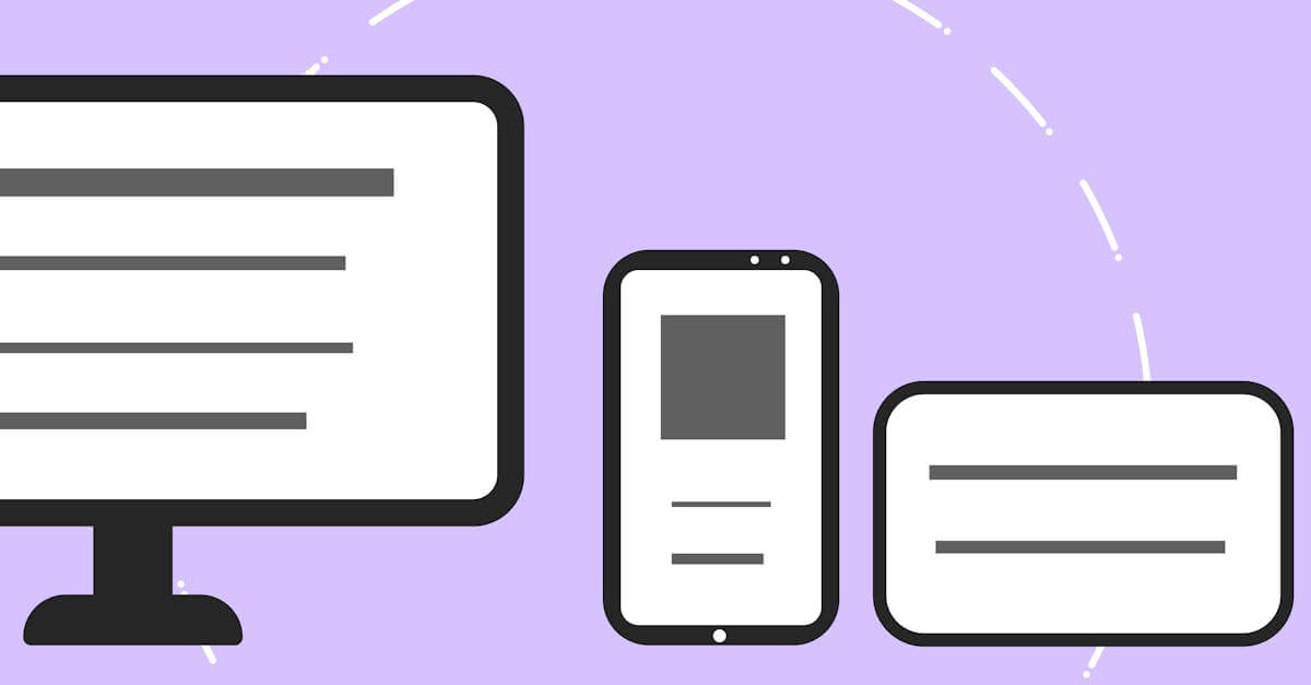
Adaptive Layouts That Optimize for Each Device Category
Adaptive layout design that creates optimized layouts for specific device categories, delivering tailored experiences that pure fluid responsive design cannot.
Mobile-First Design That Prioritizes Your Majority Audience
Mobile-first design that starts with the most constrained screen and progressively enhances for larger devices.
Responsive Website Redesign That Recovers Lost Mobile Revenue
Transform your fixed-width or poorly responsive website into a fast, mobile-optimized design that stops losing 53% of mobile visitors to slow load times.
Viewport Optimization That Makes Every Screen Width Work
Viewport optimization with proper meta configuration, fluid typography, and flexible layouts that ensure readable, usable content at every screen width.
Make Your Mobile Interface Feel Natural
Free consultation. No commitment. Get a custom responsive design strategy in 24 hours.
Related Content
Cross-Browser Testing That Catches What Emulators Miss
Cross-browser testing across Chrome, Safari, Firefox, and Edge on real devices.
Adaptive Layouts That Optimize for Each Device Category
Adaptive layout design that creates optimized layouts for specific device categories, delivering tailored experiences that pure fluid responsive design cannot.
Mobile-First Design That Prioritizes Your Majority Audience
Mobile-first design that starts with the most constrained screen and progressively enhances for larger devices.
Responsive Email Design That Works in Every Inbox
Responsive email templates that render correctly in Gmail, Outlook, Apple Mail, and every major email client on both desktop and mobile devices.