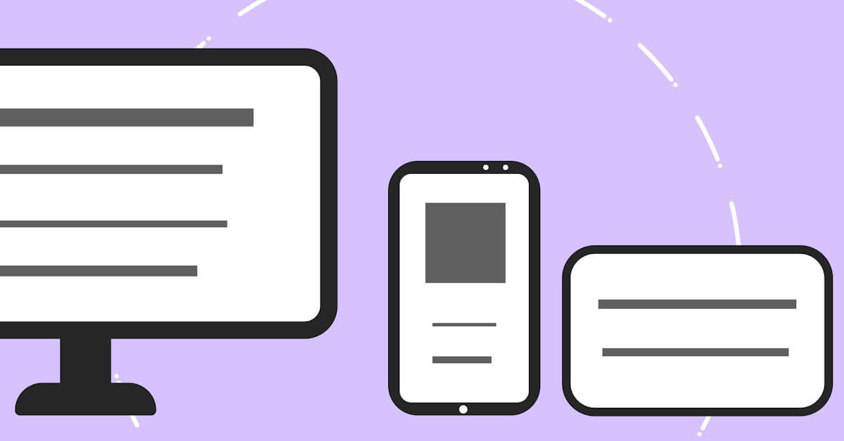
Responsive Email Design That Works in Every Inbox
Over 60% of emails are opened on mobile devices, but email rendering is decades behind web standards. We design responsive email templates that adapt to every screen size and render correctly in Gmail, Outlook, Apple Mail, and dozens of other clients.
of emails are opened on mobile devices -- email templates must be responsive to reach the majority of readers
Litmus Email Analytics, 2023
Responsive Email Design
What's Included
Everything you get with our Responsive Email Design
Responsive Email Template System
A set of branded email templates (newsletter, promotional, transactional) that render correctly across all major email clients on desktop and mobile
Multi-Client Testing
Testing across 30+ email client and device combinations including Gmail, Outlook (desktop and web), Apple Mail, Yahoo, and mobile clients on iOS and Android
Modular Component Library
Reusable email components (headers, CTAs, image blocks, text sections) that your team can assemble into new emails without starting from scratch
Our Responsive Email Design Process
Brand & Email Audit
We review your current email templates, brand guidelines, and subscriber analytics to understand which email clients your audience uses. This determines which rendering quirks we need to prioritize and which advanced features we can safely use.
Template Design & Component Build
We design the email template system with modular components, then build each component using hybrid coding techniques that work across all target email clients. Every component is tested individually before being combined into full templates.
Cross-Client Testing
We test every template across 30+ email client and device combinations using tools like Litmus or Email on Acid. Every rendering inconsistency is documented, fixed, and re-tested until the template renders correctly everywhere your subscribers read email.
Integration & Documentation
We integrate the templates into your email platform (Mailchimp, Klaviyo, HubSpot, or custom), provide documentation on how to use the modular system, and train your team on building new emails from the tested components.
Key Benefits
Consistent Branding in Every Inbox
Your email is often the most frequent touchpoint with your audience. When it looks professional in every email client, your brand credibility is reinforced with every send. A broken layout in Outlook or a text-only rendering in Gmail undermines the trust you have built through your website and product.
Higher Click-Through Rates on Mobile
When 60%+ of opens happen on mobile, a non-responsive email template means the majority of your readers are pinching, zooming, and struggling to tap tiny links. Our responsive templates present readable text, properly sized images, and thumb-friendly CTAs that make clicking through effortless on any device.
Faster Email Production
Our modular template system lets your marketing team assemble new emails from pre-tested components rather than designing from scratch every time. Each component is already tested across email clients, so new emails are guaranteed to render correctly without another round of cross-client testing.
Research & Evidence
Backed by industry research and proven results
Mobile Email Opens
Over 60% of emails are opened on mobile devices
Litmus (2023)
First Impression Study
Users form aesthetic judgments about web pages in 0.05 seconds
Behaviour & Information Technology (2006)
Related Services
Explore more of our responsive design services
Adaptive Layouts That Optimize for Each Device Category
Adaptive layout design that creates optimized layouts for specific device categories, delivering tailored experiences that pure fluid responsive design cannot.
Cross-Browser Testing That Catches What Emulators Miss
Cross-browser testing across Chrome, Safari, Firefox, and Edge on real devices.
Mobile-First Design That Prioritizes Your Majority Audience
Mobile-first design that starts with the most constrained screen and progressively enhances for larger devices.
Responsive Website Redesign That Recovers Lost Mobile Revenue
Transform your fixed-width or poorly responsive website into a fast, mobile-optimized design that stops losing 53% of mobile visitors to slow load times.
Stop Sending Broken Emails to Your Subscribers
Free consultation. No commitment. Get a custom responsive design strategy in 24 hours.
Related Content
Viewport Optimization That Makes Every Screen Width Work
Viewport optimization with proper meta configuration, fluid typography, and flexible layouts that ensure readable, usable content at every screen width.
Cross-Browser Testing That Catches What Emulators Miss
Cross-browser testing across Chrome, Safari, Firefox, and Edge on real devices.
Responsive Image Optimization That Loads Fast on Every Device
Responsive image optimization with format selection, resolution switching, and lazy loading that delivers sharp images at minimal file sizes on every device.
Touch-Friendly UI Design That Respects How People Use Phones
Touch-friendly UI design with properly sized tap targets, gesture support, and thumb-zone-optimized layouts that make mobile interaction effortless.