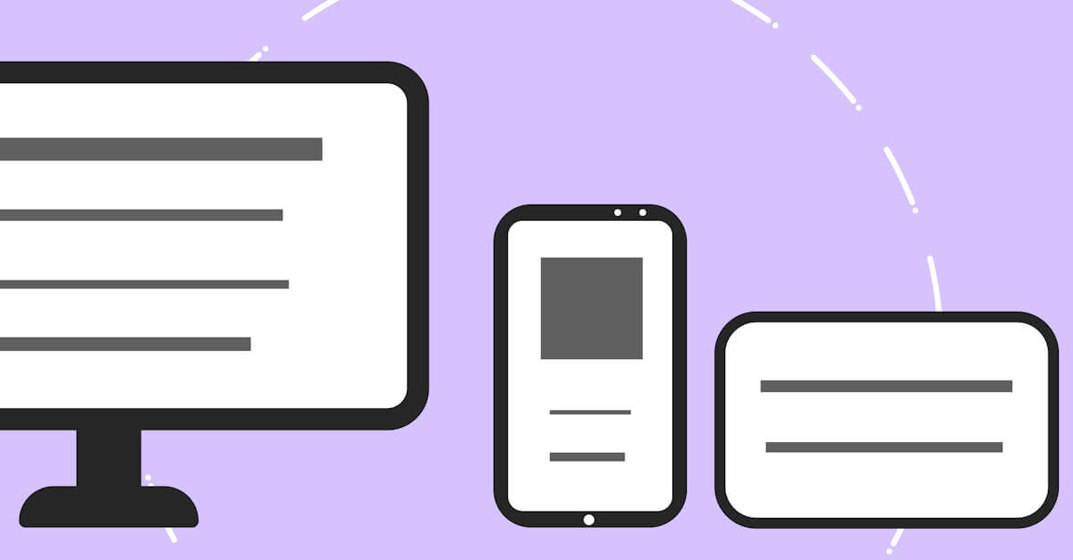
Mobile-First Design That Prioritizes Your Majority Audience
Over 60% of web traffic comes from mobile devices, yet most sites are still designed for desktop first. Mobile-first design inverts this -- starting with the phone screen and progressively enhancing for larger displays, ensuring the majority of your visitors get an excellent experience by default.
of web traffic now comes from mobile devices -- designing desktop-first means treating your majority audience as an afterthought
Statcounter, 2024
Mobile-First Design

What's Included
Everything you get with our Mobile-First Design
Mobile-First Layout System
Complete layout system designed from phone screens up, with progressive enhancement breakpoints for tablet, laptop, and desktop that add complexity as screen real estate increases
Touch-First Interaction Design
Navigation, forms, buttons, and interactive elements designed for finger input first, with mouse and keyboard enhancements added for desktop contexts
Content Priority Framework
Structured content hierarchy that ensures the most important information appears first on mobile and maintains logical order as layouts expand for larger screens
Our Mobile-First Design Process
Content & Feature Prioritization
We identify which content and features are essential for mobile users and which can be enhanced on larger screens. This prioritization drives the entire design hierarchy and ensures mobile visitors get the most important experience without compromise.
Mobile Layout Design
We design the complete site at mobile width first: navigation patterns, content layouts, form designs, and interaction models optimized for small screens and touch input. This becomes the foundation that all larger layouts build upon.
Progressive Enhancement for Larger Screens
We add tablet and desktop enhancements that leverage additional screen space: multi-column layouts, sidebar content, hover interactions, and expanded navigation. Each breakpoint adds value without breaking the mobile foundation.
Performance Testing & Optimization
We test the mobile-first design on real devices across connection speeds to verify that mobile performance meets the 3-second threshold. Desktop performance is verified separately, ensuring both experiences are optimized for their respective contexts.
Key Benefits
Better Mobile Experience by Default
When mobile is the starting point, mobile quality is guaranteed -- not compromised. Desktop-first design creates excellent desktop experiences and mediocre mobile ones. Mobile-first design creates excellent mobile experiences and enhanced desktop ones. Since over 60% of your visitors are on mobile, this approach serves the majority better.
Faster Load Times on All Devices
Mobile-first design starts with the lightest possible version and adds complexity for larger screens. This means mobile users get fast-loading pages by default, not overweight desktop pages crammed onto small screens. The performance benefits carry through to desktop, where the lean codebase loads even faster.
Forced Content Prioritization
Mobile screens have limited space, which forces hard decisions about what content truly matters. This constraint eliminates clutter and produces focused pages that communicate more effectively on every device. The discipline of mobile-first design improves content quality across your entire site.
Research & Evidence
Backed by industry research and proven results
Mobile Traffic Dominance
Over 60% of global web traffic comes from mobile devices
Statcounter (2024)
Mobile Speed Impact
53% of mobile site visitors leave a page that takes longer than 3 seconds to load
Google/SOASTA Research (2018)
Related Services
Explore more of our responsive design services
Adaptive Layouts That Optimize for Each Device Category
Adaptive layout design that creates optimized layouts for specific device categories, delivering tailored experiences that pure fluid responsive design cannot.
Responsive Website Redesign That Recovers Lost Mobile Revenue
Transform your fixed-width or poorly responsive website into a fast, mobile-optimized design that stops losing 53% of mobile visitors to slow load times.
Touch-Friendly UI Design That Respects How People Use Phones
Touch-friendly UI design with properly sized tap targets, gesture support, and thumb-zone-optimized layouts that make mobile interaction effortless.
Viewport Optimization That Makes Every Screen Width Work
Viewport optimization with proper meta configuration, fluid typography, and flexible layouts that ensure readable, usable content at every screen width.
Design for the Majority of Your Visitors
Free consultation. No commitment. Get a custom responsive design strategy in 24 hours.
Related Content
Adaptive Layouts That Optimize for Each Device Category
Adaptive layout design that creates optimized layouts for specific device categories, delivering tailored experiences that pure fluid responsive design cannot.
Cross-Browser Testing That Catches What Emulators Miss
Cross-browser testing across Chrome, Safari, Firefox, and Edge on real devices.
Touch-Friendly UI Design That Respects How People Use Phones
Touch-friendly UI design with properly sized tap targets, gesture support, and thumb-zone-optimized layouts that make mobile interaction effortless.
Responsive Email Design That Works in Every Inbox
Responsive email templates that render correctly in Gmail, Outlook, Apple Mail, and every major email client on both desktop and mobile devices.