Adaptive Layouts That Optimize for Each Device Category
Some experiences need more than fluid grids. We design adaptive layouts that create device-specific experiences -- optimizing navigation patterns, content density, and interaction models for the unique capabilities of phones, tablets, and desktops.
of viewing time is spent above the fold -- which is at a completely different position on each device, requiring adaptive content prioritization
NNGroup, 2018
Adaptive Layout Design
What's Included
Everything you get with our Adaptive Layout Design
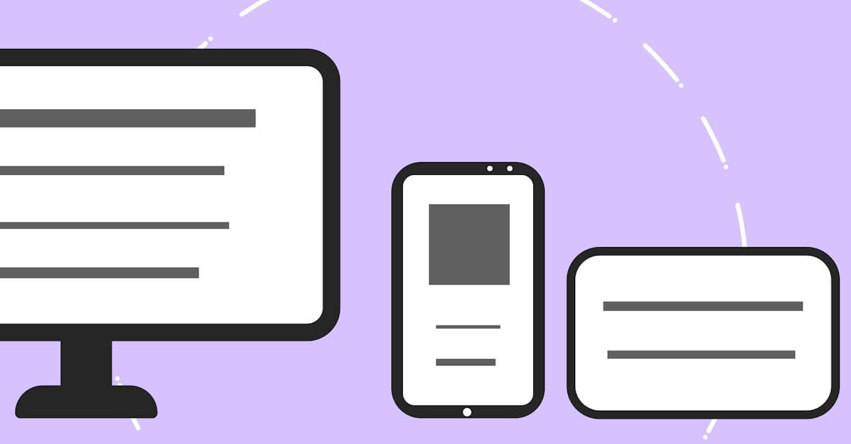
Device-Optimized Layouts
Separate layout strategies for phone, tablet, and desktop that adapt navigation, content structure, and interaction patterns to each device category's capabilities
Breakpoint Strategy
Strategic breakpoint definitions based on your actual traffic data and content requirements, not arbitrary screen widths, ensuring layout changes happen where they serve your content best
Orientation-Aware Design
Layouts that respond to device orientation changes, optimizing content display for both portrait and landscape on tablets and phones
Our Adaptive Layout Design Process
Device Analysis & Context Mapping
We analyze your traffic to identify device categories, usage patterns, and context differences. Phone users may have different goals than desktop users of the same site. This context mapping determines what each device-specific layout should prioritize.
Breakpoint Strategy & Layout Planning
We define breakpoints based on content needs and device capabilities, not arbitrary pixel values. For each breakpoint range, we plan the specific navigation pattern, content structure, and interaction model that best serves that device context.
Design & Prototype Each Layout
We design each device-specific layout and create interactive prototypes for testing. Transitions between layouts are designed to feel natural so users who resize their browser or rotate their device see smooth adaptation rather than jarring changes.
Build & Cross-Device Testing
We build the adaptive system with clean breakpoint management and test across real devices in your audience's device mix. Performance is verified at each breakpoint to ensure device-specific optimizations deliver their intended speed benefits.
Key Benefits
Optimized UX for Each Device Context
Phone users get thumb-friendly navigation and prioritized content. Tablet users get enhanced layouts that leverage larger screens. Desktop users get full-featured experiences with hover interactions and multi-column density. Each device gets an experience designed for its strengths rather than a compromise that fits all.
Better Above-the-Fold Content on Every Device
The fold position varies dramatically across devices. Adaptive layout design ensures the most important content and CTAs appear above the fold on every device, not just desktop. This increases engagement and conversion rates across your entire device mix.
Reduced Complexity for Specific Breakpoints
Adaptive design lets you deliver exactly the right amount of content and functionality at each breakpoint rather than hiding or revealing elements from a single layout. This reduces CSS complexity and improves performance on devices with limited processing power.
Research & Evidence
Backed by industry research and proven results
Above-the-Fold Research
Users spend 80% of their viewing time on content above the fold
NNGroup (2018)
Mobile Speed Impact
53% of mobile site visitors leave a page that takes longer than 3 seconds to load
Google/SOASTA Research (2018)
Related Services
Explore more of our responsive design services
Mobile-First Design That Prioritizes Your Majority Audience
Mobile-first design that starts with the most constrained screen and progressively enhances for larger devices.
Responsive Website Redesign That Recovers Lost Mobile Revenue
Transform your fixed-width or poorly responsive website into a fast, mobile-optimized design that stops losing 53% of mobile visitors to slow load times.
Touch-Friendly UI Design That Respects How People Use Phones
Touch-friendly UI design with properly sized tap targets, gesture support, and thumb-zone-optimized layouts that make mobile interaction effortless.
Viewport Optimization That Makes Every Screen Width Work
Viewport optimization with proper meta configuration, fluid typography, and flexible layouts that ensure readable, usable content at every screen width.
Give Every Device Its Best Experience
Free consultation. No commitment. Get a custom responsive design strategy in 24 hours.
Related Content
Cross-Browser Testing That Catches What Emulators Miss
Cross-browser testing across Chrome, Safari, Firefox, and Edge on real devices.
Mobile-First Design That Prioritizes Your Majority Audience
Mobile-first design that starts with the most constrained screen and progressively enhances for larger devices.
Responsive Image Optimization That Loads Fast on Every Device
Responsive image optimization with format selection, resolution switching, and lazy loading that delivers sharp images at minimal file sizes on every device.
Touch-Friendly UI Design That Respects How People Use Phones
Touch-friendly UI design with properly sized tap targets, gesture support, and thumb-zone-optimized layouts that make mobile interaction effortless.