Most small businesses already pay for offline attention.
Your trucks are on the road. Your invoices go to customers. Your receipts leave the counter. Your technicians wear uniforms. Your team sponsors local events. Your packaging sits on kitchen tables, job sites, and warehouse shelves.
The problem is that most of those moments send people nowhere useful.
A phone number is fine. A logo is fine. But if the customer has to remember your name, search later, guess the right page, and figure out the next step, you lose a lot of intent before it becomes a lead.
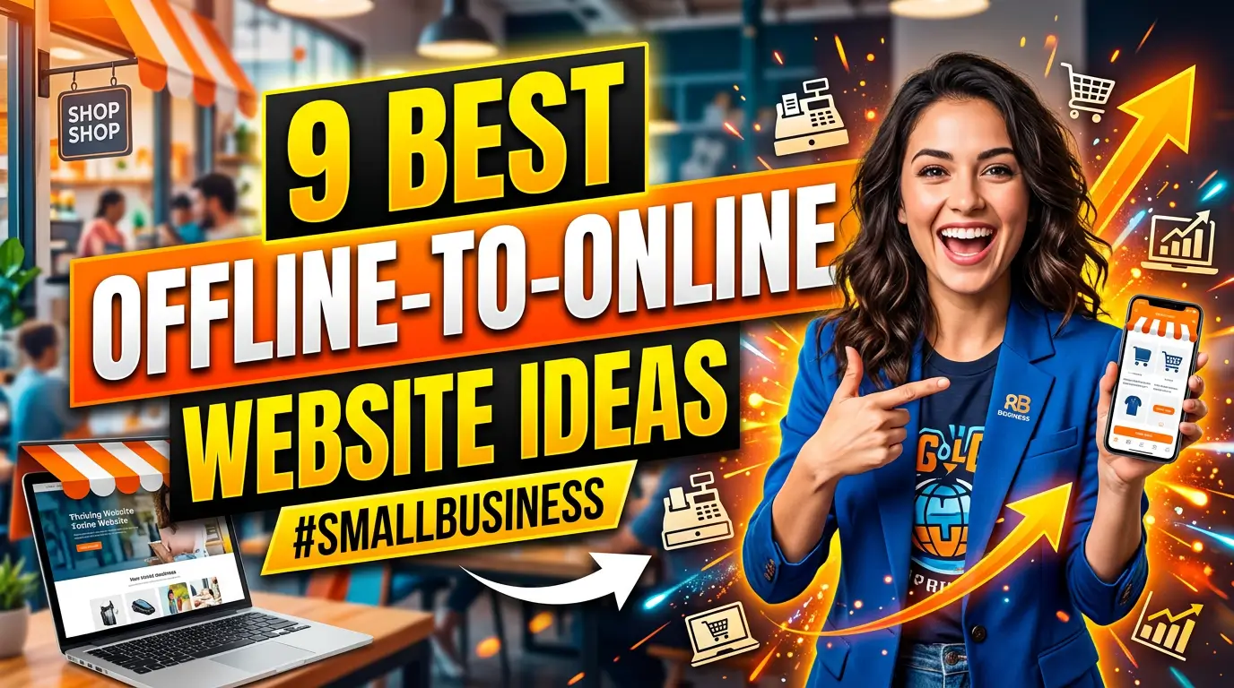
Offline-to-online marketing fixes that. It gives every real-world touchpoint a specific landing page, tracking code, QR code, or short URL so the business can turn attention into action and measure what happened.
Here are nine practical ideas worth stealing.
1. Put a quote-request page on every truck and jobsite sign
If your vehicles or yard signs only show a phone number, you’re asking people to call at the exact moment they notice you. That works sometimes. It also misses the person who is driving, walking a dog, or standing across the street.
Add a short URL and QR code that goes to a quote-request page built for that service area. A roofer could use example.com/roof-quote, while a landscaper could use example.com/yard. Keep the page simple: photos of similar local work, three service bullets, review proof, and one form.
Real example: a plumbing company can put a QR code on a water heater install sticker that says, “Need help with this unit? Scan for service.” That is better than sending the customer to the homepage.
Use UTM parameters so those scans show up in analytics. Google’s Campaign URL Builder documents how UTM source, medium, and campaign values identify traffic from specific promotions.
2. Turn receipts into review, reorder, or referral paths
Receipts are not glamorous, but they show up after trust has already been created. Someone bought from you. That makes the next click more valuable than a cold ad click.
For a restaurant, the receipt can point to a catering inquiry page. For a hardware store, it can point to a contractor account page. For a med spa, it can point to aftercare instructions and a rebooking page. The trick is matching the page to what the customer just did, not sending everyone to the same generic site.
Square, Toast, Shopify POS, Clover, and many invoicing systems let businesses customize receipt text or email receipt links. Even a plain printed line can work if the URL is short enough.
Example: “Loved the install? Leave a review or refer a neighbor: example.com/thanks.” That page can give customers two clean choices without making staff explain the process every time.
3. Add service-specific QR codes to invoices and estimates
Invoices and estimates are decision documents. People read them when they’re weighing cost, timing, scope, and trust. That makes them a smart place to answer buying questions.
A remodeler could add a QR code that opens a “What happens next” page with timeline photos, financing options, warranty terms, and insurance details. A B2B supplier could link to a reorder page for the exact product category. A dental office could link treatment estimates to a payment plan explainer.
This is not about decoration. It’s about reducing back-and-forth. If customers always ask the same five questions before approving an estimate, build one page that answers them and link it from the document.
Payment links can also reduce friction. Square Invoices supports online invoice payment, invoice tracking, and payment status visibility, which is useful when the website, payment system, and office process all point in the same direction.
4. Use packaging inserts to drive support, repeat purchases, and registration
Packaging is one of the rare places where a customer gives you full attention after the sale. Don’t waste it on a generic “follow us” message.
For ecommerce, product packaging can point to setup videos, replacement parts, warranty registration, refill subscriptions, or a product care page. For local retailers, bag inserts can point to a seasonal offer, loyalty signup, or event calendar. For manufacturers, box labels can point distributors to spec sheets, SDS files, installation guides, or reorder forms.
The page matters more than the code. A QR code that opens the homepage feels lazy. A QR code that opens “How to install your Model 240 valve in 6 minutes” feels useful.
This also helps customer service. If common setup questions are answered on one mobile-friendly page, your team spends less time repeating instructions and more time handling real problems.
5. Build event landing pages before the booth is printed
Trade shows, farmers markets, job fairs, home shows, and chamber events all create the same problem: people stop by, talk for three minutes, take a card, then forget who they met.
Don’t send event traffic to your homepage. Build a short page for that event before the banner, flyer, badge sticker, or table sign gets printed. Include the event name, the offer, a calendar link, the products or services featured at the booth, and one follow-up action.
A home services company at a home show could use example.com/home-show with a photo of the booth, a show-only inspection offer, and appointment slots for the next two weeks. A manufacturer at an industry expo could use a page with the exact line card and spec sheets discussed at the booth.
This makes follow-up cleaner too. Sales can email the same page after the conversation instead of attaching five PDFs that nobody opens.
6. Make print ads measurable with one offer, one URL, and one phone path
Print ads fail quietly when they point to the homepage. You can’t tell whether the ad worked, and the visitor can’t tell what to do next.
Use a campaign-specific URL, call tracking number, or both. The page should match the ad headline, repeat the offer, show proof, and remove unrelated navigation if the campaign is direct-response.
Direct mail still earns attention when it is targeted well. Industry summaries of the 2025 ANA/DMA response rate data commonly cite an average direct mail response rate of 4.4%, which is high enough that small improvements to the landing page can matter.
Example: a commercial cleaning company mailing to office parks should not send prospects to a homepage with residential cleaning, hiring links, and old blog posts. Send them to a page for office cleaning quotes in that city, with photos, industries served, insurance details, and a booking form.
7. Put customer education pages on stickers, labels, and equipment tags
If your business installs, repairs, rents, or maintains physical equipment, you have a permanent marketing surface sitting in the customer’s building.
Use it carefully. A sticker on an HVAC unit can point to filter replacement instructions and service scheduling. A label on rented equipment can point to safety videos and emergency support. A tag on a commercial appliance can point to maintenance intervals, warranty details, and parts requests.
This works because the customer is scanning at the moment they need help. They are not browsing. They’re trying to solve a problem.
The page should load fast, work on a phone, and put the urgent action at the top. If the equipment is down, don’t make someone scroll through company history to find the emergency number.
You also get cleaner data. When scans from equipment tags spike, that may reveal training gaps, product confusion, or a service issue worth fixing.
8. Give business cards a real next step instead of a homepage
Most business cards are polite but weak. Name, title, email, phone, logo. Useful, but not persuasive.
Give each role a better next step. The owner’s card might point to a consultation booking page. A sales rep’s card might point to a comparison page. A technician’s card might point to support, reviews, and referral options. A recruiter at a hiring event might point directly to open roles.
Dynamic QR codes can be useful here because you can change the destination later without reprinting. Just be careful with vendors. Make sure the code won’t stop working if you cancel a subscription.
Example: a commercial insurance agency could give producers cards that say, “Scan for our 5-minute renewal checklist.” The page can include the checklist, calendar booking, carrier logos, and common risk questions. That is more useful than another homepage visit.
9. Match radio, podcast, and local sponsorships with easy-to-say URLs
Audio traffic is different. People can’t scan a QR code from a radio mention, podcast ad, sports sponsorship, or stage announcement. They need a URL they can remember after hearing it once.
Use short, plain campaign paths like /radio, /podcast, /team, or /fair. Avoid clever spellings. Say the URL out loud before you buy the spot. If your staff can’t repeat it after one listen, customers won’t either.
The landing page should repeat the exact phrase from the ad. If the podcast host says “free roof check,” the page headline should say “Free Roof Check,” not “Residential Exterior Services.”
Local sponsorships are perfect for this. A youth sports banner can point to a community page with the sponsorship, a neighborhood offer, and photos from local work. That feels more connected than a cold landing page and gives the sponsor a real way to measure visits.
Make every offline touchpoint earn its keep
Offline marketing doesn’t have to be a black box. Start with the places your business already shows up: trucks, receipts, estimates, invoices, packaging, signs, equipment, events, cards, and sponsorships.
Pick one. Build a focused page. Add tracking. Give customers one clear action.
If you want help turning your offline marketing into measurable website leads, start a conversation with Your Web Team. We’ll help you find the touchpoints you’re already paying for and turn them into pages that do real work.