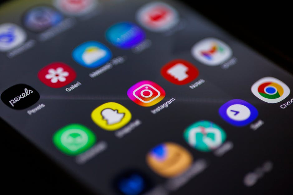
60% of Your Traffic Is Mobile. Is Your Design Ready?
Google reports that 53% of mobile users abandon sites that take longer than 3 seconds to load. We design mobile experiences that load fast, feel intuitive, and turn visitors into customers.
Mobile-First Design That Matches How People Actually Browse
""
Our Mobile Design Services
Eight specialized services covering every dimension of mobile experience design -- from native app interfaces to progressive web apps, gesture systems to form optimization.
Native App Design That Users Don't Uninstall
Native mobile app design for iOS and Android. Platform-specific interfaces that follow Apple HIG and Material Design conventions for apps users actually want.
Your Mobile Site Is Probably Losing 53% of Visitors
Mobile web design that converts the 60% of traffic coming from phones. Fast-loading, thumb-friendly interfaces built for real mobile conditions -- not just.
App-Store Downloads Are a Barrier. PWAs Remove It.
PWA design that delivers app-like experiences without app store downloads.
Stop Making Users Learn Your Interface
Mobile UI pattern implementation using tab bars, card layouts, bottom sheets, and sliding panels. Familiar interfaces that reduce learning curves and increase.
Buttons Are Slow. Gestures Are How Mobile Users Think.
Gesture-based navigation design for mobile apps and sites. Swipes, pinches, long-presses, and drag interactions that feel instinctive on touch devices.
85.65% of Mobile Carts Get Abandoned. Forms Are Usually Why.
Mobile form optimization that fixes the 85.65% cart abandonment rate. Native input types, smart defaults, and thumb-friendly layouts that turn form friction.
Your Icon Gets 50 Milliseconds. Make Them Count.
App icon design that earns taps in crowded app stores and home screens. Distinctive icons following Apple and Google platform guidelines for maximum visual.
Most Apps Lose Users Before They Even Start
Mobile onboarding design that gets users to value fast. First-run experiences that drive activation, reduce churn, and turn downloads into retained users.
Why Teams Choose YourWebTeam for Mobile Design
Mobile-Native Thinking, Not Desktop Downsizing
We design for thumbs first. Every layout starts from the smallest screen and scales up, accounting for touch targets, thumb reach zones, and the reality that mobile users are often multitasking or moving. This is the opposite of how most agencies work, and it shows in the results.
Decisions Backed by Device Data
We pull real analytics from your traffic -- device mix, viewport distributions, connection speeds, and interaction heatmaps -- before touching a single pixel. Design decisions are validated against actual user behavior, not assumptions about how people might use their phones.
Platform-Specific Fluency
iOS and Android users have different expectations for navigation patterns, gesture behavior, and visual hierarchy. We design for each platform's conventions rather than forcing a one-size-fits-all interface that feels off on both.
Performance as a Design Constraint
Google's data shows that 53% of mobile users leave if a page takes over 3 seconds. We treat load time as a first-class design variable -- choosing image formats, animation approaches, and component architectures that keep experiences fast on real-world networks.
Ready to See Results?
Get a free strategy customized to your business. No contracts, no obligations.
Get My Free StrategyMobile Experiences That Keep Users Coming Back
Free mobile audit. See how your mobile experience stacks up and what's costing you users.