Most website copy gets judged by the headline.
That makes sense. Headlines matter. But plenty of small business websites lose leads after the headline does its job, because the little words around forms, buttons, pricing, and scheduling feel unclear.
That little text is microcopy.
It is the line under your button. The sentence beside your quote form. The error message when someone types a phone number wrong. The privacy note that tells people you will not spam them.
Baymard Institute’s large-scale checkout research shows the average documented cart abandonment rate sits at 70.19%, and unclear form or checkout experiences are part of the reason buyers bail. You do not need an ecommerce store to learn from that. Service businesses lose leads the same way, just without a cart report showing the damage.
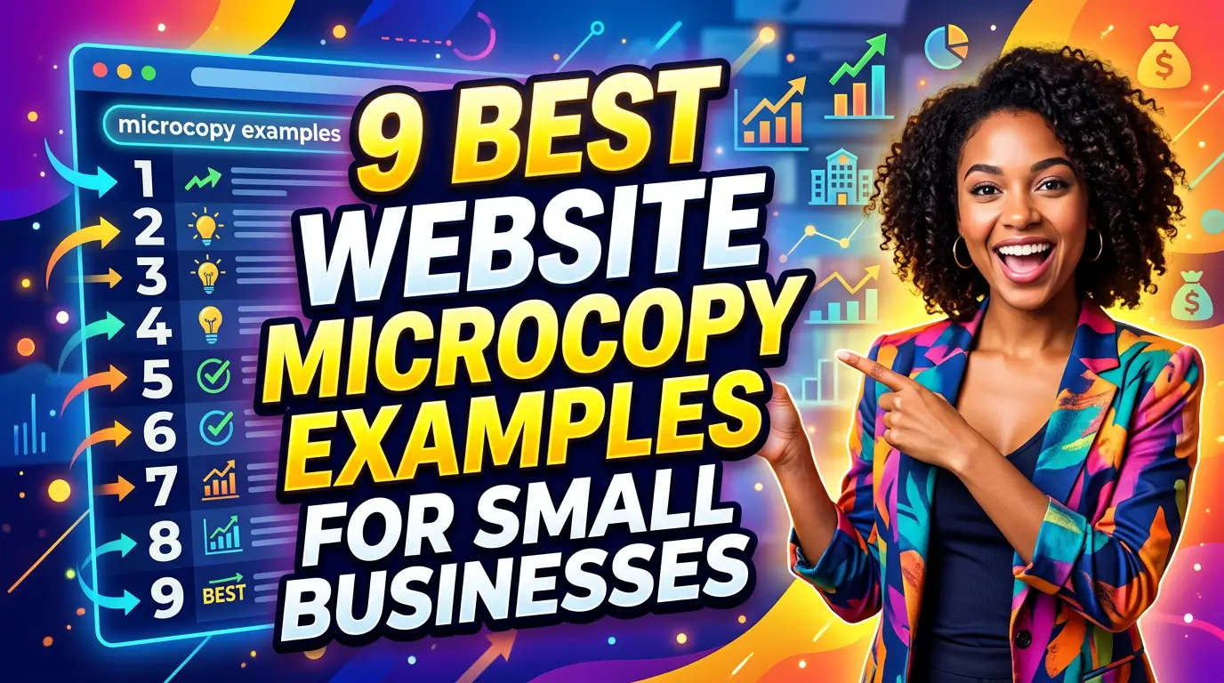
Here are 9 website microcopy examples small businesses can use to reduce hesitation and get more visitors to take the next step.
1. Button copy that says what happens next
A vague button makes visitors work too hard. “Submit” is the classic offender. Submit what? To whom? What happens after the click?
Better microcopy tells the visitor what they are actually getting.
Example: instead of “Submit,” a roofing company could use “Get My Roof Inspection Quote.” A CPA firm could use “Schedule My Tax Planning Call.” A web design agency could use “Get My Website Review.”
This matters because users scan pages quickly. Nielsen Norman Group’s research on how people read online found that users often scan instead of reading word-for-word. Your button has to carry meaning on its own.
Good button microcopy answers one question: if I click this, what happens next?
2. Form helper text that removes field confusion
Every form field should earn its place. If a field could confuse someone, add helper text before they guess wrong or abandon the form.
Example: a contractor asking for project budget could add, “A rough range is fine. This helps us recommend the right crew size.” That feels much better than a blank “Budget” field that makes the visitor wonder if they are being judged.
A B2B consultant asking for company size could write, “Include full-time and part-time staff.” A dentist asking for insurance details could write, “If you’re not sure, leave this blank and we’ll check it with you.”
Baymard’s form usability research recommends clear field labels and guidance because users often misinterpret inputs when context is missing source. Small notes can prevent bad submissions and lost leads. For a deeper cleanup process, use this guide to website form optimization for more leads.
3. Privacy reassurance near high-friction forms
People know contact forms can lead to spam. They have filled out one too many forms and been chased by sales reps for weeks.
Put the reassurance where the fear happens.
Example: under a quote form button, write: “No spam. No obligation. We’ll reply within one business day.” That sentence does three useful jobs. It lowers risk, sets expectations, and makes the business sound human.
A home services company might use, “We only use your number to confirm your appointment.” A marketing agency could use, “Your audit request stays private. We do not share your website data.”
The FTC’s guidance on protecting personal information makes privacy a real business responsibility, not just a footer link. Microcopy will not replace a privacy policy, but it can make visitors feel safer at the exact moment they are deciding whether to hand over their information.
4. Error messages that tell people how to fix the problem
Bad error messages make visitors feel like they broke something. Good ones tell them exactly what to fix.
Weak example: “Invalid input.”
Better example: “Please enter a 10-digit phone number, like 555-123-4567.” That is specific, calm, and useful.
This matters most on contact forms, payment forms, appointment booking pages, and account signup flows. If a visitor has already decided to act, do not punish them with a mystery error.
The W3C’s Web Content Accessibility Guidelines say input errors should be identified and described to the user in text source. That is good accessibility and good sales. The goal is not to sound clever. The goal is to help someone finish the task.
5. Pricing notes that explain what is included
Pricing sections create hesitation because buyers are trying to compare value, not just cost. Microcopy can answer the quiet questions before they become objections.
Example: under a website maintenance plan, write: “Includes plugin updates, uptime checks, backups, and 30 minutes of content edits each month.” That beats “Maintenance Plan” because it explains what the buyer gets.
A cleaning company could write, “Price includes supplies, travel, and standard equipment.” A consultant might add, “No long-term contract. Cancel before your next billing date.”
According to B2B buying research from Gartner, buyers spend a lot of time gathering information before speaking with a supplier. Clear pricing microcopy helps them qualify themselves before the sales call, which saves time for both sides.
6. Scheduling copy that sets expectations
Booking pages fail when visitors are unsure what they are committing to. Is it a sales pitch? A paid consultation? A discovery call? How long will it take?
Say it plainly.
Example: “Book a free 20-minute fit call. We’ll review your goals, answer questions, and tell you if we’re not the right fit.” That line lowers pressure because it explains the agenda and gives the visitor permission to say no.
A repair business might write, “Choose a service window. Our dispatcher will call if the technician is running more than 15 minutes late.” A law firm could write, “This request does not create an attorney-client relationship until we confirm representation.”
Calendly reports that automated scheduling removes back-and-forth emails and speeds up meeting booking source. The software helps, but the words around the calendar decide whether the visitor feels comfortable booking.
7. Empty-state copy that keeps visitors moving
Empty-state copy appears when there is nothing to show yet. It is easy to ignore until your website makes a visitor hit a dead end.
Example: if a site search returns no results, do not write “No results found” and stop. Write, “We couldn’t find that service. Try searching by problem, like ‘water heater repair,’ or contact us and we’ll point you in the right direction.” If searches keep turning up empty, fix the underlying site search experience for small business websites, not just the message.
For a customer portal, an empty invoice screen could say, “No invoices yet. Once your first project starts, billing details will appear here.” For a resources page, it could say, “No guides match that filter. Clear filters or browse all resources.”
Nielsen Norman Group’s guidance on empty states recommends using these moments to explain the situation and guide the next action. That is exactly what good microcopy does.
8. Trust microcopy beside proof points
Logos, reviews, and badges can help, but only if visitors understand what they mean. A row of unexplained logos often looks like decoration.
Add a short line that gives the proof context.
Example: “Trusted by 47 local contractors for website support and lead tracking.” That is stronger than a logo strip with no explanation. A dentist could write, “4.9-star average from 312 patient reviews on Google.” A software consultant could write, “Certified Shopify Partner since 2018.”
BrightLocal’s Local Consumer Review Survey found that consumers rely heavily on reviews when evaluating local businesses source. Do not make them hunt for the meaning of your proof. Put the plain-language explanation right beside it.
9. Confirmation copy that tells leads what happens after they act
The thank-you message is not an afterthought. It is the first moment after someone becomes a lead.
Weak example: “Thanks.”
Better example: “Thanks, your request is in. Richard will review your website and reply within one business day. If this is urgent, call 555-123-4567.”
That kind of confirmation copy reduces anxiety and prevents duplicate submissions. It also gives hot leads a faster path if they need help now.
This is especially useful for contractors, agencies, medical offices, and professional services where response time affects close rate. Lead response research published by Harvard Business Review found that companies contacting leads within an hour were far more likely to qualify them than companies that waited longer. Your confirmation copy should make speed visible.
Make the small words do real work
Microcopy will not fix a weak offer, slow website, or confusing service. But when the offer is good and the visitor is close to acting, small words can remove the last bit of friction.
Start with the money pages: your homepage CTA, service page forms, quote request page, booking flow, pricing section, and thank-you page. Look for any place where a visitor might wonder, “What happens next?” Then answer that question in plain English.
If you want a website that turns more visitors into leads instead of making them guess, get started here. We’ll help you tighten the copy, fix the friction, and build a site that does its job.