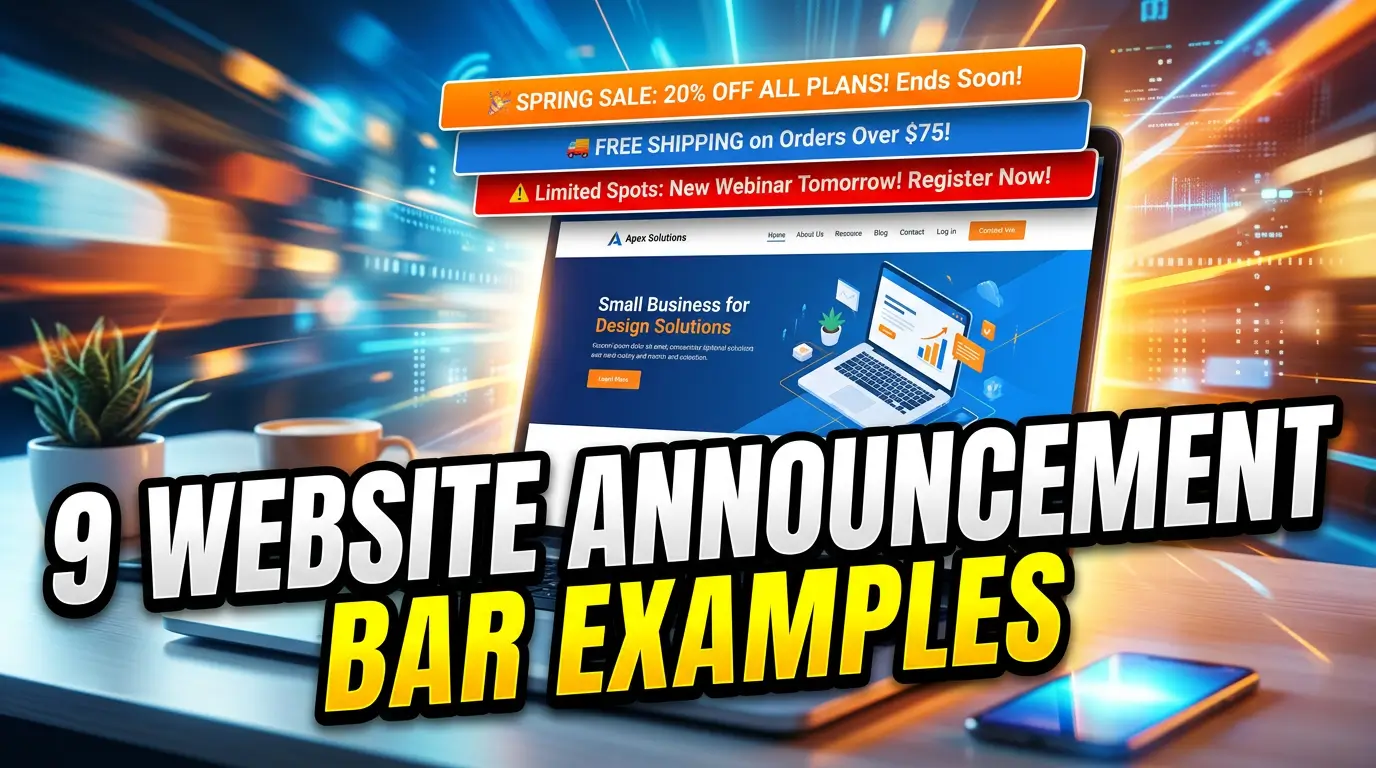
Most announcement bars are wasted space.
They say things like “Big News!” or “Sign Up Today” without telling visitors why they should care. Worse, they sit at the top of every page forever, so regular visitors stop seeing them.
That matters because users already ignore anything that feels like an ad. Nielsen Norman Group’s eyetracking research found that people often avoid fixating on ad-like banners, a behavior known as banner blindness.
A good announcement bar is different. It is short, specific, and tied to something the visitor might actually want right now.
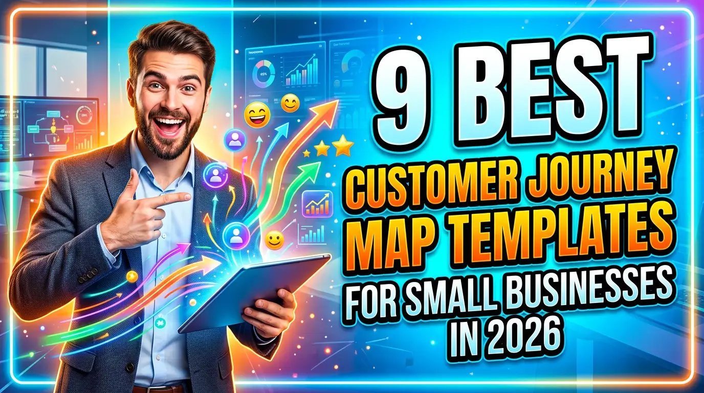
Here are 9 website announcement bar examples small businesses can use to turn more visitors into leads, bookings, and sales.
1. The limited-time offer bar
A limited-time offer bar works when the deadline is real. Use it for seasonal service windows, end-of-month promotions, early-bird pricing, or a sale that actually ends.
Example: “Spring tune-up appointments are filling fast. Book by May 17 and save $49.” That is clear enough for an HVAC company because it combines timing, value, and action in one sentence.
Do not run the same “48-hour sale” for three months. People notice. Your regular buyers will learn that your deadlines are fake, and trust is harder to rebuild than traffic.
Keep the button direct: “Book Now,” “Claim the Offer,” or “Schedule Service.” If the offer needs a coupon code, show it in the bar so the visitor does not leave the site hunting for one.
2. The free shipping or delivery threshold bar
For ecommerce businesses, a shipping threshold bar can increase order size without adding another popup. The best version tells shoppers exactly what they need to do next.
Example: “Free local delivery on orders over $75. You’re $18 away.” That message is useful because it changes as the cart changes. It feels like help, not noise.
This is especially helpful for retailers, specialty food brands, hardware stores, and local shops that sell online but still compete with larger stores. The bar gives buyers a reason to add one more item instead of comparing shipping costs elsewhere.
Keep it honest. If the threshold excludes heavy items, remote ZIP codes, or wholesale orders, link to the shipping policy instead of hiding the details.
3. The booking availability bar
Service businesses can use announcement bars to steer demand toward open appointment slots. This works well for dentists, salons, repair companies, consultants, contractors, and clinics.
Example: “Two website audit slots open this week. Get a 30-minute review before Friday.” That tells the visitor there is current availability and gives them a simple reason to act.
A booking bar is stronger than a vague “Schedule a Call” button because it answers the silent question buyers have: Can you help me soon?
Use real inventory when possible. If your calendar has three emergency plumbing openings, say that. If your design team is booking projects for June, say that too. Scarcity only works when it reflects the actual schedule.
4. The trust proof bar
Sometimes the best announcement is not a discount. It is proof.
Example: “Rated 4.9 stars by 312 local homeowners. See recent reviews.” For a local service company, that kind of bar can reduce anxiety before the visitor clicks a quote form or phone number.
BrightLocal’s Local Consumer Review Survey shows how much reviews shape local buying decisions, especially for service businesses where customers are comparing risk as much as price source.
The key is to make the proof verifiable. Link the bar to your Google Business Profile, a reviews page, a case study, or a testimonial page. Do not paste a random award logo or star rating without context.
This bar works best on high-intent pages like service pages, pricing pages, location pages, and quote request pages.
5. The new service or product bar
If you add a new service, do not bury it in the navigation and hope people find it. Announce it with a short bar for a few weeks.
Example: “New: same-day garage door spring repair in Plano. Check availability.” That is much stronger than “We launched a new service” because it names the buyer problem, location, and next step.
This works for professional services too. A CPA firm might promote “New: 2026 tax planning sessions for S corp owners.” A marketing consultant might use “New: GA4 cleanup audits for small business websites.”
The mistake is making the bar company-centered. Visitors do not care that your team is excited. They care whether the new offer solves a problem they already have.
Send the click to a focused page, not your homepage.
6. The deadline reminder bar
Deadline bars are useful when buyers need to act before a policy, event, class, grant, or seasonal window closes.
Example: “Last day to register for the June bookkeeping workshop. Seats close at 5 PM.” That message gives the visitor a clear reason to act now without sounding fake.
This is a strong fit for accountants, attorneys, coaches, schools, nonprofits, event venues, and B2B firms with application windows or onboarding cutoffs.
Use exact dates and times. “Enrollment closing soon” is easy to ignore. “Enrollment closes May 24 at midnight” is concrete.
If the deadline affects price, access, availability, or compliance, say so in plain English. The bar should answer: What happens if I wait?
7. The content upgrade bar
A content upgrade bar points visitors toward a useful guide, checklist, calculator, webinar, or template related to the page they are reading. This is not the same as a generic newsletter signup.
Example: On a website redesign article, the bar could say, “Planning a redesign? Get the 25-point launch checklist.” That matches the visitor’s current intent.
This approach works because the offer is connected to the page topic. Someone reading about Google Ads mistakes is more likely to want a campaign audit checklist than a broad monthly newsletter.
Keep the ask small. Name, email, and maybe company size are enough for most small-business lead magnets. Longer forms can wait until the sales conversation.
After the signup, send people to a thank-you page with the next step. Do not leave them staring at a success message.
8. The support or service update bar
Sometimes an announcement bar should reduce confusion, not sell something. Use it for holiday hours, storm delays, phone outages, shipping delays, system maintenance, or temporary service changes.
Example: “Storm update: emergency roof tarping crews are available today. Non-urgent inspections resume Monday.” That protects your team from bad-fit calls and helps urgent customers move faster.
For software or online services, link the bar to a status page or support update. For local businesses, link to a short page with hours, contact options, and what customers should expect.
This bar builds trust because it shows the business is paying attention. The only rule is to remove it when the issue is over. A stale service update makes the whole site feel neglected.
9. The consultation CTA bar
A consultation bar works when the visitor has seen enough to consider talking to you but has not clicked a main call to action yet.
Example: “Not sure why your website is not producing leads? Get a practical plan in one call.” That line is specific to the pain, and the button can point to your main conversion page.
This is a good fit for agencies, consultants, home service companies, financial professionals, attorneys, and B2B service firms. The goal is not to explain everything. The goal is to give a serious buyer a low-friction path forward.
Make the CTA match the sales process. If you sell high-ticket services, “Get Started” or “Request a Consultation” usually beats “Buy Now.” If speed matters, include response time: “We reply within 1 business day.”
For Your Web Team, send this bar to get started.
How to make announcement bars work without annoying visitors
The bar is only as good as the decision behind it. Before you publish one, check three things.
First, keep it short. A strong bar usually fits in one sentence plus a button. If you need a paragraph, build a landing page.
Second, watch mobile layout. Google uses Core Web Vitals as part of page experience, and pages should avoid unstable layouts that shift content around as they load source. A sticky bar that pushes the page down late can hurt usability.
Third, do not use motion that people cannot control. WCAG guidance says moving, blinking, scrolling, or auto-updating content that starts automatically and lasts more than five seconds needs a way to pause, stop, or hide it source.
Use one bar at a time. Give it one job. Measure clicks, form fills, bookings, and calls before deciding whether it worked.
Need a website that turns traffic into leads?
A good announcement bar can help, but it will not fix a weak offer, confusing page, or slow website.
If your site gets traffic but not enough leads, Your Web Team can help you find the friction and fix it. Start here: get started.