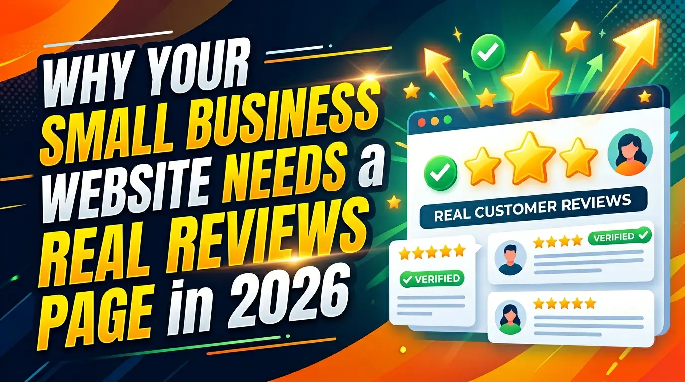
When someone lands on your pricing page, they are not browsing casually. They are trying to answer one blunt question: is this worth it?
If that page is vague, cluttered, or makes people work too hard, you lose some of the warmest traffic on your site. That hurts because pricing pages attract high-intent visitors. According to HubSpot, pricing is one of the most visited pages on many business websites, and CXL notes that pricing-page visitors often sit much closer to a purchase decision than a typical blog reader source.
The best pricing pages do not just list numbers. They frame value, reduce risk, and help buyers choose.
Here are 9 of the best pricing page examples for small businesses in 2026, and what to copy from each one.
1. Basecamp, keep pricing painfully simple
Basecamp’s pricing page is a good reminder that not every business needs a complicated table. It gives buyers a very clear choice: one flat-rate plan for teams, plus a limited free option for personal use.
That simplicity works because the offer is easy to understand. There is no hunting through feature grids just to figure out what the product costs. The buyer gets the number, the audience fit, and the next step almost immediately.
For small businesses, this is a strong model when your service is straightforward. If you sell one main package, do not invent fake tiers just to look bigger. Say what it costs, who it is for, and what the buyer gets. HubSpot recommends reducing decision friction on pricing pages, and Basecamp does that better than most source.
2. Webflow, let buyers compare plans without feeling lost
Webflow’s pricing page handles a harder job. It has multiple product lines, site plans, workspace plans, ecommerce tiers, and enterprise options. That could easily become a mess.
Instead, Webflow groups plans by buying context. A freelancer looking for one site does not have to think like an agency managing multiple seats. An ecommerce brand can jump straight to the right section. That structure makes a complex offer feel more manageable.
This is the lesson for small businesses with more than one package. Organize around buyer intent, not internal terminology. If you serve startups, local businesses, and enterprise accounts, separate those paths early. Nielsen Norman Group has long shown that clear information architecture reduces confusion and helps users complete tasks faster source.
3. Shopify, show the starting point and reduce sticker shock
Shopify’s pricing page does a strong job of showing entry pricing while still leaving room for upgrades. Buyers can scan plan names, monthly pricing, core features, and an obvious trial CTA without reading a wall of copy.
The useful part is not just the design. It is the framing. Shopify helps visitors understand what the lowest practical starting point looks like, then gives enough differentiation to justify moving up.
That matters for service businesses too. If your full pricing depends on scope, you can still show a starting package, a monthly retainer floor, or a project minimum. Research from Demand Gen found that B2B buyers value transparent vendor information early in the process. Pricing opacity creates drag. Even a realistic starting range can move the right lead forward.
4. Mailchimp, explain what changes as the price goes up
Mailchimp’s pricing page works because the upgrade logic is visible. The plans do not just list more stuff. They explain how the buyer gets more automation, testing, support, or advanced features as spend increases.
A lot of small-business pricing pages miss this. They stack features in a table, but they never answer the real question: why should I pay more?
That is where Mailchimp is useful. Each tier creates a clearer business case. One plan fits a smaller sender. Another helps a more serious marketing team do more with segmentation and optimization.
If you offer bronze, silver, and gold style packages, rewrite them around business outcomes. What does the buyer unlock at each level? Which bottleneck gets removed? According to the Baymard Institute, users often abandon decision-heavy flows when information is hard to compare or interpret source.
5. Ahrefs, use a calculator when pricing depends on usage
Ahrefs’ pricing page is helpful because it acknowledges a common pricing problem: one number does not fit every buyer. Usage, seats, and limits matter. Rather than hiding that complexity, Ahrefs gives buyers tools to estimate fit.
This is a great move for small businesses that price by volume, locations, users, or monthly work. A bookkeeper could estimate based on accounts. A marketing agency could estimate based on locations or ad spend. A software tool could estimate based on seats or projects.
The key is honesty. If pricing changes with usage, show how. Do not wait until the sales call to reveal the math. Salesforce reports that 80% of customers say the experience a company provides is as important as its products and services. Surprise pricing is a bad experience.
6. Notion, pair premium pricing with proof
Notion’s pricing page does more than show plans. It supports higher-tier pricing with context, including feature depth, team use cases, and customer trust signals across the site experience.
That matters when your page asks buyers to spend more than the cheapest alternative. If your package is not low-cost, your pricing page has to carry some of the trust burden. Reviews, recognizable clients, guarantees, case studies, and security signals all help justify the number.
Small businesses underuse this. They show the price, then make the buyer do all the mental work. If your service starts at $3,000, say what that includes, who it is for, and what results you are typically hired to improve. According to BrightLocal, 91% of consumers say reviews make them more likely to use a business. Proof reduces hesitation.
7. Slack, answer objections right on the pricing page
Slack’s pricing page does something smart for conversion. It does not force buyers to leave the page to understand security, plan differences, or whether a free option exists. Important objections are handled in the page flow.
That is a strong pattern for small businesses because pricing objections are predictable. People want to know contract length, setup fees, cancellation terms, onboarding time, or whether support is included.
If those questions always come up on sales calls, put them on the page. A short FAQ beneath pricing can save your team time and keep buyers from bouncing. Clutch found that buyers care strongly about clear service information and transparency when evaluating providers. Pricing pages should do some of that trust-building work before the first conversation.
8. Zapier, help people choose with a highlighted recommendation
Zapier’s pricing page uses visual emphasis well. One plan is typically presented as the recommended option, which helps buyers narrow the field fast instead of staring at four equally weighted choices.
This matters because too much choice slows people down. The classic Sheena Iyengar and Mark Lepper jam study is not a pricing-page study, but it is still a useful reminder that more options can reduce action when choice becomes burdensome source.
For a small business, that could mean highlighting your most common package, your best-fit monthly plan, or your most profitable retainer. Do not manipulate people. Just guide them. If 70% of good-fit clients choose one offer, make that offer easier to pick.
9. ConvertKit, make the call to action match the buyer stage
ConvertKit’s pricing page is a good example of matching CTAs to where the buyer is in the decision process. Lower-friction options like starting free sit alongside stronger paid-plan comparison paths.
That is useful because not every pricing-page visitor is ready for the same step. Some want to buy now. Some want to talk. Some want to test. The right CTA depends on your sales model.
A local service company might need “Request a Quote.” A consultant might need “Book a Discovery Call.” A software tool might need “Start Free.” What matters is alignment. Unbounce reports that matching message and intent is a major conversion driver on high-intent pages. Your pricing page should not end with a generic button if the buyer needs a more specific next move.
What the best pricing page examples have in common
The strongest pricing pages usually do five things well:
- They make the offer easy to understand.
- They show what changes between options.
- They reduce uncertainty with proof or FAQs.
- They guide the buyer toward the best-fit next step.
- They respect the visitor’s time.
That last point matters more than most businesses think. Pricing-page traffic is expensive to earn. If someone gets there, you have already done the hard part.
Do not waste that moment with vague copy or confusing packages.
If you want help building a pricing page that turns more high-intent visitors into leads, get started here.
FAQ
What should a small business pricing page include?
A strong pricing page should show clear plan names, what is included, who each option is for, a visible call to action, and trust signals like reviews, guarantees, FAQs, or customer logos.
Should small businesses show prices on their website?
Usually, yes. Showing pricing filters out bad-fit leads and helps serious buyers move faster. If custom quoting is required, many businesses still benefit from showing starting prices, package ranges, or minimum project sizes.
What makes a pricing page convert better?
Clear packaging, simple comparisons, honest copy, and reduced uncertainty usually matter more than clever design. Buyers want to understand cost, value, and next steps quickly.