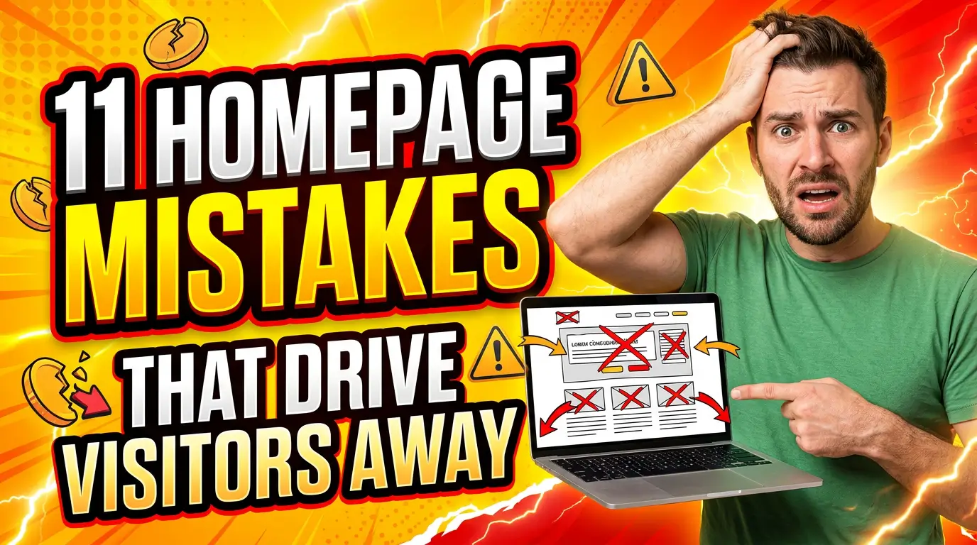
Most small-business websites act like buyers are already convinced.
They are not.
A serious visitor may like your work and still hesitate. Is this too expensive? Will it work for my situation? How long will it take? What happens after I fill out the form? Can I trust this company with my money, my home, my systems, or my staff?
If your website does not answer those questions, the buyer carries them into another tab. That usually means a competitor gets the call.
HubSpot’s sales objection guide frames objections as normal parts of the buying process, not dead ends. Your website should do the same job before a salesperson ever gets involved.
Here are 9 website sections that help small businesses handle objections and turn more visitors into qualified leads.
1. A “who this is for” section
A buyer’s first objection is often fit. They want to know whether your service was built for a business like theirs or for someone else.
A “who this is for” section solves that fast. List the industries, business sizes, project types, or customer situations where you do your best work. A commercial HVAC contractor might say they serve office buildings, medical facilities, retail centers, and light industrial spaces. A web design agency might say it works best with service businesses that need more qualified leads, not ecommerce brands chasing thousands of SKUs.
This section also lets you say who is not a fit. That sounds risky, but it saves bad calls. If you do not handle emergency work, say so. If your minimum project starts at a certain size, say so. Good-fit buyers appreciate clarity.
Keep it specific enough that a visitor can self-select in under 10 seconds.
2. A plain-language pricing context section
Price is the objection everyone has and few websites answer well.
You do not always need a fixed price table. Custom work, legal services, construction, consulting, and marketing retainers often depend on scope. But you should give buyers enough context to know whether they are in the right range.
For example, a remodeler can explain that bathroom projects usually vary based on plumbing changes, tile selection, permits, and layout. A marketing consultant can explain what changes between a one-time strategy session and a monthly implementation plan.
This is not about publishing your lowest possible number. It is about reducing sticker shock and unqualified leads. Clutch’s small business website cost research shows website pricing can vary widely depending on scope, provider, and features. That kind of range is exactly why buyers need context before they book a call.
A short pricing note near your CTA can prevent the wrong prospects from wasting everyone’s time.
3. A “what happens next” section
Many buyers do not fear the form. They fear what happens after the form.
Will they get spammed? Will someone call immediately? Will they be pushed into a sales pitch? Will it take three days to hear back? A “what happens next” section removes that uncertainty.
Use three simple steps. For a roofing company: “Send photos of the issue,” “We schedule an inspection,” “You get a written estimate.” For a B2B consultant: “Tell us the problem,” “We review fit,” “You get a practical next-step plan.”
Nielsen Norman Group has written about how clear process information reduces user uncertainty. That matters on service websites because uncertainty slows action. A visitor who knows what happens next is more likely to complete the form.
Put this section directly above or below your primary contact form. Do not bury it on an about page.
4. A proof block tied to the specific service
Generic testimonials help, but service-specific proof works harder.
If someone is reading your website maintenance page, show proof from a maintenance client. If they are reading your Google Ads page, show proof from a paid search project. If they are on a commercial cleaning page, show proof from a facility that looks like theirs.
The objection you are answering is simple: “Can you really do this for someone like me?”
A strong proof block includes the customer’s situation, the work performed, and the result. For example: “A regional accounting firm came to us with slow load times and unclear service pages. After the rebuild, organic consultation requests increased 38% in 90 days.” If you use a number like that, link to or publish the case study behind it.
Stanford’s web credibility guidelines also point to verifiable proof, contact details, and real organization signals as trust builders. Make your proof easy to believe.
5. A comparison section
Buyers compare options even when they do not tell you.
A comparison section helps them see the tradeoff clearly. This could be “custom website vs. template website,” “repair vs. replacement,” “monthly SEO vs. one-time audit,” or “DIY bookkeeping vs. outsourced bookkeeping.”
The goal is not to attack competitors. The goal is to help buyers choose the right path. A good comparison table covers cost, speed, support, risk, ownership, and best-fit use cases.
For example, a small manufacturer choosing between an off-the-shelf ecommerce platform and a custom distributor portal needs to understand setup speed, integration limits, product data complexity, and long-term maintenance. That is a practical decision, not a design preference.
Comparison content also helps search because people look for alternatives and “vs” queries when they are close to making a decision. Just keep the section honest. If the cheaper option is good enough for some buyers, say that.
6. A risk-reversal section
Risk is one of the biggest reasons buyers delay.
A risk-reversal section explains how you reduce the downside of saying yes. That might be a written scope, a satisfaction guarantee, a pilot project, a cancellation policy, staged payments, insured technicians, licensed work, documented handoff, or a clear support window.
For a web project, risk reversal might sound like this: “You approve the sitemap and design direction before development starts. You own the site when it launches. We document logins, hosting, plugins, and update instructions.” If that ownership language is missing, start with a website governance checklist before the proposal becomes a support problem. For a home service company, it might be warranty coverage, photos before and after work, and proof of insurance.
Do not fake this. A weak guarantee creates more questions than it answers. Be precise about what is covered, what is not, and how a customer uses it.
This section belongs near the decision point, especially on pricing, proposal, booking, and checkout pages.
7. A timeline and capacity section
Timing kills plenty of leads.
Some buyers need help immediately. Others need to plan around a season, budget cycle, board meeting, product launch, or building shutdown. If your website never mentions timeline, visitors have to ask, and many will not.
A timeline section should explain typical start times, project length, and the factors that speed things up or slow them down. A web design project might take 6 to 10 weeks depending on content, approvals, integrations, and feedback cycles. A contractor might book estimates within 48 hours but schedule larger installs several weeks out.
The real example here is any seasonal service business. HVAC, landscaping, pool service, tax preparation, and commercial maintenance all have busy seasons. If capacity changes by month, say so before the buyer waits too long.
Clear timing does not scare serious buyers away. It gives them a reason to act now.
8. A security and privacy reassurance section
If your site collects payment details, health information, financial documents, login credentials, or project files, trust is not optional.
A security and privacy reassurance section should explain what data you collect, why you collect it, and how it is handled. Link to your privacy policy, name the secure payment processor, explain whether files are uploaded through a protected portal, and tell visitors who can access their information.
For example, a law firm intake form should feel very different from a newsletter signup. A medical spa booking flow should explain payment, cancellation, and personal information handling. A B2B agency asking for analytics access should explain exactly what access is needed and why.
Google’s HTTPS guidance recommends secure connections for websites, and modern buyers expect the lock icon by default. Security language should be plain, not technical theater.
9. A human fallback section
Automation is useful until the buyer has a question that does not fit your form.
A human fallback section tells visitors how to get help if they are not sure which option to choose. This can be a phone number, short email note, scheduling link, or line that says, “Not sure where to start? Send us the short version and we will point you in the right direction.”
This matters because some websites over-optimize. They add quizzes, forms, chatbots, calendars, popups, and filters, then forget the person who just wants to talk to someone.
Salesforce reports that 88% of customers say the experience a company provides is as important as its products or services. For many small businesses, a good experience means the website gives people a clear path without trapping them in software.
Use automation to reduce friction. Keep a human door open for the buyers who need it.
Start with the objections your buyers already say out loud
You do not need nine new sections tomorrow.
Start by reviewing sales calls, emails, contact form messages, reviews, and lost deals. Write down the objections that appear again and again. Price. Fit. Timing. Trust. Risk. Process. Security. Then add the answers where buyers hesitate most.
A website that handles objections does not feel pushy. It feels prepared.
If your site gets traffic but too few serious inquiries, Your Web Team can help you find the gaps and fix the pages that should be producing leads. Get started here.