Most FAQ pages are dead weight.
They get stuffed with random questions, hidden in the footer, and written like legal disclaimers. Then business owners wonder why nobody uses them.
A good FAQ page does the opposite. It answers buying questions before they turn into hesitation. It cuts support friction. It helps people move.
That matters because, according to Harvard Business Review, 81% of customers try to solve issues themselves before contacting a live representative. If your site can’t answer basic questions fast, a lot of visitors won’t wait around.
Here are 9 FAQ page examples small businesses can learn from in 2026.
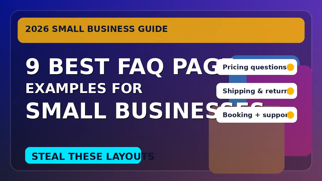
1. Calendly, answer the exact questions that block the next step
Calendly’s scheduling FAQ is a strong example because it focuses on the moments where users get stuck right before a booking or right after one. Questions like how to reschedule, how buffers work, and how availability is handled are practical, specific, and tied to user action.
That’s the right model for a small business site. Your FAQ should not try to answer everything about your company. It should answer the questions that stop someone from booking, buying, or contacting you. Think pricing, turnaround time, revisions, service area, refunds, onboarding, or what happens after the first call.
The lesson here is simple: build your FAQ around friction points, not around what your team feels like explaining. If a question shows up in sales calls more than twice a month, it probably belongs on the page.
2. Shopify, organize by customer task, not by internal department
Shopify’s help content around returns and exchanges works because it mirrors the customer’s real task. A visitor doesn’t think, “I have a fulfillment operations question.” They think, “I need to return this item.” Shopify writes for that reality.
Small businesses should steal that structure immediately. Group questions by what the visitor is trying to do: book service, place an order, track delivery, request a change, cancel, or get support. That is much easier to scan than categories built around your org chart.
This is especially useful for service businesses. Instead of sections like “Billing” and “Operations,” use labels like “Before You Start,” “During the Project,” and “After Launch.” Visitors scan for their situation. If your FAQ matches how they think, they’ll find answers faster and feel less uncertain.
3. Stripe, keep the language plain when the topic is complicated
Stripe deals with payment issues, disputes, account verification, and billing questions that can get technical fast. Their customer FAQ for businesses using Stripe stays useful because it leads with simple, direct language. The questions sound like what a real customer would type into Google.
That matters for small business websites too. If your FAQ says “What is your implementation methodology?” you’re making people work. “What happens after I sign up?” is better. “Do you require a contract?” is better. “Can I cancel anytime?” is better.
Plain language does two jobs at once. It improves usability, and it improves search alignment. Clear question phrasing gives you a better shot at matching the exact wording people use in search, support chats, and AI answers. If your audience wouldn’t say it out loud, don’t put it in the FAQ.
4. Mailchimp, cover pricing confusion before it becomes sales friction
Mailchimp’s Help Center is a good reminder that billing questions are often conversion questions in disguise. People hesitate when they don’t understand limits, contacts, upgrades, overages, or plan changes. Mailchimp addresses those topics directly because unclear pricing creates support load and lost customers.
For a small business, this is one of the biggest FAQ opportunities on the site. If you sell a service, answer the uncomfortable questions clearly: what’s included, what’s extra, how payment works, whether there’s a deposit, how revisions are handled, and whether there are cancellation fees.
You do not need to publish a full price sheet if your work is custom. But you should remove avoidable uncertainty. A short FAQ under your pricing or services page can do more for conversions than another paragraph of polished copy. Confused visitors rarely become leads.
5. Zapier, make search and category scanning work together
Zapier’s Help Center does a nice job of serving two different user behaviors at once. Some visitors want to search. Others want to browse categories like account, billing, or automation setup. Zapier supports both without making the page feel cluttered.
That’s a useful pattern for any small business with more than 15 or 20 common questions. Don’t force people into one path. Add a simple search bar if your FAQ is large, but keep visible categories underneath for skimmers.
This matters because FAQ pages are rarely read top to bottom. People arrive with urgency. They want the fastest route to “yes, this works for me” or “no, this isn’t for me.” A good FAQ behaves more like a navigation tool than a blog post. If you make users dig, they’ll bounce and call someone else.
6. Webflow, mix education with support when your service needs context
Webflow’s Help Center works well because it doesn’t just answer support questions. It also connects users to tutorials and deeper education through Webflow University. That matters for products or services where the buyer needs a little confidence before they can move forward.
Many small businesses need this same blend. A digital agency might answer “How long does a website redesign take?” with a short explanation plus a link to a launch checklist. A local service business might answer “What happens at the first visit?” with a short video or photo walkthrough.
The key is not to overload the FAQ answer. Give the quick answer first. Then offer the deeper resource for people who want details. That format respects both types of users: the person who wants a fast answer and the person who needs more reassurance before buying.
7. Notion, separate beginner questions from account questions
Notion’s help and billing content is a good example of separating “How does this work?” questions from “How does my account get charged?” questions. That sounds obvious, but a lot of FAQ pages mix product education, onboarding, billing, and troubleshooting into one giant accordion.
For small businesses, this split is powerful. A prospect has different questions than an existing client. Someone deciding whether to hire you wants to know about fit, scope, timing, and results. A current customer wants to know about invoices, support, scheduling, or next steps.
You don’t always need two separate help centers. But you should at least divide pre-sale and post-sale questions clearly. When those two audiences get mixed together, your FAQ becomes harder to scan and less persuasive. A prospect should feel guided toward action, not dropped into a support archive.
8. OpenAI, show the most common issue clusters immediately
OpenAI’s Help Center surfaces major issue areas right away, including account access, billing, and workspace management. That’s smart because it acknowledges reality: most visitors are not browsing for fun. They’re trying to solve a specific problem quickly.
A small business FAQ should do the same. Put your highest-frequency question clusters near the top. If customers constantly ask about response times, service area, minimum project size, or refund policy, don’t bury those under “About Us” fluff. Lead with them.
This is where your support inbox and sales calls become content research. Review the last 30 to 60 days of messages. What keeps repeating? Start there. Your FAQ should feel like it was built from real conversations, because that’s what makes it useful. The best FAQ pages don’t guess what people care about. They know.
9. HubSpot, treat the FAQ as a conversion asset, not a cleanup page
HubSpot’s own roundup of FAQ page examples highlights the same pattern you see on the best pages: clarity, scannability, and a visible path to support when self-service isn’t enough. That’s the part many small businesses miss. A great FAQ does not replace human contact. It reduces unnecessary friction before contact happens.
Your FAQ page should always support the next step. That might be a contact form, a booking link, a pricing page, or a support email. Don’t leave visitors at the end of an answer with nowhere to go.
This is also where FAQ pages help SEO and conversion work together. Better answers can reduce pogo-sticking, improve trust, and help visitors qualify themselves before reaching out. If your website sells a service, your FAQ is not a junk drawer. It’s one more sales page, just written in question form.
What to copy from these FAQ pages
If you’re building or rewriting your own FAQ page, focus on these principles:
- Answer real pre-sale and post-sale questions, not filler
- Use plain language that matches how customers actually ask
- Group questions by task or stage, not by your internal departments
- Put your most common objections and friction points near the top
- Add a clear next step such as booking, contacting, or reading a deeper guide
A simple FAQ page done well can make your website easier to trust and easier to buy from.
If your current site leaves visitors with too many unanswered questions, we can help. Get started.

Richard Kastl
Founder & Lead EngineerRichard Kastl has spent 14 years engineering websites that generate revenue. He combines expertise in web development, SEO, digital marketing, and conversion optimization to build sites that make the phone ring. His work has helped generate over $30M in pipeline for clients ranging from industrial manufacturers to SaaS companies.