A buyer does not contact you the moment they land on your website. They scan, compare, doubt, and look for reasons to trust you.
That happens fast. Nielsen Norman Group says people often leave web pages in 10 to 20 seconds, and pages need a clear value proposition within that window. For B2B companies, the pressure is even higher. Gartner has reported that buyers spend only 17% of the buying journey meeting with potential suppliers.
Your website has to answer better questions before the sales call ever happens.
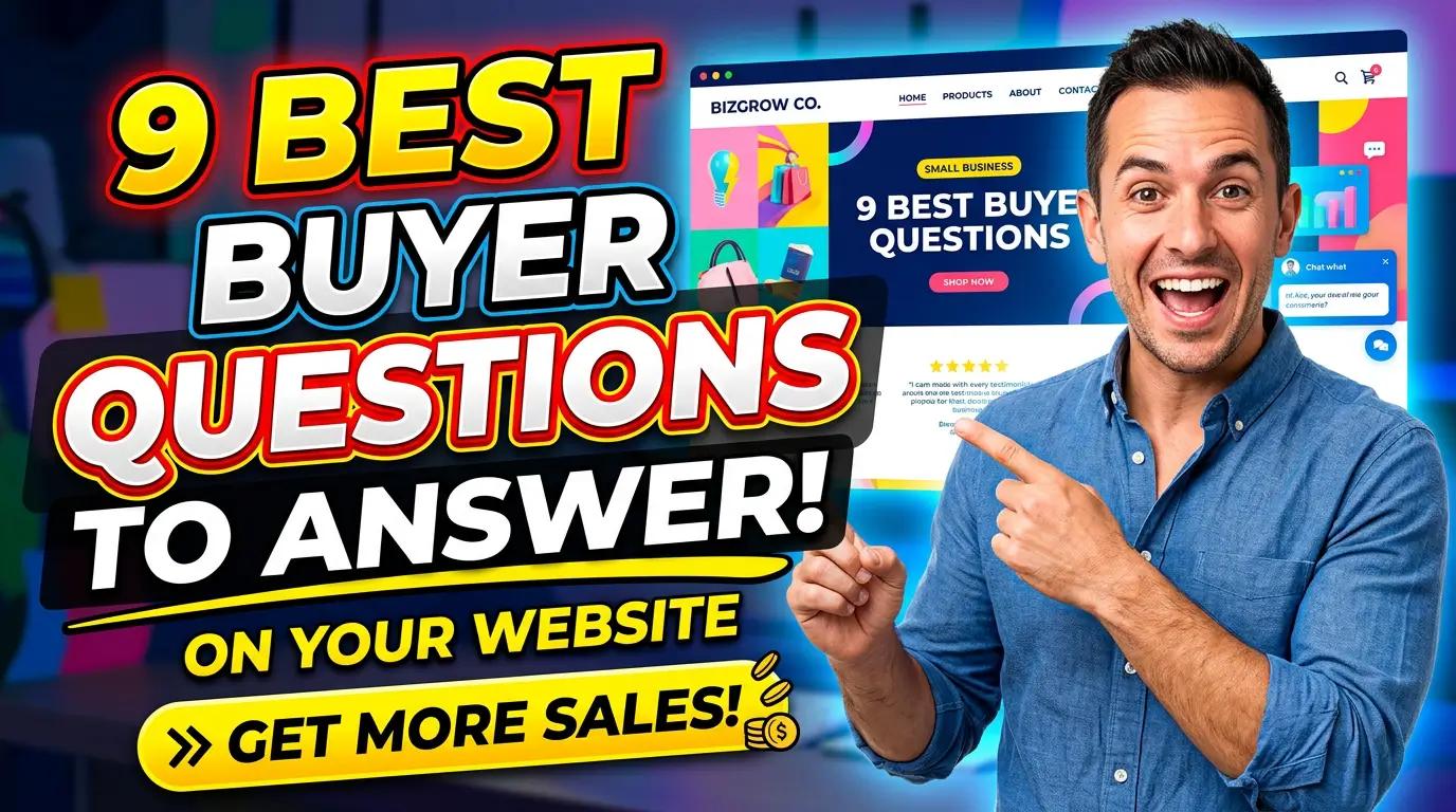
Here are nine buyer questions small business websites should answer clearly in 2026.
1. What do you actually do?
This sounds obvious, but many websites make people work too hard to understand the offer. The homepage says “growth solutions,” “better outcomes,” or “trusted partner,” but never names the service in plain English.
Your first job is clarity. Say the category, the audience, and the result. “Commercial HVAC maintenance for multi-location property managers” beats “comfort solutions for modern facilities.” “Custom websites for service businesses that need more qualified leads” beats “digital experiences that scale.”
Basecamp does this well. The product is explained as project management software without burying the visitor in buzzwords. A small business can use the same discipline on its homepage and service pages.
If a visitor cannot explain what you do after 10 seconds, your copy is not clever. It is costing you leads.
2. Is this for a business like mine?
Buyers want to know whether you understand their world. A restaurant owner, machine shop, dental practice, roofing company, and B2B software firm may all need marketing help, but they do not all respond to the same proof.
Show who you serve. That can mean industry pages, customer logos, use cases, location pages, or short examples inside the copy. HubSpot’s customer stories work because visitors can filter by industry, company size, and business need. The buyer does not have to wonder whether the example fits.
For a small business, this can be much simpler. A landscaping company might say it serves HOAs, commercial properties, and homeowners in specific towns. A managed IT company might show separate examples for law firms, medical offices, and manufacturers.
Do not make buyers guess whether they belong. Say it plainly.
3. Why should I trust you?
Trust is not one thing. It is a stack of small signals that lower doubt.
Clutch’s 2025 research on trustworthy websites found that clear contact information, professional design, and security cues are major trust factors for users. Reviews, testimonials, recognizable clients, certifications, guarantees, and real photos add more weight.
Look at Molly Maid. The site uses local pages, clear service explanations, review signals, and an estimate path that feels familiar. Nothing about it asks the visitor to take a wild leap of faith.
Small businesses should put trust near the decision point, not only on a separate testimonials page. Add a review beside the form. Show licenses near the service description. Put a real team photo near the contact information. Trust works best when it answers doubt at the exact moment the doubt appears.
4. What does this cost?
Price silence creates friction. Even when buyers do not expect an exact quote, they want to know whether they are in the right ballpark.
You can answer this without publishing a fixed price for every situation. Use starting prices, typical ranges, package examples, minimum project sizes, or pricing factors. If custom work starts at $5,000, say that. If maintenance plans depend on square footage, explain the variables.
Webflow’s pricing page is a useful example because it separates plans by buyer need and makes the comparison visible. Service businesses can borrow that structure even when the final quote changes.
The goal is not to make every visitor happy. It is to help good-fit buyers keep moving and help poor-fit buyers opt out before wasting everyone’s time. That saves sales calls, follow-up time, and frustration.
5. What happens after I contact you?
A lot of websites ask for the lead before explaining the process. That is backwards.
People hesitate when they do not know what comes next. Will they get a pushy sales call? A quote? A calendar link? A discovery meeting? A same-day reply? A three-week wait?
Spell it out in three or four steps. For example: submit the form, get a reply within one business day, schedule a 20-minute fit call, receive a written plan. That is not fancy, but it removes uncertainty.
Calendly built a large business around reducing scheduling friction. The lesson for small business websites is simple: clear next steps make action feel safer.
Put the process near every serious CTA. If your button says “Get started,” the section beside it should explain what “started” actually means.
6. Have you solved this problem before?
Buyers do not just want confidence. They want evidence.
Case studies, before-and-after examples, short project summaries, screenshots, and measured results answer this question better than generic praise. Shopify’s success stories are strong because they connect the customer, the challenge, and the outcome. A buyer can see the pattern.
Small businesses do not need a giant case study library. Three solid examples can be enough. A remodeler can show a dated kitchen, the finished project, timeline, and budget range. A marketing consultant can show traffic, lead quality, or booked calls before and after a campaign. A web team can show how page speed, form quality, or local search visibility changed.
Use numbers when you have them. If you do not, use concrete details: timeline, scope, constraints, and what changed.
7. How do you compare with my other options?
Your buyer is already comparing you with competitors, DIY work, freelancers, software tools, internal staff, and doing nothing. If your website ignores those choices, someone else frames the comparison.
A fair comparison page or section can help. The key is honesty. Explain who each option is best for, where it falls short, and when your service makes sense.
ConvertKit’s comparison pages are a good model. They do not just say “we are better.” They compare against known alternatives using buyer priorities like audience growth, publishing needs, and pricing.
A local service business could compare repair vs. replacement. A web design company could compare template sites vs. custom builds. A consultant could compare hourly help vs. fixed-scope projects.
Do not trash the other option. Buyers can smell that. Give them a clean decision framework instead.
8. Can I see the work, product, or outcome?
Visual proof matters because it reduces imagination work. Buyers want to see what they are getting, especially when the result is physical, visual, technical, or expensive.
That might mean product photos, project galleries, screenshots, short videos, sample reports, dashboard previews, diagrams, or downloadable examples. Wyzowl’s video marketing research found that 98% of people have watched an explainer video to learn more about a product or service. Buyers clearly use visuals to understand offers.
For small businesses, the best visual proof is often simple. Show the cleaned facility, the finished patio, the audit report, the before-and-after website, the installed equipment, or the exact intake process.
Avoid polished stock images when real work would be more persuasive. Real examples beat perfect-looking filler because they answer the buyer’s real question: “Will this look right for me?”
9. How fast will you respond?
Speed is part of the offer. If a buyer fills out a form and hears nothing for two days, the website did its job and the business still lost the lead.
Response expectations belong on the website. Tell people when they will hear back, what channel you use, and what information helps you reply faster. A line like “We reply within one business day” is better than silence. If you can back it up operationally, “same-day response for requests before 2 p.m.” is even stronger.
Harvard Business Review reported that companies contacting online leads within an hour were nearly seven times more likely to qualify the lead than companies that waited even one hour longer. The study is older, but the lesson still holds. Fast follow-up wins.
Set the expectation, then meet it. Your form confirmation, thank-you page, and follow-up email should all match the promise.
Make the buyer’s job easier
A good small business website is not just a brochure. It is a decision tool.
If your site answers these nine questions, buyers do not have to hunt for the basics. They understand the offer, see whether it fits, trust the business, know the next step, and show up to the conversation with fewer doubts.
Want a website that answers buyer questions and turns more visitors into qualified leads? Get started with Your Web Team.